
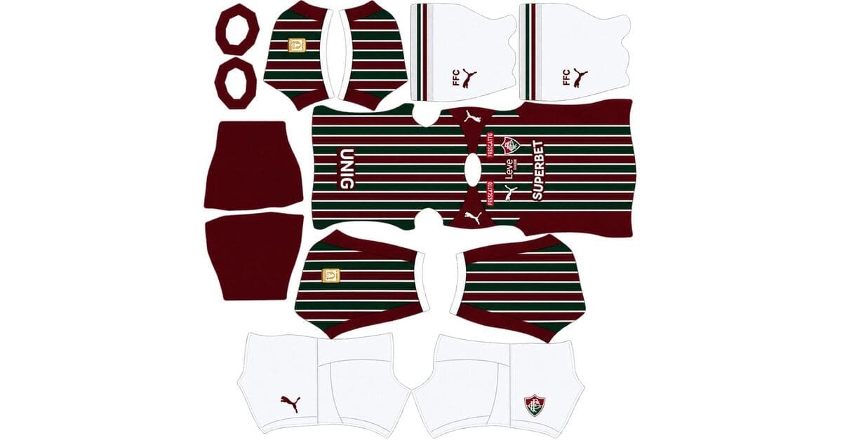
A Fluminense DLS kits URL is a direct link to a 512×512 PNG Tricolor shirt you paste into Dream League Soccer. All four slots are below, with each file loaded into the game before it was added to this page.

Fluminense FC Logo
Official Logo 512×512 (2026/27)

Fluminense FC Home Kit
Home Kit 512×512 (2026/27)

Fluminense FC Away Kit
Away Kit 512×512 (2026/27)

Fluminense FC GK Home Kit
GK Home Kit 512×512 (2026/27)
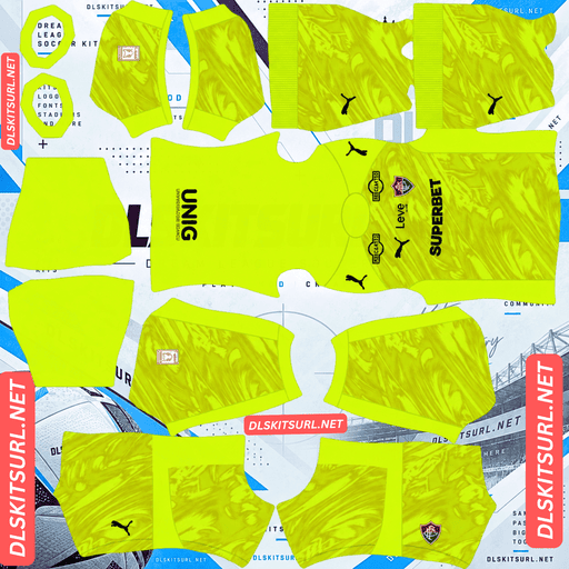
Fluminense FC GK Away Kit
GK Away Kit 512×512 (2026/27)

Fluminense FC GK Third Kit
GK Third Kit 512×512 (2026/27)
Puma took over from Umbro in January, and its first Fluminense home shirt narrowed the stripes. That sounds like a small design change, but at 512×512 it changes exactly where the file is most likely to fail.
The white dividing lines carry the home kit
Released on 1 January 2026 under the “Bendita Armadura” campaign, the home keeps Fluminense’s traditional green and maroon vertical stripes, but makes them thinner and separates them with white lines. The design draws from a shirt worn around fifty years ago.
A white V-neck, matching cuffs, white shorts and white socks complete the look, while “Retumbante de Glórias” appears at the nape.
Green against maroon is a narrow pairing
Green and maroon are both saturated, relatively dark colours.
Put them directly beside each other and they do not have much value separation. They are nowhere near as distinct as green against white or maroon against gold.
That makes the white dividing lines more important than they might appear.
They are not simply decorative trim. They are what separates two colours that would otherwise begin to merge.
Which makes a thin element structural
An outline between two similar colours is carrying the contrast rather than merely decorating the shirt.
The problem is that the divider is also thin, which puts it right in the part of the image most vulnerable to losing detail.
So the home effectively depends on whether those white lines remain crisp.
If they do, you get a proper three-colour shirt with green, maroon and white clearly separated.
If they soften, the green and maroon begin to merge into a darker mass and the whole stripe structure loses definition.
Basel’s navy outline between red and blue performs the same job, while Monza’s third uses white outlining in a similar way. An outline between close colours is a contrast device.
And the stripes got thinner this year
This is where Puma’s redesign matters.
The stripe count increased while the individual bands became narrower, moving the shirt closer to the pinstripe threshold where 512×512 resolution starts to decide what remains visible.
A file that handled last season’s wider stripes well may therefore struggle with this year’s version.
Open the image at full size and count how many stripes remain clearly separated. The more distinct bands you can see, the better. Most importantly, inspect the white dividers, because they are likely to disappear before the green and maroon themselves do.
What this means in practice
The vertical stripes do not create a difficult alignment problem. They follow the centre line of the kit template, so there is no complicated diagonal or multi-directional geometry to correct.
The concern is simply resolution.
Confirm the actual image dimensions before importing. On a computer, right-click the image and open it in a new tab so your browser can report its size.
And the nape inscription will not appear
“Retumbante de Glórias” sits at the back of the collar.
That area is not mapped in a useful way for this design, while Dream League Soccer places squad numbers further down the back.
Expect the inscription to disappear.
Napoli’s Partenopei lettering, Monaco’s arches motif, Boca’s anchor graphic, Alianza Lima’s collar slogan and Monterrey’s neckline text all run into the same basic limitation.
Visibility
Dream League Soccer displays players at a small size, so the shirt needs enough separation from the pitch to remain readable.
The three Fluminense colours behave very differently. White is bright and highly visible, maroon is dark but distinct, and green is the difficult one because it sits close to the pitch.
Having all three together helps prevent the shirt from becoming one solid colour. The white is doing double duty: it separates the green and maroon and also provides the brightest parts of the player’s silhouette.
Use white or sky blue numbers on the home. Because the stripes continue across the back, a darker number colour could disappear when it lands over either the green or maroon sections.
The away’s relief artwork cannot travel
The 2026 away is predominantly white and draws from Fluminense’s 1952 away design. It adds green and maroon sleeve stripes, relief artwork across the front, a subtle surface texture and “Amor Igual Não Se Viu” on the back.
Two impossible things at once
Relief is a raised surface effect. You see it because light creates highlights and shadows around the raised areas.
A flat 512×512 image has no actual surface depth, so it cannot reproduce that effect in the same way.
The all-over texture creates another problem. It relies on subtle tonal changes rather than strong colour boundaries, which are exactly the kind of details that disappear when the image is reduced.
So both surface effects should be treated as lost.
Expect a plain white body with the sleeve stripes remaining.
Monaco’s embossed monogram, Hoffenheim’s stag antlers, Torino’s embossed third and Palmeiras’ Avanti shirt all run into the same limitation.
But the sleeve stripes survive
Green and maroon have plenty of contrast against the white base.
The sleeves are also a well-mapped section of the kit template, giving the stripes enough space to remain defined.
They should therefore survive, making their edges your main quality test on the away. At full size, the colour boundaries should be sharp rather than smeared.
And the back inscription goes too
“Amor Igual Não Se Viu” sits across the back, where the game also places squad numbers and where fine detail has less room to survive.
Expect the inscription to disappear or be hidden.
And white needs the right number colour
Dream League Soccer takes number colours from two separate swatches in the kit template, not from the imported image. One controls shirt numbers and the other controls shorts numbers.
White numbers on a white shirt disappear completely. It is the classic mistake with light kits, and the shirt preview does not necessarily make the problem obvious because the numbers are controlled separately.
Use maroon or green on the away.
Visibility
White separates cleanly from pitch green and is one of the brightest possible shirt bases.
Once the relief and surface texture disappear, the away becomes a relatively simple white shirt with coloured sleeve details. That simplicity works in its favour.
It is therefore the most readable kit in the Fluminense range.
The third carries a map, which is a problem
Released in July 2026 as Puma’s first Fluminense third and the club’s final kit launch of the season, the shirt is green and honours Laranjeiras, carrying an old map of the district where the club’s stadium stands.
Maps are near the top of the detail scale
A street map is one of the densest graphics you can put on a shirt.
It contains fine lines running in many directions, blocks, junctions and often tiny labels. At 512×512, the entire shirt has roughly the visual resolution of a thumbnail.
A map needs far more room than that to remain recognisable as a map rather than becoming visual noise.
Expect the design to reduce to vague texture, or disappear altogether.
Only a photograph tends to be denser. Lugano’s city-map third faces essentially the same problem, while Alavés’s crowd photograph pushes the density even further.
And the base colour makes it worse
Green is already the weakest base colour in Dream League Soccer because of its similarity to the pitch.
A map printed over green is also likely to use a related tone rather than a strongly contrasting colour, creating a second problem on top of the density.
Open the third at full size before importing it. If the street lines are already difficult to distinguish in the flat source image, there is little chance of them becoming readable in the game.
Which leaves the branding
The crest, Puma logo and sponsor are the useful quality checks here.
The map itself is too unreliable at this resolution to tell you whether the file is good.
And green is the weakest base in the range
Once the map disappears, expect the third to read mainly as a green shirt with limited internal contrast.
Use white numbers on it.
Fluminense have produced several green thirds over the years, including Adidas in 2015, Umbro in 2020-21 and another Umbro version in 2023-24 honouring Cartola and Mangueira.
So searching for a “Fluminense green third” is not enough to identify the current shirt. Compare the design with the card above.
Which Fluminense kit survives best?
The home keeps its basic tricolour structure, but its success depends heavily on the thin white lines remaining crisp. If they soften, the green and maroon begin to merge.
The away loses its relief and subtle texture but retains the sleeve stripes. Its white base makes it the best of the range for visibility.
The third has the biggest detail problem. The Laranjeiras map is too dense to reproduce reliably, and the green base is also the hardest colour to separate from the pitch.
How to tell if a Fluminense file is current
Four checks make the current range easy to identify.
First, look for Puma branding rather than Umbro. Puma took over in January 2026 on a five-year deal, so an Umbro logo dates a file to 2025 or earlier.
Second, the home should have thin green and maroon stripes separated by white lines. The Umbro-era homes used wider bands.
Third, the away should be white with green and maroon sleeve stripes.
Fourth, the third should be green with the Laranjeiras map print. The previous 25-26 third was deep maroon with gold.
The Puma logo does most of the work, while the thinner home stripes provide a useful second check when comparing files.
A note on Brazilian season labels
This matters when searching for the files.
Brazilian football uses a single calendar-year season, running from January through December.
Fluminense’s shirts are therefore normally labelled 2026. A file marked 2026 is current here, whereas the same naming convention can mean something different for European clubs.
Some retailers label the same shirts 2026/27 because they remain in use during the early months of the following season.
Both labels can therefore refer to the same kit range.
MLS also uses calendar years, while Liga MX divides its season across two calendar years. The design remains the better identifier than the year in the filename.
How to use a Fluminense DLS kits URL
Copy the link using the button on the kit card, not from your browser address bar. The address bar normally gives you the webpage rather than the direct image.
In Dream League Soccer, open My Club, then Customise, and choose Kit. Do not select Logo; the crest is imported separately.
Choose your slot before pasting because the currently selected slot is the one that will be replaced. Press and hold the URL field, tap Paste, then choose Confirm. Older versions may call the button Download.
The three current outfield shirts fill the three outfield slots exactly, leaving the goalkeeper position available.
You can also use the 25-26 maroon and gold third as a rotation option. Its maroon base should reproduce more reliably than the green 2026 third, although the gold accents will lose their metallic effect.
Dream League Soccer accepts any working 512×512 kit URL regardless of the original shirt’s age.
The first custom kit requires a one-time gem unlock. After that, changing kits costs nothing.
Test the link first
Open the URL in your browser before importing it. The shirt should appear by itself, and the address should end in .png.
If you see a webpage with headers, buttons or other surrounding content, you have a viewer page rather than the direct image file. Dream League Soccer cannot use that page as a kit URL.
For the home, use the white dividing lines as the main test. If they remain crisp, the three-colour structure has a chance of holding. If they have already softened, the green and maroon will begin to merge.
For the away, do not judge the file by its relief artwork or subtle texture. Those features are expected to disappear even from a good 512×512 file.
Why do Fluminense kit URLs stop working?
Three things commonly break kit links, and only one is immediately obvious.
Free image hosts can delete files. Unused uploads may be cleared after months or years, leaving a URL that still looks valid but no longer returns the image. Fluminense are one of Rio’s big four, so their kits are widely covered and replacement files are generally easier to find. A new supplier deal also creates more upload activity than a normal season.
Hotlink protection can be switched on. A host may allow your browser to load the image while refusing requests coming from another application. That is why a link can work when clicked directly but fail when pasted into Dream League Soccer.
The third problem is a mismatch between the preview and the direct file. Some pages display a thumbnail hosted on their own server while the actual copy link points somewhere else. The page can continue to work even after the direct image has disappeared.
Here, the shirt shown and the link provided are the same file on the same server.
The Fluminense badge
Set the crest during the same customisation session, but choose Logo rather than Kit.
Fluminense’s badge is a shield carrying the interlocked FFC monogram in green, maroon and white.
Dream League Soccer crops imported badges into a circle, while a shield naturally narrows toward its bottom. Leave clear space around the artwork rather than trimming the source tightly to the edges.
The interlocked lettering is the weak point. The letters overlap and sit close together, so their finer forms can soften at the small size used beside the score.
Use a genuine 512×512 badge file rather than enlarging a smaller source.
The white parts of the crest do much of the visual work. Green and maroon alone would produce a darker, less defined shape at that size, just as they do on the shirt when the white dividers disappear.
Keeping your Fluminense kits
Custom kits are stored on your device rather than in your account. Updating the game usually leaves them in place, but reinstalling the game or changing phones can remove the kits and badge.
The home file with crisp white dividers is the one worth keeping especially carefully because that detail is the hardest part of the current range to reproduce.
Umbro-era files are also still widely available, so save the correct current links rather than assuming the first Fluminense URL you find is the right one.
Paste all four URLs into a notes app before you start.
FAQ FOR RANK MATH
What is a Fluminense DLS kits URL?
A direct link to a 512×512 PNG Tricolor shirt that you paste into Dream League Soccer’s kit screen. A working direct link ends in .png.
What should I check on the home kit?
Check the thin white lines separating the green and maroon stripes. Those lines provide the contrast between two relatively close colours, so they are the first detail to inspect.
Why are the white dividers more important this season?
Puma increased the stripe count and narrowed the individual bands. That moves the design closer to the pinstripe threshold, where 512×512 resolution starts to determine whether the dividers remain visible.
Will the relief artwork on the away kit show up?
No. Relief depends on surface depth, highlights and shadows, while a flat 512×512 image has no actual raised surface. The subtle all-over texture is also expected to disappear.
What survives on the away?
The green and maroon sleeve stripes. They have strong contrast against the white base and occupy a well-mapped area of the kit, making them the best quality test.
Will the Laranjeiras map on the third kit appear?
Probably not in readable form. A street map is extremely dense, with many fine lines and junctions, and the green base does not provide enough contrast to help it survive at 512×512.
What number colour should I use?
Use white or sky blue on the home, maroon or green on the white away, and white on the green third. Avoid white numbers on the away because they disappear into the white shirt.
Who makes Fluminense’s kits?
Puma, which took over from Umbro in January 2026 on a five-year deal. An Umbro-branded Fluminense file belongs to 2025 or earlier.