

An LDU Quito DLS kits URL is a direct link to a 512×512 PNG Liga de Quito shirt that you can import into Dream League Soccer. All four kit slots are listed below, and each file was loaded into the game before being added to this page.

Ldu Quito Logo
Official Logo 512×512 (2026/27)
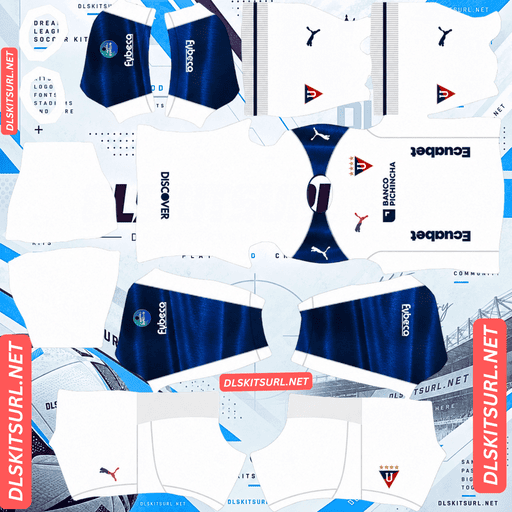
Ldu Quito Home Kit
Home Kit 512×512 (2026/27)
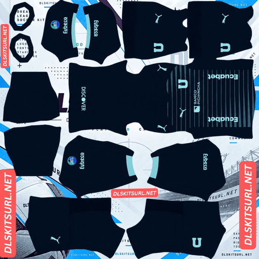
Ldu Quito Away Kit
Away Kit 512×512 (2026/27)

Ldu Quito Third Kit
Third Kit 512×512 (2026/27)
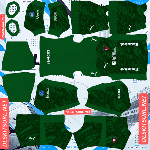
Ldu Quito GK Home Kit
GK Home Kit 512×512 (2026/27)
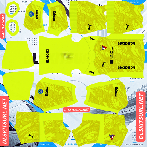
Ldu Quito GK Away Kit
GK Away Kit 512×512 (2026/27)
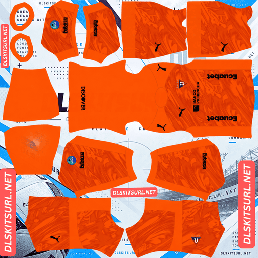
Ldu Quito GK Third Kit
GK Third Kit 512×512 (2026/27)
There is one detail worth understanding before choosing a design: Puma has used gradient effects on three different logos across this range. Gradients on small logos behave very differently from gradients printed across a shirt.
Why gradients on logos behave differently
All three kits were released on 6 January 2026 under the club motto “La Mejor Hinchada”, with Banco Pichincha as the shirt sponsor.
Three logo-sized elements feature gradient treatments:
Home: Puma logo with a blue-to-pink gradient.
Third: Club crest with a red gradient.
Third: Puma logo, also using a gradient to mirror the crest.
Why small logos lose their gradients
A gradient is made up of a gradual transition between slightly different colour values. When a shirt image is too small, that transition can break into visible blocks or bands of flat colour. This is the usual problem with gradients printed across large areas of fabric.
A logo has a different problem. At 512×512, the Puma wordmark takes up very few pixels, leaving almost no room for the gradual colour changes to appear. The result is usually a single flat shade, often whichever colour dominates the original design.
That means the gradient disappears without leaving the obvious banding that would warn you about a poor-quality file. A banded shirt gradient is easy to spot, but a flattened logo gradient can look perfectly normal.
For these kits, pay closer attention to the edges and details than to the gradients.
The third kit’s crest gradient is hidden anyway
The red gradient on the third kit’s crest is unlikely to be visible in the game, even if the original file reproduces it perfectly.
Dream League Soccer places your imported badge over the chest area of the shirt. That means your own crest covers the one already printed on the kit image.
Use the standard LDU Quito crest instead. The third kit’s gradient crest is part of its original design, but it is not something you can expect to see in-game.
The home kit’s body pattern will disappear
The home shirt is predominantly white, with blue details. Its design includes a subtle tonal geometric pattern across the white body, a blue gradient treatment on the sleeves and gold stars on the club crest.
Tonal patterns on white are difficult to reproduce
Tonal designs use different shades of the same colour. In this case, the geometric pattern is made from variations of white, rather than a contrasting colour.
That leaves very little for a 512×512 image to preserve. A pale background makes the problem even more noticeable because there is no dark colour to help separate the pattern from the rest of the shirt.
Expect the home kit to look like a clean white shirt in Dream League Soccer. The missing pattern is a limitation of the image format, not necessarily a sign of poor quality.
The same issue affects Bayern’s tonal pinstripes, Sevilla’s tonal designs, Millonarios’ El Campín pattern, Barracas Central’s third kit and Vélez’s navy away shirt.
Check the sleeve gradient carefully
The sleeves occupy a relatively small area of the kit template, but they are still larger than a logo. That gives the blue gradient more room to reproduce, although it can still break into visible bands.
Open the home image at full size and inspect the sleeves. A smooth, continuous colour transition is a good sign. If the blue changes in obvious steps, the file is not reproducing the gradient cleanly.
This is the most useful quality check on the home shirt. The body pattern will disappear, leaving the sleeve treatment as the main detail worth inspecting.
Choose a darker number colour
Dream League Soccer takes number colours from two small swatches on the kit template, not from the imported PNG. One controls the shirt numbers, while the other controls the shorts.
White numbers on a white shirt will be almost impossible to see. The kit preview does not necessarily reveal this problem because it shows the shirt design rather than how clearly the numbers stand out during a match.
Use navy for the home kit’s numbers.
How visible is the home during matches?
Players appear relatively small on the pitch, so a kit needs enough contrast to stand out from the grass.
White separates clearly from the green playing surface, making the home the easiest of the three designs to identify at match distance. However, once the tonal body pattern disappears, the shirt has little internal detail.
The blue sleeves provide most of its visible definition.
The away kit’s pinstripes can survive
The away shirt uses a navy blue base, with light blue pinstripes and mint-coloured lettering. The crest and text use a fresh mint shade that stands out against the dark background.
Why these pinstripes have a chance
Pinstripes are among the thinnest stripe designs used on football shirts. However, their thickness alone does not determine whether they survive at 512×512. The difference between the stripe colour and the background matters just as much.
Here is how similar designs compare:
Argentinos Juniors: Red pinstripes on white — survive.
LDU Quito: Light blue pinstripes on navy — survive.
Cerro Porteño: Red and navy pinstripes on white — survive.
Inter Milan: Dense navy pinstripes on white — survive.
Bayern Munich: Tonal red pinstripes on red — lost.
Sevilla: Tonal pinstripes — lost.
Udinese: Metallic pinstripes — lost.
LDU’s light blue stripes have a genuine brightness difference against the navy background. That light-versus-dark contrast gives the image enough information to preserve the pattern during compression.
A decent file should retain the pinstripes. With a weaker one, they may blur together and make the shirt look like a flat mid-blue design.
That makes the away a more useful resolution test than the home.
Mint lettering is the best quality indicator
The mint lettering provides an even clearer test. It has strong contrast against the dark navy base, and text has defined edges that are easy to inspect.
Open the image and look closely at the lettering. If the edges are sharp rather than smeared, the file is retaining the resolution it claims to have.
Across the entire LDU range, this is the most reliable way to judge image quality.
How visible is the away during matches?
Navy separates from the pitch, although it creates a darker overall shape than the white home shirt.
The light blue pinstripes and mint lettering break up that dark base. Both details should remain visible with a good file, giving the away more definition than many other dark kits.
Use white or mint numbers to keep the squad numbers readable.
The third kit uses black and red
The third shirt has a black base with red details. It also features the gradient crest and Puma logo discussed earlier.
Why it is the least visible option
An almost completely black kit can look like one large dark shape when viewed from match distance. The red details provide the main contrast, while the gradient crest would have added another visual feature if it were not covered by the imported badge.
Use white numbers on this shirt. Against the dark background, they provide a clear bright detail that helps identify players.
Sport Recife’s All Black third, Kocaelispor, the Red Bulls, Inter Miami’s away, Al-Ittihad’s third and Vélez’s third face a similar visibility challenge.
Red details should reproduce well
Unlike the gradients, the red details have a defined colour rather than a gradual transition. Red against black creates strong contrast, so those elements should reproduce clearly in a suitable 512×512 file.
Whatever red features appear on the original shirt should remain visible in the game.
Which LDU Quito kit looks best in Dream League Soccer?
Each design has a different strength. The home is the easiest to see, the away offers the best detail and resolution test, and the third is the darkest option.
Home: White base, tonal pattern and gradient sleeves. The body pattern disappears, but the shirt remains the most readable of the three.
Away: Navy base with light blue pinstripes. The details survive with a good-quality file, making this a strong option if the image is sharp.
Third: Black base with red details and gradient logos. The red survives, but the gradients flatten, and the design is the least visible during matches.
Two anniversary shirts give you more options
There are two additional LDU Quito shirts worth looking out for if you want something beyond the regular three-kit range.
The 108th anniversary kit celebrates the club’s roots in the founding of Club Universitario in 1918. It uses a traditional white base with a high navy polo collar and red trim, giving the shirt a retro-inspired appearance.
A separate commemorative shirt was released in July 2026 to mark 18 years since the club won the Copa Libertadores.
Both anniversary designs should reproduce well
Retro-inspired shirts generally rely on solid colours and clearly defined shapes. They do not depend as heavily on subtle fabric textures or complicated gradients, which makes them better suited to a 512×512 image.
A contrasting polo collar is also a well-defined feature, so it should remain visible after importing the shirt.
The main difficulty is finding the files. One-off commemorative releases usually attract fewer uploads than regular league kits, so you may have to search longer. Save a good version when you find one.
How to identify a current LDU Quito DLS kit
Use these four details to check whether you have the correct 2026 designs:
Puma branding and Banco Pichincha sponsorship should appear across the range.
The away shirt should be navy, with light blue pinstripes and mint lettering. That mint colourway is particularly distinctive.
The third shirt should be black, with red details.
Compare the design with the kit cards above. The 2024 home shirt was white with black side stripes, so it has a noticeably different appearance.
The away kit’s mint lettering is the strongest identification detail. It is distinctive enough to recognise the 2026 design without needing to inspect every part of the shirt.
How to use an LDU Quito DLS kits URL
Use the copy button on the kit card rather than copying the address from your browser. The browser address usually points to the webpage, not directly to the PNG image.
Once you have copied the link, open Dream League Soccer and follow these steps:
Go to My Club.
Select Customise.
Open Kit, not Logo. These are separate sections.
Choose the kit slot you want to replace.
Press and hold the URL field, then tap Paste.
Select Confirm to import the shirt. Older versions may label this button Download.
The three regular kits fit into the three outfield slots: home, away and third. That leaves the goalkeeper slot available, although you could also use it for one of the anniversary or Libertadores commemorative designs if you prefer.
Your first custom kit requires a one-time gem unlock. Once that is done, changing or replacing kits does not cost additional gems.
Test the kit URL before importing it
Open the copied link in your browser before entering the game. A working direct link should display the image by itself, with the address ending in .png.
If the picture appears inside a webpage with buttons, headers or other page elements, you probably have a viewer link rather than the direct image address. Dream League Soccer cannot import that type of page.
For the away shirt, check the actual image dimensions and inspect the pinstripes closely. They depend on a clear difference between individual pixels, so every bit of resolution matters.
The home and third require a different approach. Do not judge their quality by the gradient logos, because those small gradients are likely to flatten even when the file itself is good.
Why do LDU Quito kit URLs stop working?
There are three common reasons a custom kit link can stop working. Only one is immediately obvious.
Image hosts delete old uploads. Free hosting services sometimes remove files that have not been accessed for months or years. The original link may still look valid, but the image is no longer available.
LDU are among the best-covered clubs in Ecuadorian football, although Ecuador generally attracts less kit-upload activity than Brazil or Argentina. The two commemorative shirts are especially vulnerable because fewer people are likely to upload and maintain copies of them.
Hotlink protection blocks the game. Some image hosts restrict requests that do not come from their own websites. Your browser may open the image normally, while Dream League Soccer’s request is rejected. This explains why a link can work when you click it but fail when you paste it into the game.
The preview and copied link point to different files. Some websites display a thumbnail stored on their own server but provide a separate URL hosted elsewhere. The preview can continue working even after the actual image link has stopped responding.
For the kits on this page, the image displayed and the link provided by the copy button are the same file on the same server.
Choosing the right LDU Quito badge
You can import the club crest during the same customisation session. Open the same menu, but select Logo instead of Kit.
LDU’s badge features the club’s U monogram, with stars representing its honours.
There are two details to consider when importing it.
The gold stars will appear flat. Their metallic appearance depends on gradients and colour variation, which a small image cannot reproduce particularly well. Expect the gold to look more like flat yellow. That is a limitation of the game’s rendering, not necessarily a problem with your badge file.
The circular crop can cut into the stars. They sit along the top of the crest, close to the area where Dream League Soccer’s circular crop is most likely to trim the design. Choose a badge file with enough empty space around the artwork instead of one cropped tightly to its edges.
The standard LDU crest is the best choice across all three kits. It is especially important on the third, where your imported badge covers the gradient version printed on the shirt.
Supporters using the Brazil, Galatasaray, Peñarol, Honduras and Millonarios badges face a similar issue with stars near the top of their designs.
Keep your LDU Quito kit links safe
Custom kits are saved on your device rather than being attached to your Dream League Soccer account. Updating the game usually leaves them in place, but reinstalling the game or moving to another phone can remove both your kits and badge.
Keep a copy of the original URLs somewhere safe before importing anything.
The away shirt is particularly worth saving if you find a version with sharp, clearly separated pinstripes. The anniversary and Libertadores commemorative designs may be even harder to replace because fewer copies are available.
Paste all four kit links into a notes app so you can find them again if you need to reinstall the game.
FAQ FOR RANK MATH
What is an LDU Quito DLS kits URL?
An LDU Quito DLS kits URL is a direct link to a 512×512 PNG Liga de Quito shirt that you can paste into Dream League Soccer’s kit customisation screen. A working direct image link ends in .png.
Why don’t the gradient logos look right in Dream League Soccer?
Logos occupy too few pixels for a gradient to reproduce properly. On a shirt body, a low-resolution gradient may break into visible colour bands. On a small logo, there is not enough room for those bands to appear, so the gradient usually becomes a flat colour.
What happens to the third kit’s gradient crest?
The gradient crest will be covered by your imported badge. Dream League Soccer places your own logo over the chest area, so even a perfect kit image cannot keep the original gradient crest visible underneath it.
Will the LDU Quito home kit’s geometric pattern appear in DLS?
No. The pattern uses different shades of white against a white shirt, making it difficult for a 512×512 image to preserve. Expect the home to appear as a mostly plain white shirt with blue details.
Do the LDU Quito away kit’s pinstripes survive?
Yes, provided you use a good-quality file. The light blue stripes have enough contrast against the navy background to remain visible. With a weaker image, they may blur together and look like a flat mid-blue area.
What is the best way to check the quality of an LDU Quito kit file?
Look at the mint lettering on the away shirt. Mint stands out clearly against navy, and the lettering has defined edges. If the text looks sharp rather than blurred, the image is retaining its resolution well.
Which number colour should I use on the LDU Quito home kit?
Use navy numbers. White numbers will disappear against the white shirt. Remember that Dream League Soccer controls shirt and shorts number colours through separate swatches in the kit template.
Are there other LDU Quito kits worth using?
Yes. The 108th anniversary shirt features a traditional white design with a high navy polo collar and red trim. There is also a commemorative shirt released in July 2026 to mark 18 years since LDU Quito’s Copa Libertadores title. Both use retro-inspired designs that should reproduce well, although their files may be harder to find.