
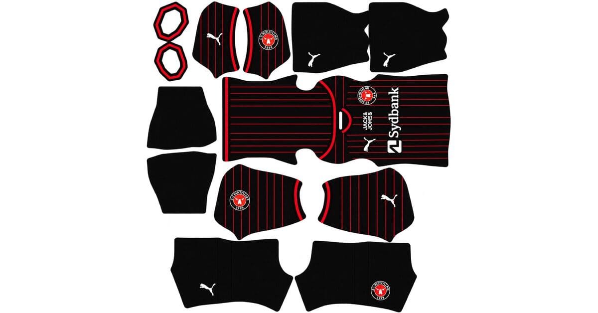
An FC Midtjylland DLS kits URL is a direct link to a 512×512 PNG Midtjylland shirt that you paste into Dream League Soccer. All four slots are below, with each file loaded into the game before it was added to this page.

FC Midtjylland Logo
Official Logo 512×512 (2026/27)
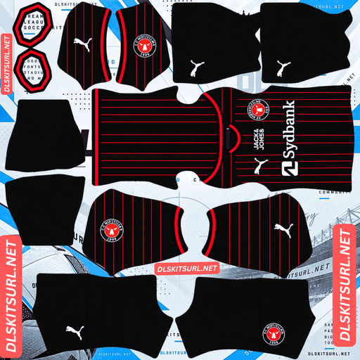
FC Midtjylland Home Kit
Home Kit 512×512 (2026/27)
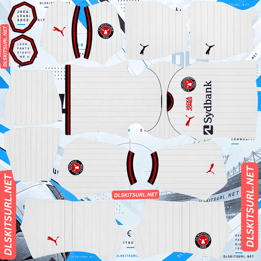
FC Midtjylland Away Kit
Away Kit 512×512 (2026/27)
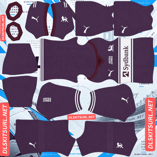
FC Midtjylland Third Kit
Third Kit 512×512 (2026/27)

FC Midtjylland GK Home Kit
GK Home Kit 512×512 (2026/27)

FC Midtjylland GK Away Kit
GK Away Kit 512×512 (2026/27)
Both current kits use pinstripes, but they do not survive the same way. That makes Midtjylland a useful test case for understanding why some pinstriped DLS files hold their detail while others turn plain.
The same stripe, three different outcomes
Midtjylland’s 26-27 home is black with red pinstripes, while the away is white with black and red pinstripes. Both are made by Puma and carry Sydbank, with the designs built around the club motto “Heart. Head. Heath.”
The 25-26 third was cream with subtle pinstripes and burgundy accents.
Three kits, one stripe width, three results
The important part is that the stripe width is essentially the same. The difference is the contrast between the stripe and the base.
The 26-27 away, with black pinstripes on white, has maximum contrast and the stripes survive.
The 26-27 home, with red on black, sits in the middle. There is enough difference for the stripes to exist, but not enough to make them completely safe at 512×512.
The 25-26 third, with off-white pinstripes on cream, has minimal contrast. At this resolution, those stripes disappear.
That is the pinstripe rule demonstrated by one club across two seasons: wide colour separation survives; narrow or tonal separation does not.
There are now thirteen clubs in the pinstripe comparison, and the same split keeps appearing. Midtjylland simply happens to show all three outcomes at once.
The away is the reliable one
Black against white gives you the strongest possible value difference.
On a genuine 512×512 file, the away’s pinstripes should remain clearly separated. Use them as your first quality check. Count the lines. If you can distinguish individual stripes, the file is doing its job. If the stripes have merged into a grey-looking wash, the source is probably undersized.
The red elements on the away provide another useful check because red against white also has strong contrast.
Check the dimensions as well. On a computer, right-click the image and open it in a new tab so you can confirm the actual image size rather than trusting the displayed preview.
The home needs more care
Red against black is a moderate contrast combination. Red is a saturated mid-value colour, while black sits at the darkest end, so there is a visible difference, but nowhere near the separation you get from black and white.
At pinstripe width, that makes the home borderline.
A good file still shows the red lines. A weak one lets them soften into the black until the shirt looks almost plain.
That makes the home the kit where file quality changes the finished appearance most. A good source gives you a black-and-red pinstriped shirt; a poor one gives you a black shirt.
Check it at full size before importing.
Atlas, Tijuana and D.C. United use the same red-on-black relationship, but none puts that combination into pinstripe-width lines.
Visibility
Dream League Soccer renders players relatively small, so shirt visibility depends heavily on how far the colours separate from the pitch.
An almost entirely black kit becomes one dark shape at match distance. The red pinstripes are the main visual relief, so losing them makes the home even harder to follow.
The away has the opposite advantage. White is the brightest base, while the black and red stripes create strong internal contrast.
The result is simple: the away is much easier to read during a match. If you prefer clearer player identification, it is worth considering for your home slot.
Number colour
Dream League Soccer takes number colours from two small swatches in the kit template rather than from the shirt image itself. One controls the shirt numbers and the other controls the shorts.
Use white on the black home. It gives the squad number a strong bright element against the dark shirt.
For the white away, use navy or black. White numbers on a white shirt disappear, which is an easy mistake to make with any pale kit. The shirt preview does not necessarily make that problem obvious because the number colour is controlled separately.
The motto will not survive
Both current shirts are built around “Heart. Head. Heath.” — Hjertet, Hovedet, Heden — referring to the club’s values and the Jutland heath.
Which lands in unreachable zones
A shirt that uses a motto as part of its identity usually places the wording in areas that DLS cannot reproduce particularly well:
Chest: the imported badge can cover the area.
Upper back or neck: this is a small, low-resolution part of the template and also interacts with the squad-number area.
Hem: it is rendered at a much smaller scale and can partly disappear behind the shorts.
Inside the collar: the game does not map interior surfaces of the shirt.
So the design arrives more successfully than the meaning behind it.
That does not hurt the structure of the kits because the pinstripes remain the main visual feature. It is simply worth knowing before assuming a missing piece of text means the file is poor.
Nacional’s collar inscription, AGF’s 1880 tribute, Columbus’s founding mark and América de Cali’s 1927 date face the same limitation.
The third
Midtjylland’s 26-27 third completes the current set with a lifestyle-inspired aesthetic connected to the club’s regional roots.
Rather than judging the file from a written description, compare it directly with the card above and use the usual structural checks.
Colour boundaries should remain sharp instead of becoming smeared. Collar and cuff trim should have clean edges. The Puma branding, crest and sponsor should remain defined, and the image should actually be 512×512.
With one caution
“Lifestyle-inspired” usually points toward muted colours and subtle treatments rather than large, obvious blocks.
That is exactly where DLS files can struggle.
A detail that looks understated and attractive on a physical shirt can become almost invisible in a 512×512 image. Open the file at full size. If the design is obvious without having to search for it, it has a chance of carrying through. If you have to hunt for the detail, expect the game to simplify it further.
The 25-26 third is the warning here. Its subtle pinstripes on cream disappeared because there was not enough contrast. AGF Aarhus’s sand-and-cream third has the same basic problem this season.
Which Midtjylland kit survives best?
The home is black with red pinstripes. Its reproduction is borderline and depends heavily on the quality of the source file, while its dark base also makes it the weakest kit for match visibility.
The away is white with black and red pinstripes. Its lines survive much more reliably, and it is the easiest of the current range to follow during a match.
The third has a lifestyle-inspired regional design, so the card itself is the best reference when judging whether the file contains the intended details.
The practical choice is the away. The game uses your home kit most often, and the white shirt is considerably easier to read. Swapping the two is worth considering.
Puma replaced Nike
Midtjylland returned to Puma in 2023, ending the Nike partnership.
Which gives you a clean dating check
A Nike Swoosh on a Midtjylland shirt points to 2022-23 or earlier.
A Puma cat indicates 2023 onward, but Puma alone cannot identify a recent season because the supplier has now been with the club for several seasons.
The sponsor is a more useful second marker. Sydbank appears on the 26-27 kits, while Vestjysk Bank was used on the 25-26 third.
Basel, Grasshoppers, Fiorentina, Alavés, FC Zürich and AGF Aarhus have also changed suppliers recently, so the manufacturer logo is useful but should not be treated as a complete season identifier.
How to tell if a Midtjylland file is current
Four checks narrow it down quickly.
First, look for Puma with Sydbank.
Second, the current home should be black with red pinstripes, while the away should be white with black and red pinstripes.
Third, a cream shirt with burgundy accents belongs to the 25-26 third rather than the current set.
Finally, compare the file directly against the cards above. Midtjylland’s black shirts can look broadly similar across seasons, so the actual design matters more than a filename.
The sponsor is particularly useful because it gives you a tighter dating window than Puma alone.
A note on the Danish season
This matters when searching for files.
The Danish Superliga runs across two calendar years, so the current set is labelled 26-27.
A file simply labelled “2026” could refer to either the 25-26 or 26-27 collection. Always check the design rather than relying on the year in the filename.
How to use an FC Midtjylland DLS kits URL
Copy the link from the copy button on the kit card, not from your browser address bar. The browser address normally points to the page containing the image rather than the direct image itself.
In Dream League Soccer, open My Club, then Customise, and choose Kit. Do not use Logo; the badge has its own import system.
Select the slot before pasting. Press and hold the URL field, choose Paste, and then Confirm. Older versions may call the final button Download.
Three outfield kits fill the three outfield slots, leaving the separate goalkeeper slot.
Think about the order before importing. The white away is substantially easier to follow than the black home, so it can make sense to give it the home slot.
Set the goalkeeper deliberately as well. With a black home kit in the rotation, a bright goalkeeper shirt can make player separation easier.
The first custom kit requires a one-time gem unlock. After that, changing custom kits is free.
Test the link first
Open the URL in a browser before entering it into the game.
The image should appear by itself, and the address should end in .png. If you see a webpage with headers, buttons or other content around the picture, you have a viewer page rather than a direct image file.
For the away, count the pinstripes. Black on white provides maximum contrast, so merged lines are a strong warning that the file is undersized.
For the home, look specifically for the red stripes. Because red on black is only moderate contrast, this is where a weak source file can visibly remove part of the shirt design.
Why do Midtjylland kit URLs stop working?
Three common problems account for most broken kit links.
Free image hosts delete files. An old upload can disappear after months or years while the original page or reference remains. Midtjylland are among Denmark’s bigger clubs and have regular European exposure, so current coverage is generally good. The lifestyle-inspired third is the greater risk because it is a more seasonal design.
Hotlink protection can be enabled later. The host may allow the image to open in a browser while refusing requests coming from another application. That is why a URL can work when clicked but fail after being pasted into DLS.
The preview and direct link may not point to the same file. A page can continue showing a locally cached or separately hosted preview while the URL supplied to users points somewhere else.
For these Midtjylland files, the shirt shown and the copied link are the same file on the same server.
The FC Midtjylland badge
Import the crest from the same My Club → Customise area, but choose Logo instead of Kit.
Midtjylland’s badge uses the club’s black and red and features the wolf associated with Ulvene.
The wolf is a strong shape for DLS because its silhouette remains recognisable even when small. Fine facial or line details are more likely to soften, though, especially at the size the game displays beside the score. That is a rendering limitation rather than necessarily a bad source file.
Red against black has the same moderate contrast relationship as the home shirt’s pinstripes. If the badge file is undersized, those colours can blur together.
Use a genuine 512×512 badge file rather than enlarging a smaller one. A version with white separating the black and red areas is preferable because that extra contrast keeps the crest more readable.
DLS crops badges into a circle, so leave clear space around the full design instead of trimming the image tightly around the artwork.
Universidad de Chile’s Chuncho, Nordsjælland’s tiger and Tijuana’s xolo face the same general issue: animal details can soften even when the main silhouette remains clear.
Keeping your Midtjylland kits
Custom kits are stored on your device rather than attached to your account.
Updating the game normally keeps them, but reinstalling the game or moving to another phone can remove the custom kits and badge.
Record the home file where the red pinstripes remain visible. It is the hardest part of this set to reproduce consistently and the easiest detail to lose when a source disappears.
Save all four URLs in a notes app before you start so you can restore the set later.
FAQ FOR RANK MATH
What is an FC Midtjylland DLS kits URL?
A direct link to a 512×512 PNG Midtjylland shirt that you paste into Dream League Soccer’s kit screen. A working direct image URL ends in .png.
Why do the home and away pinstripes behave differently?
Because their contrast is different. Black on white has maximum contrast and survives much more reliably, while red on black is only moderate contrast. At pinstripe width, a weak file can lose the red lines.
Which kit should I use to check file quality?
The away. Count the individual pinstripes. If the black lines remain clearly separated on white, the file is a good starting point. Then check whether the red lines survive on the home.
Will the “Heart. Head. Heath.” motto show up?
Not reliably. Its possible placements include the chest, upper back, hem and inside collar, all of which are covered, rendered very small or not mapped by the DLS template.
Which Midtjylland kit works best in DLS?
The away. Its white base is much easier to see against the pitch, while the black and red pinstripes provide strong internal contrast.
Should I swap the home and away slots?
It is worth considering. Because the home slot is used most often, putting the more readable white away there can make matches easier to follow.
What number colour should I use?
Use white on the black home and navy or black on the white away. White numbers on a white shirt will disappear.
Was the 25-26 third really that difficult to reproduce?
Yes. Its subtle pinstripes on a cream base had minimal contrast, so the lines could disappear at 512×512. It demonstrates the same problem seen with AGF Aarhus’s sand-and-cream third.