
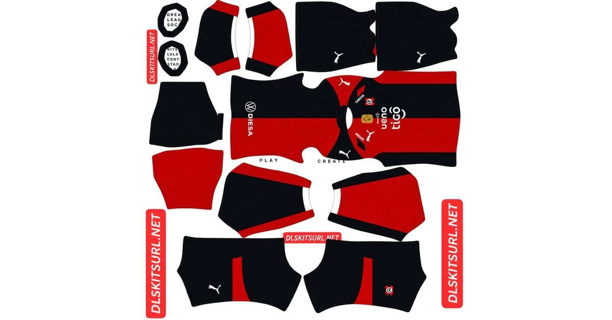
A Cerro Porteño DLS kits URL is a direct link to a 512×512 PNG Ciclón shirt that you can import into Dream League Soccer. All four kit slots are listed below, and every file has been loaded into the game before being added to this page.
Cerro Porteno Logo
Official Logo 512×512 (2026/27)
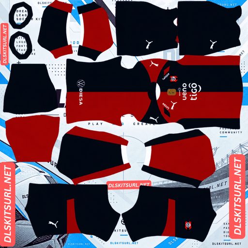
Cerro Porteno Home Kit
Home Kit 512×512 (2026/27)
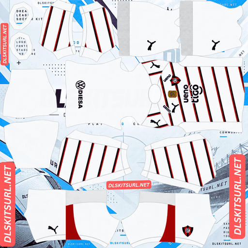
Cerro Porteno Away Kit
Away Kit 512×512 (2026/27)
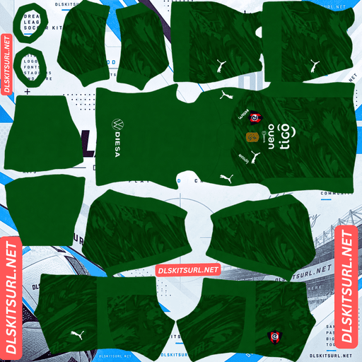
Cerro Porteno GK Home Kit
GK Home Kit 512×512 (2026/27)
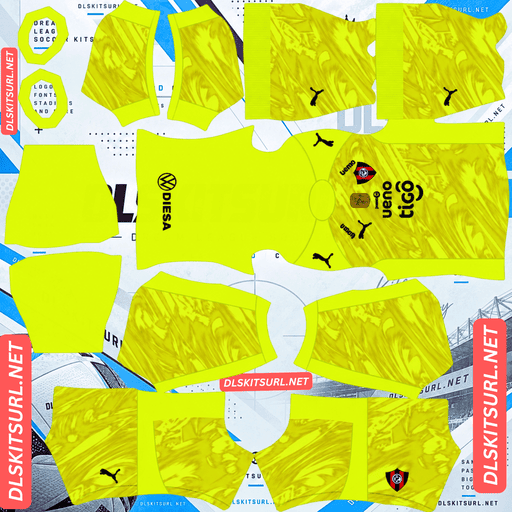
Cerro Porteno GK Away Kit
GK Away Kit 512×512 (2026/27)
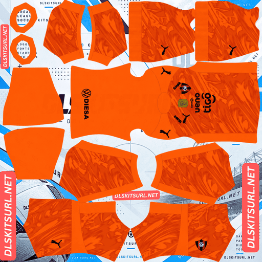
Cerro Porteno GK Third Kit
GK Third Kit 512×512 (2026/27)
For 2026, Puma has moved away from Cerro’s familiar striped design. The new home shirt is split into two colours, with red on one side and navy on the other. That makes the centre line the most important detail to check when choosing a file.
The home kit is split between red and navy
Cerro’s 2026 home shirt is a clear break from its traditional striped look. The right half of the body is red, while the left half is navy blue. All the logos are white.
There are also contrasting panels across the upper left and right sections, forming a Puma Formstripe. Puma usually blends this template feature into the surrounding fabric, but it is deliberately visible on this shirt.
The centre line is the main thing to check
Every kit has to work with the seams and layout of the DLS template. A half-and-half design is unusual because nearly all its alignment difficulty comes down to one point.
Vertical stripes: The main concern is getting the stripe position right.
Half-and-half design: The two colours must meet cleanly along the centre line.
Horizontal bands: Several separate positions need to line up.
Diagonal sash: Both the position and angle must remain consistent across the seams.
On Cerro’s home shirt, the red and navy meet in a straight line down the middle of the chest. Structurally, that is fairly straightforward: it needs to line up in one place, much like a vertical stripe.
The centre split also affects your badge
Dream League Soccer places your imported crest in the middle of the chest. Unfortunately, that is exactly where Cerro’s two colours meet.
The badge therefore sits across both the red and navy sections. That matches the layout of the real shirt, but it also means your chosen crest needs to stand out against both backgrounds.
A badge made entirely from one colour can disappear into the half of the shirt with the matching colour. Cerro’s own white logos show why white works so well here: it remains visible against both red and navy.
Before importing the home kit, open the image at full size and check where the centre line passes through the chest.
Make sure the colour boundary is sharp
There is one particularly important quality check: the red and navy should meet at a clean, straight vertical edge.
A blurry transition, soft gradient or smeared strip is a sign that the file may not be sharp enough. This design does not rely on complicated textures or fine tonal details. Its main feature is the colour split, so that boundary needs to be clear.
The away kit has red and navy pinstripes
Cerro’s away shirt uses a white base with thin red and navy pinstripes. The logos are navy.
Thin stripes need a good-quality image
Pinstripes are among the most difficult patterns to preserve in a 512×512 kit image. At that size, a narrow line may be represented by only one or two pixels.
However, line thickness is not the only factor. Pinstripes are especially vulnerable when they are both thin and low-contrast, such as metallic or tonal designs.
Cerro’s away shirt has a better chance because its red and navy lines stand out clearly against the white background. The colours have enough contrast to remain distinguishable if the source image is sharp.
Open the away file at full size and see whether you can follow the individual lines. If they blend together into a pinkish-grey haze, the image probably lacks the resolution needed.
Atlético Bucaramanga’s green and yellow pinstripes on black are a similar example of contrasting colours. Udinese’s gold pinstripes and Sevilla’s tonal designs are different cases because their colours are less distinct from their backgrounds.
The third kit is a 1990s Puma remake
Cerro’s third shirt is a direct retro remake inspired by the club’s “Pinturas Renner” era of the 1990s.
Why this retro design should reproduce well
Many shirts from the 1990s relied on flat colours and bold shapes. The printing and fabric technology of the time did not offer the same range of tonal gradients, sublimated textures and metallic finishes found on modern kits.
That makes a faithful retro remake a particularly good fit for Dream League Soccer. Its main design elements are the kinds of shapes and colours that usually survive the move to a 512×512 image.
Of the four Cerro designs, this is the one most likely to reproduce almost exactly as intended.
Check the crest and sponsor
Retro remakes sometimes use a historic club crest or a sponsor from the original period.
Dream League Soccer only displays one imported crest at a time, regardless of which kit you are wearing. If the third shirt uses an older Cerro badge, look for a matching version and decide whether you want your team to use the historic or modern look.
Santos, Corinthians, CF Montréal, Vancouver and Orlando face a similar choice when using retro-inspired shirts.
The 114th anniversary kit
Puma has also released a separate shirt celebrating Cerro Porteño’s 114th anniversary. It uses a late-1990s retro aesthetic.
That gives the club four outfield designs for 2026, even though Dream League Soccer only provides three outfield kit slots. There is also some overlap in style, since both the third shirt and anniversary edition draw on retro designs.
Rather than using two slots for similar looks, compare the available files and choose whichever one has the better quality. You can always bring the other shirt into your team later.
Once you have completed the first custom-kit unlock, changing between kits costs nothing.
Which Cerro Porteño kit reproduces best?
Home: The half-red, half-navy design should survive well. The key is a sharp, correctly positioned centre line.
Away: The white shirt with red and navy pinstripes depends more heavily on image resolution.
Third: The 1990s remake is the strongest candidate for an accurate reproduction because it uses bold shapes and flat colours.
Anniversary: Its late-1990s styling should also reproduce well, although the final result depends on the quality of the available file.
How visible are Cerro’s kits on the pitch?
All four designs should stand out clearly because none relies on colours close to the green of the pitch.
Dream League Soccer displays players at a relatively small size during matches, so strong colour separation makes a difference.
Red contrasts strongly with green, while navy also stays distinct from the grass, even though it is a much darker colour. The home shirt benefits from having both colours together: one bright half and one dark half create a strong silhouette with plenty of contrast.
The away shirt is easy to pick out because of its white base. Its pinstripes add extra detail, but the white background does most of the work at match distance.
What number colours work on Cerro’s kits?
Dream League Soccer does not take the number colour from your imported image. You control it through two small colour swatches in the kit template: one for shirt numbers and another for shorts.
Here are the combinations worth trying:
Home: Use white. The red-and-navy split continues down the back, meaning the number sits across both colours. White remains readable against either side.
Away: Use navy to match the logos and pinstripes. White numbers would disappear against the white shirt.
Third and anniversary: Choose a colour that contrasts with the dominant colour on the upper back.
Remember to set the shirt and shorts number colours separately.
How to tell if a Cerro Porteño kit file is current
There are four useful details to check before importing a file:
Puma branding: Puma is the supplier for the 2026 designs. An older Nike swoosh points to a previous period.
The home design: It should be split between red and navy, not covered in the club’s traditional vertical stripes.
The away design: Look for a white base with red and navy pinstripes.
The two retro shirts: Make sure you can distinguish the 1990s third kit from the separate 114th anniversary design.
The home shirt is the quickest way to identify the current season. Cerro used vertical stripes for years, so a striped home file belongs to an earlier design.
How to use a Cerro Porteño DLS kits URL
Use the copy button on the kit card rather than copying the address from your browser bar. The browser address usually points to the webpage, not directly to the shirt image.
Open Dream League Soccer and follow these steps:
Go to My Club.
Open Customise.
Choose Kit, not Logo. The badge has its own separate section.
Select the kit slot you want to replace.
Press and hold the URL field, then tap Paste.
Select Confirm. Some older versions of the game use the label Download.
Choose your slot carefully before pasting. The selected slot is the one that will be replaced.
You can use three outfield designs for home, away and third, with a separate goalkeeper slot. Since Cerro has four outfield shirts, make a note of which retro design you leave out so you can rotate it in later.
The first custom kit requires a one-time gem unlock. Once that is done, future kit changes are free.
Test the kit URL before importing it
Open the copied link in your browser first. A valid direct image link should display the shirt by itself, with the address ending in .png.
If the page has navigation, buttons or other content around the image, you are probably looking at a viewer page rather than a direct image file. Dream League Soccer cannot use that type of link.
For Cerro’s away shirt, checking the actual image dimensions is especially important. The pinstripes need enough pixels to remain separate instead of blending together.
Why do Cerro Porteño kit URLs stop working?
There are three common reasons a kit link can fail, and not all of them are obvious.
The image host deletes the file
Free image-hosting services sometimes remove uploads that have not been accessed for months or years. The URL may still look normal, but the image itself is gone.
The anniversary kit carries a greater risk here because one-off commemorative shirts tend to attract fewer uploads than regular home and away designs.
Hotlink protection blocks the game
Some image hosts enable hotlink protection. This prevents other websites and apps from loading images directly from their servers.
As a result, a link may open successfully when you click it in your browser but fail when Dream League Soccer tries to import it.
The preview and copied link point to different files
Some websites display a thumbnail hosted on their own server but provide a separate URL for the full image. The preview can continue working even after the actual download link has stopped functioning.
For the files listed here, the shirt shown in the card and the copied URL point to the same image on the same server.
The Cerro Porteño badge
You can import the crest during the same customisation session. Open the same menu, but select Logo instead of Kit.
The badge deserves extra attention with Cerro’s 2026 home shirt because it sits directly over the boundary between red and navy.
A crest containing white details will remain visible against both halves. A badge made entirely of red or navy may blend into the matching side and become difficult to see.
Dream League Soccer crops imported badges into a circle. Choose an image with enough empty space around the entire crest so that no important part gets cut off.
If you are building your team around the retro third kit, also check whether a period version of Cerro’s crest is available.
Keeping your Cerro Porteño kits
Custom kits are saved on your device, not permanently attached to your game account. Updating the game normally keeps them in place, but reinstalling Dream League Soccer or moving to a new phone can mean losing both your kits and badge.
Cerro has four outfield shirts, two retro-inspired designs and a crest choice that affects how the home kit looks. It is worth saving everything before you start.
Copy all four kit URLs and the badge link into a notes app. That way, you can restore your preferred setup or switch to the unused retro shirt without having to search for the files again.
FAQ FOR RANK MATH
What is a Cerro Porteño DLS kits URL?
It is a direct link to a 512×512 PNG Cerro Porteño shirt that you can paste into the kit section of Dream League Soccer. A working direct image link ends in .png.
What does the Cerro Porteño 2026 home kit look like?
The 2026 home shirt is split down the middle, with red on the right half and navy blue on the left. All logos are white, and the design replaces the club’s traditional vertical stripes.
How do I check a half-and-half Cerro Porteño kit file?
Look at the centre line where the red and navy sections meet. It should be a sharp, straight vertical edge rather than a blurry gradient or smeared band.
Why does my badge look unusual on the Cerro home kit?
Dream League Soccer places your imported crest in the centre of the chest, directly over the red-and-navy boundary. A badge with white details is a good choice because it remains visible against both colours. A single-colour crest may blend into one half.
Will the pinstripes on Cerro’s away kit survive in DLS?
They can, provided the source image is sharp enough. The red and navy lines contrast strongly with the white background, so the main challenge is preserving their thin details at 512×512 resolution.
Which Cerro Porteño kit reproduces best in Dream League Soccer?
The 1990s retro third kit is likely to reproduce best. Its flat colours and bold shapes are well suited to a 512×512 image, unlike designs that depend on subtle gradients, textures or metallic finishes.
How many Cerro Porteño kits are available for 2026?
There are four outfield designs: the half-and-half home, the pinstriped away, a 1990s-inspired third kit and a separate 114th anniversary shirt. Dream League Soccer has three outfield slots, so you will need to choose one to leave out initially.
What number colour should I use on Cerro Porteño’s home kit?
White is the best choice. The red-and-navy split continues down the back, so the number sits across both colours. White provides clear contrast against each side.