

An AC Horsens DLS kits URL is a direct link to a 512×512 PNG Horsens shirt you paste into Dream League Soccer. All four slots are below, with each file loaded into the game before it went on this page.
AC Horsens Logo
Official Logo 512×512 (2026/27)

AC Horsens Home Kit
Home Kit 512×512 (2026/27)
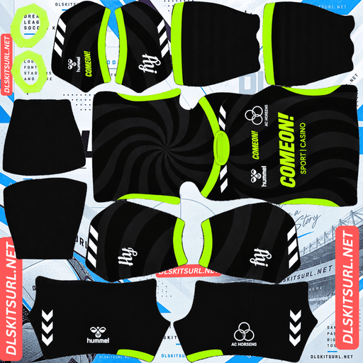
AC Horsens Away Kit
Away Kit 512×512 (2026/27)
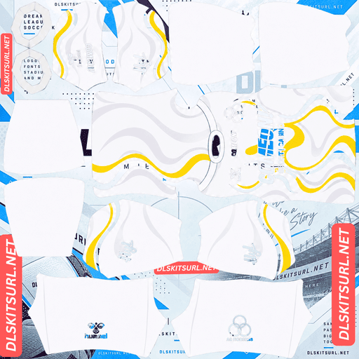
AC Horsens Third Kit
Third Kit 512×512 (2026/27)
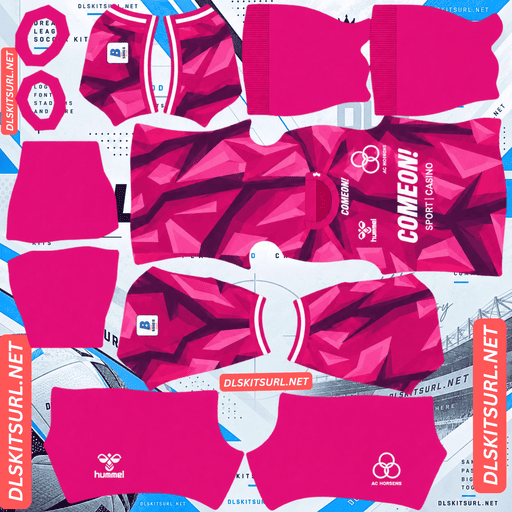
AC Horsens GK Home Kit
GK Home Kit 512×512 (2026/27)
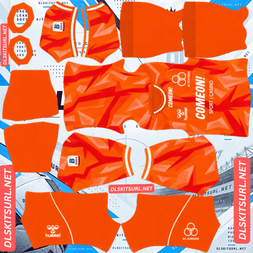
AC Horsens GK Away Kit
GK Away Kit 512×512 (2026/27)

AC Horsens GK Third Kit
GK Third Kit 512×512 (2026/27)
Hummel describe the new home kit as a bespoke design, and that word matters more than it sounds when the finished shirt has to survive as a 512×512 image.
“Bespoke” is usually bad news here
Released for the 26-27 Danish Superliga season, AC Horsens’ home is described as a bespoke design tailored specifically for the club. It is made by Hummel with NG Zink as sponsor.
Which inverts what you would expect
A bespoke kit sounds like a better kit. On an actual shirt, it usually is.
In DLS, it can be the opposite.
Premium bespoke designs are where manufacturers tend to use sublimated textures, tonal weaves, embossed details, metallic finishes and subtle gradients. Those effects depend on surface depth or very small differences in tone.
A flat 512×512 PNG cannot reproduce the physical part of that.
Standard teamwear has an unexpected advantage here. Flat colours and defined panels have very little to lose.
The same distinction appears elsewhere on the site: practical designs such as Union Saint-Gilloise’s O’Neills kits reproduce cleanly, while bespoke ranges from Marseille, Monaco and Bahía can lose the feature that made the original shirt distinctive.
FC Zürich is probably the clearest single-club example. Its move into bespoke Castore designs introduced fading pinstripes and a topographic map, both of which are much harder to preserve than simple colour blocking.
So open the home at full size first
Before judging the file, identify what the design is actually asking the PNG to reproduce.
Colour blocking, stripes and panels should survive.
Sublimated or tonal patterns may disappear.
Embossed or woven textures cannot retain their physical depth.
Fine graphic or ornamental linework is likely to simplify.
The useful rule is simple:
If you can clearly read the design on a flat image, it has a chance of carrying into DLS. If you have to work out where the design is, 512×512 probably will not preserve it.
Confirm the dimensions as well. On a computer, right-click the image and open it in a new tab so the browser can report the actual size.
And check the Hummel chevrons
Hummel’s signature chevron trim runs down the sleeves and sides as a series of small repeating shapes.
Those chevrons are the sensitive part.
They are narrow, repeated and high-contrast, so compression or an undersized source will damage them much sooner than a large yellow or black panel.
Use the chevrons as your quality gauge on the Horsens file, regardless of what the bespoke design itself contains.
Odense Boldklub, Esbjerg, Le Havre, Bournemouth and Rotherham provide the same useful Hummel check.
Yellow and black is the best pairing in this game
AC Horsens play in yellow and black, which gives the club an advantage before the design even starts.
Both measures come out right
DLS renders players relatively small, so the base colour needs to separate clearly from the pitch.
Yellow sits a long way from pitch green. It is bright, saturated and immediately readable.
Black against yellow also provides maximum internal contrast. Any defined shape using the two colours has an obvious boundary.
That is why the palette works so well compared with darker combinations. Red and white also offer maximum contrast, while blue and white are similarly clear, but Horsens gets the benefit of a very bright base plus a very dark secondary colour.
Columbus Crew, Young Boys, Dortmund and Watford enjoy much the same advantage.
Whatever the bespoke home actually contains, the palette itself is working in your favour.
Number colour
Dream League Soccer reads number colours from two small swatches on the kit template, not from the shirt image. One controls shirt numbers and the other controls shorts numbers.
For a yellow shirt, black is the obvious choice. It gives the strongest separation and matches the club’s secondary colour.
Avoid white where possible. White against yellow is too close in brightness, especially at match distance.
For the white third, use black or navy. White numbers on white simply disappear, and the kit preview does not show that problem because the number colours are handled separately.
The third is carried over
This is important when you are sorting files by season.
AC Horsens’ 26-27 third is a carry-over from last season. It is the same predominantly white design with yellow and black graphic elements used during 25-26.
Which inverts the usual advice
On most kit pages, a file carrying last season’s label is a warning.
Not here.
A 25-26-labelled Horsens third can be the correct current shirt.
So do not reject it simply because the filename says 25-26. Compare the actual design with the current card.
And carry-overs are not just an MLS thing
MLS provides plenty of obvious carry-over examples because Adidas generally introduces one new kit per club each year.
Horsens shows that the same practical decision happens in Europe, even if it is less systematic. Smaller clubs can retain a third for another season rather than replacing every slot annually.
That makes older labels worth checking whenever you are looking outside the biggest leagues.
The third should reproduce well
The third has a much easier job than a texture-heavy bespoke shirt.
White, yellow and black provide clear colour separation.
Black against white has maximum contrast. Yellow against white is softer, but it still produces a meaningful value difference, while defined graphic shapes should remain intact at 512×512.
Expect the black elements to look particularly crisp.
But it was poorly received
The third was not especially popular among supporters.
That matters for DLS because unpopular designs tend to generate fewer 512×512 files. Luzern’s gold and navy third, Vaduz’s teal third and Thun’s navy third face a similar availability problem.
And white is a good base
White is the brightest base available, so it separates easily from pitch green.
With yellow and black graphics providing internal contrast, the third should be highly readable in matches. If the new home is predominantly yellow, however, that home has the stronger base colour advantage.
The away
AC Horsens’ 26-27 away was released alongside the home and is also made by Hummel.
Compare the file directly with the card above rather than relying on a text description from another source.
The usual checks still apply:
Colour boundaries should be sharp rather than smeared.
Hummel chevrons should remain distinct shapes.
The crest and NG Zink sponsor should be crisp.
The dimensions should be confirmed before import.
Which AC Horsens kit survives best?
The home has the strongest palette, but its reproduction depends on exactly what Hummel put into the bespoke construction.
The third is the safer file from a purely technical perspective: white with yellow and black defined graphics has very little working against it.
The away should be judged directly from its card rather than from the filename.
The 2024 blackout kit is a caution
The back catalogue provides a useful contrast.
AC Horsens released an all-black kit in 2024, and it was well received at the time.
Which is the one thing Horsens should avoid here
An almost entirely black strip becomes a single dark shape at match distance. Whatever accents are present then have to do all the visual work.
For a club whose normal colours provide such strong visibility, a blackout shirt gives up much of that advantage.
Yellow accents rescue black immediately because yellow against black has maximum contrast.
If the accents are instead tonal or anthracite, the kit can become much flatter.
Zamalek’s fluorescent away and Alavés’s pastel pink show how unusual colours can remain readable, while Inter Miami’s anthracite stripes and Dortmund’s tonal lightning demonstrate the opposite problem.
Check the actual source image before choosing an older blackout design.
A note on file availability
The club’s recent league status affects what you are likely to find.
AC Horsens spent 24-25 in the Danish First Division, the second tier.
Kit sites tend to follow top divisions much more closely than second tiers, so 24-25 Horsens files are noticeably scarcer than their Superliga-season files.
Current kits are easier to locate now that the club is back in the Superliga.
Odense Boldklub were in the same position that season, while Vaduz experienced the reverse situation after moving back up.
And Horsens are a small club either way
Even in the Superliga, AC Horsens generate less upload volume than Copenhagen, Brøndby or Midtjylland.
That means you should not expect the same number of alternate files or replacement links.
If you find a working Horsens file, save it.
How to tell if a Horsens file is current
Four checks will usually settle it:
Hummel branding with NG Zink as sponsor. Hummel have supplied Horsens for many years, so this confirms the club but does not date the shirt by itself.
A 25-26-labelled third can be correct, because the third carries into 26-27.
The home should match the new bespoke design. Compare the actual construction against the card.
Use the cards above as the final reference, because Horsens’ yellow-and-black identity has remained consistent.
Horsens are therefore harder to date than clubs with a recent supplier change. The design comparison does most of the work.
Odense, Sion, Thun and Nordsjælland have the same problem with long-term suppliers.
A note on the Danish season
The Danish Superliga runs across two calendar years, so Horsens’ current match kits are labelled 26-27.
The exception is the third, which carries its 25-26 label because it was retained.
So when searching, check the design rather than automatically rejecting an older season label.
How to use an AC Horsens DLS kits URL
Copy the link using the button on the kit card, not from the browser address bar. The browser address usually points to the page rather than the standalone image.
In Dream League Soccer, open My Club → Customise → Kit. Do not use Logo; that is a separate system.
Select the slot before pasting because the selected slot is the one that gets replaced.
Press and hold the URL field, tap Paste, then choose Confirm. Older versions may call the button Download.
The home, away and third occupy the three outfield slots, leaving the goalkeeper slot separate.
Set the shorts and socks deliberately as well. DLS treats the three garment areas independently, so the default combination may not match the shirt.
The first custom kit requires a one-time gem unlock. After that, changing custom kits is free.
Test the link first
Open the URL in a browser before importing it.
A proper direct image should fill the screen on its own, with the address ending in .png.
If you get a webpage with headers, buttons or other content surrounding the picture, it is a viewer page rather than the image file DLS needs.
For Horsens, use two tests.
First, check the Hummel chevrons. They are small and repetitive, so they reveal weak resolution quickly.
Second, identify what the bespoke home is actually using. If a texture or tonal effect is missing, that may be an unavoidable limitation of the flat PNG rather than a bad file.
Why do AC Horsens kit URLs stop working?
Three common problems account for most failures.
Free image hosts delete files. Old uploads can be removed after months or years while the original page continues to exist. AC Horsens are a smaller Danish Superliga club, so upload volume is already modest. The 24-25 second-tier kits and the 2024 blackout shirt are therefore among the higher-risk files.
Hotlink protection can also be enabled. A browser may load the image because it is being requested through the host’s own site, while DLS sends a direct request that the server refuses.
That explains why a link can work when opened manually but fail when pasted into the game.
The preview and copied URL can also be different files. A site may display a thumbnail from one location while its copy button points somewhere else. The page remains visible even after the direct image has disappeared.
Here, the shirt displayed on the card and the copied link are the same file on the same server.
The AC Horsens badge
Set the crest in the same session, but choose Logo instead of Kit.
Horsens’ badge uses the club’s yellow and black colours together with the club initials and heraldic elements.
Yellow against black is excellent contrast, which helps at the small size DLS uses for badges.
Fine lettering and heraldic details will soften, though. That is normal at this scale, so start with a genuine 512×512 badge file rather than an enlarged source.
DLS also crops imported badges into a circle. Leave clear space around the artwork so the circular crop does not cut into the outer details.
If the bespoke home ends up being visually simple, the badge becomes one of the few sharply defined elements on the shirt, making a clean source particularly worthwhile.
Keeping your Horsens kits
Custom kits are stored on your device rather than in your account.
A game update will usually leave them in place, but reinstalling the game or changing phones can remove the custom kits and badge.
Horsens files can be harder to replace than files from Denmark’s biggest clubs, so save working links when you find them.
Paste all four URLs into a notes app before importing and record the season beside each one. For the third, note that the 25-26 label is still current.
FAQ FOR RANK MATH
What is an AC Horsens DLS kits URL?
A direct link to a 512×512 PNG Horsens shirt that you paste into Dream League Soccer’s kit screen. A working direct image link ends in .png.
Why can “bespoke” be bad for DLS?
Because bespoke designs often use sublimated textures, tonal weaves, embossed details, metallic finishes and subtle gradients. Those effects depend on surface depth or small tonal differences that a flat 512×512 PNG cannot reproduce properly.
What parts of a bespoke kit should survive?
Defined colour blocks, stripes and panels should survive. Tonal textures, physical weave, embossed relief and very fine ornament are much more likely to disappear or simplify.
What should I check on a Hummel file?
Check the Hummel chevrons. They are small, repeated and high-contrast, making them much more sensitive to poor resolution and compression than the large yellow or black areas.
Why is yellow and black such a good Horsens combination?
Yellow separates strongly from pitch green, while black against yellow provides maximum internal contrast. That gives the kit both match visibility and clear design boundaries.
Is a 25-26 Horsens third file outdated?
No. The 25-26 third carries over into 26-27, so a file labelled 25-26 can be the correct current third. Compare its design with the current card.
What number colour should I use?
Black on the yellow home is the safest choice. On the white third, use black or navy. White numbers should be avoided on both yellow and white bases.
Why are 24-25 Horsens kits harder to find?
AC Horsens spent that season in the Danish First Division, and second-tier kits receive much less coverage and file uploading than top-flight kits.