

A Brøndby DLS kits URL is a direct link to a 512×512 PNG Brøndby shirt you paste into Dream League Soccer. All four slots are below, with each file loaded into the game before it went on this page.
Brøndby IF Logo
Official Logo 512×512 (2026/27)

Brøndby IF Home Kit
Home Kit 512×512 (2026/27)
Brøndby IF Away Kit
Away Kit 512×512 (2026/27)
Brøndby IF Third Kit
Third Kit 512×512 (2026/27)
Brøndby IF GK Home Kit
GK Home Kit 512×512 (2026/27)

Brøndby IF GK Away Kit
GK Away Kit 512×512 (2026/27)
The away kit puts three separate elements into the one part of the shirt DLS handles most awkwardly, so it deserves a closer look.
The away stacks three things in the chest zone
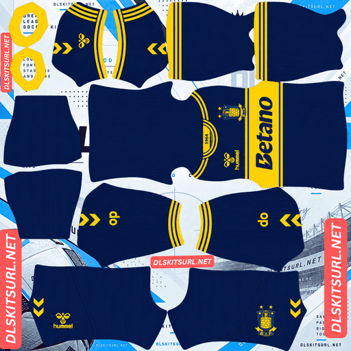
Released on 28 July 2026, the away has a retro-inspired design built around a predominantly navy shirt, a striking yellow horizontal chest band, and a Betano sponsor in navy inside that band. It is completed by navy shorts and socks and made by Hummel.
The colours are never in doubt
Yellow against navy is close to maximum contrast.
Yellow is one of the brightest colours available, while navy gives it a dark background. The result is a band that remains clearly visible even after the image is reduced to 512×512.
So the colour reproduction is not the difficult part.
But the band is demanding geometry
The problem is where the band has to go.
A horizontal band needs to meet at both side seams and both sleeve junctions, while also maintaining the same upper and lower edges. That gives you six alignment points to watch.
The failure is obvious when it happens. Horizontal lines create a very strong expectation of continuity, so even a small height difference becomes visible when the sleeve meets the body.
Import the file and inspect it from the side.
Does the yellow band remain at exactly the same height? Is its thickness consistent around the shirt? Does the edge continue cleanly through each seam?
Boca Juniors’ yellow chest band, Olimpia’s black franja, St. Gallen’s green band and Sion’s 25-26 third have the same geometric problem.
And your badge lands on all of it
DLS places your imported crest on the chest, regardless of what the original shirt had in that position.
On Brøndby’s away, that means the badge sits directly on the yellow band and can also cover part or all of the Betano sponsor inside it.
Three elements are therefore competing for one area:
The yellow band survives, because it continues on either side of the badge.
The navy Betano sponsor can be covered, because it is concentrated in the centre.
Your imported crest sits on top.
This is actually the better possible outcome for a chest feature. A continuous band survives around the badge, while the self-contained sponsor is the part that disappears.
Lugano’s V, Vélez’s chevron and similar continuous shapes behave the same way. Alianza FC’s gothic A and Ghana’s Black Star are more vulnerable because their important shapes are concentrated in the centre.
So if the Betano logo disappears, do not treat that as a bad PNG. It is a consequence of how DLS layers the imported badge.
Visibility
The navy base separates from grass without blending into it, but it is still a dark colour with little brightness of its own.
The yellow band solves that problem.
It creates a strong horizontal break across the dark shirt, making the player’s silhouette much easier to read than a completely navy strip.
For the away, white numbers are the safest choice. They add another bright element to an otherwise dark kit.
The home
Brøndby’s 26-27 home was launched on 9 July 2026 through the club shop under the line “Once Brøndby, always Brøndby.”
Compare the file directly with the card above rather than relying on another site’s description.
The normal checks are:
Colour boundaries should be sharp rather than smeared.
Hummel chevrons should remain distinct shapes.
The crest and Betano sponsor should be crisp.
The dimensions should be confirmed.
On a computer, right-click the image and open it in a new tab so the browser can report its actual size.
The chevrons are your quality gauge
Hummel’s signature chevron trim runs down the sleeves and shoulders as small repeating shapes.
That is the most sensitive element on a Hummel shirt.
The shapes are narrow, repeated and high-contrast, so compression damage becomes visible there much sooner than on the large areas of yellow or navy.
Use the chevrons as your quality test on every Brøndby file.
Odense Boldklub, AC Horsens, Esbjerg, Le Havre and Bournemouth provide the same Hummel comparison.
And yellow is an excellent base
Yellow sits a long way from pitch green, so the home starts with one of the strongest possible visibility advantages.
With navy providing the secondary colour, the shirt also has strong internal contrast.
The home should therefore be the easiest Brøndby kit to read during a match.
Use navy or black numbers on the yellow home. Avoid white, which does not separate strongly enough from the yellow.
The women’s kits are different, and both lose their striping
This is worth checking because Brøndby have separate men’s and women’s designs, and files can easily be labelled too generally.
The women’s 26-27 home uses a pastel yellow base with dark navy accents, subtle diagonal shadow striping across the torso, navy side inserts and Hummel chevrons on the shoulders.
The women’s 26-27 away is dark navy with subtle tonal vertical striping, a polo collar and yellow edging on the cuffs. The design references more than five decades of women’s football at the club since 1971.
“Shadow” and “tonal” both mean the same thing here
A shadow stripe is essentially a tonal stripe: the same base colour appears in a slightly different shade to create depth.
That gives compression very little to preserve.
Do not expect those stripes to survive clearly at 512×512.
Bayern’s tonal pinstripes, Servette’s garnet home, Cagliari’s tone-on-tone graphic and Odense’s chequered third all demonstrate the same limitation.
But the yellow tipping survives
A narrow element only disappears when its contrast is also weak.
Yellow against dark navy has strong contrast, so the yellow cuff tipping on the women’s away should remain visible.
It may look thinner than it does on the physical shirt, but it has enough separation to survive.
That is the better quality test on this version because the tonal striping cannot tell you much.
And check which version you have
A file called “Brøndby 26-27 home” could refer to either the men’s or women’s shirt.
The distinction is obvious once you look at the design: the women’s home uses a pastel yellow base, unlike the men’s version.
Check the card before importing.
Monterrey, FC Juárez, Pachuca, Young Boys and FC Copenhagen also have women’s variants this season, while Alianza FC uses one collection across both teams.
Which Brøndby kit survives best?
The men’s home has the strongest combination of visibility and straightforward colour reproduction.
The men’s away also works well, although its chest band needs a proper seam check and the imported badge can cover the Betano sponsor.
The women’s shirts lose their tonal striping, but their yellow and navy bases remain readable.
Brøndby have unusual extras this season
There are two additional designs worth knowing about, and neither is a normal match kit.
A retro shirt that was never meant for the pitch
Brøndby and Hummel released a limited-edition retro shirt for 26-27 as a lifestyle and collector’s piece rather than an official match kit.
That creates a different availability problem.
A shirt that was never worn in matches generates no action photography, broadcast stills or matchday images. You are largely dependent on launch photographs and owner-uploaded images.
That makes it even harder to find than a never-sold playing shirt.
DLS will still accept any working 512×512 URL, regardless of what the garment was originally designed for, so it is a legitimate option.
Expect very few files, though.
A blackout pre-match shirt
Hummel also released a blackout pre-match shirt for the 26-27 season.
From a file perspective, this is easy.
Plain black has almost nothing to lose.
The problem comes on the pitch. An all-black strip becomes one dark shape at match distance, with very little internal separation.
If you use it, white numbers give the shirt its strongest possible visual break.
And a chocolate brown third last season
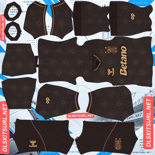
Brøndby’s 25-26 third was chocolate brown.
Brown is a difficult base for DLS: it is dark, muted and relatively unsaturated. It can separate from the pitch, but it does not create the bright silhouette that yellow or white does.
That means any contrasting elements have to do most of the work.
Platense’s brown and white pinstripes provide a useful comparison because the white rescues the darker base. A plain brown shirt has no such advantage.
How to tell if a Brøndby file is current
Four checks make the identification straightforward:
Hummel branding with Betano as sponsor. Hummel have supplied Brøndby for decades, so this confirms the club but does not date the shirt on its own.
The men’s away should be navy with a yellow horizontal chest band, with the sponsor positioned inside it.
Check whether the file is men’s or women’s, since the two collections are different.
A chocolate brown shirt belongs to 25-26, not the current range.
Brøndby are therefore harder to date than clubs with a recent supplier change. The design itself is doing most of the dating work.
Odense, Horsens, Sion and Nordsjælland face the same issue.
A note on the Danish season
The Danish Superliga runs across two calendar years, so Brøndby’s current kits are labelled 26-27.
A file labelled simply “2026” could refer to either the 25-26 or 26-27 collection.
When the filename and design disagree, trust the design.
How to use a Brøndby DLS kits URL
Copy the URL using the button on the kit card, not from your browser address bar. The browser address usually leads to the webpage rather than the direct image.
In Dream League Soccer, go to My Club → Customise → Kit. Do not choose Logo; that is handled separately.
Select your slot before pasting because the selected slot is the one that gets replaced.
Press and hold the URL field, tap Paste, then choose Confirm. Older builds may call this button Download.
With the home and away occupying two outfield slots, the third slot is available for another option. The retro shirt, blackout pre-match shirt or 25-26 brown third can all fill it if you have working files.
Set the shorts and socks deliberately as well. DLS handles the shirt, shorts and socks separately, so the default combination may not match the intended kit.
The first custom kit requires a one-time gem unlock. After that, changing custom kits costs nothing.
Test the link first
Open the URL in your browser before importing it.
The image should fill the screen on its own, and the address should end in .png.
If you see a webpage with headers, buttons or other surrounding content, you have a viewer page rather than the direct image DLS needs.
Use the Hummel chevrons as your general file test.
For the away, do not judge the file by the Betano sponsor alone. The imported badge sits over that chest area regardless of how good the original PNG is.
Instead, check the yellow band edges and their position across the seams.
Why do Brøndby kit URLs stop working?
Three common problems account for most dead links.
Free image hosts delete files. Old uploads can be cleared after months or years while the original page continues to exist. Brøndby are one of Denmark’s best-supported clubs, so current files are relatively plentiful, but the limited retro shirt is the obvious high-risk option because it was never a match kit.
Hotlink protection can also be enabled. Your browser may display the image because it is being requested through the host’s own site, while DLS sends a direct request that the server refuses.
That is why a URL can work when you click it but fail when you paste it into the game.
The preview and copied URL can also be different files. A page might display a thumbnail from one location while the copy button points to another, leaving the preview intact after the direct file has disappeared.
Here, the shirt displayed on the card and the copied URL are the same file on the same server.
The Brøndby badge
Set the crest in the same session, but choose Logo instead of Kit.
Brøndby’s badge uses the club’s yellow and blue, with the B monogram and 1964 founding year.
The monogram is particularly well suited to DLS because its main shape is bold and uncomplicated.
The four-digit year is the weaker detail. Small numerals soften quickly, so use a genuine 512×512 badge file rather than an enlarged source.
Yellow against blue provides strong contrast and keeps the crest readable.
DLS crops imported badges into a circle, so leave clear space around the entire design rather than trimming the file tightly.
The badge is especially important on the away because it sits directly on the yellow chest band and can cover the Betano sponsor underneath.
Keeping your Brøndby kits
Custom kits are stored on your device rather than in your account.
Updating the game usually leaves them intact, but reinstalling the game or changing phones can remove the custom kits and badge.
Because Brøndby have separate men’s and women’s designs for 26-27, record which version each URL represents.
Save all four working links in a notes app before you start rather than relying on the game to preserve them.
FAQ FOR RANK MATH
What is a Brøndby DLS kits URL?
A direct link to a 512×512 PNG Brøndby shirt that you paste into Dream League Soccer’s kit screen. A working direct image link ends in .png.
Will the Betano logo on the away kit show up?
It may be partly or completely covered. The sponsor sits inside the yellow chest band, exactly where DLS places your imported crest. The band survives around the badge because it continues across the shirt, while the central sponsor is more vulnerable.
Does the yellow chest band survive?
Yes, provided the file is correctly constructed. Yellow against navy has very strong contrast. The important check is its geometry: import the shirt and make sure the band stays at the same height and thickness across the body and sleeve seams.
Why don’t the women’s kits’ stripes reproduce properly?
Both rely on tonal striping. The women’s home uses shadow striping, while the away uses tonal vertical striping. Because those effects are based on subtle shade differences rather than strong colour boundaries, much of the detail disappears at 512×512.
How do I check any Hummel file?
Use the chevrons. They are small, repeated and high-contrast, making them much more sensitive to weak resolution or compression than the large areas of yellow and navy.
What number colour should I use?
Use navy or black on the yellow home and white on the navy away. Avoid white on yellow because the contrast is too weak.
Can I use the Brøndby retro shirt in DLS?
Yes. DLS accepts any working 512×512 PNG URL, regardless of whether the original garment was made for matches. The problem is availability: the retro shirt was a collector’s/lifestyle piece rather than a match kit, so there is very little match photography or file coverage.
Was the 25-26 Brøndby third really brown?
Yes, it was chocolate brown. Brown is a relatively poor DLS base because it is dark and muted. Strong contrasting details can rescue it, but a plain brown shirt will not have the visibility of Brøndby’s yellow or white designs.