
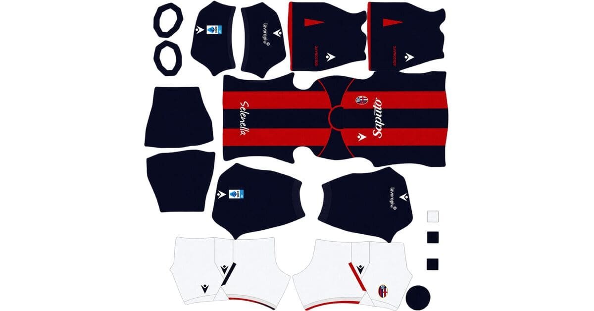
A Bologna DLS kits URL is a direct link to a 512×512 PNG Bologna shirt you paste into Dream League Soccer. All four slots are below, with each file loaded into the game before it went on this page.
Bologna FC Logo
Official Logo 512×512 (2026/27)
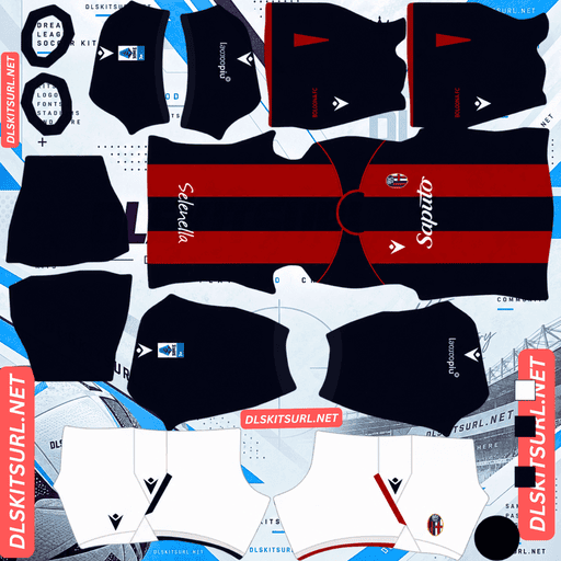
Bologna FC Home Kit
Home Kit 512×512 (2026/27)
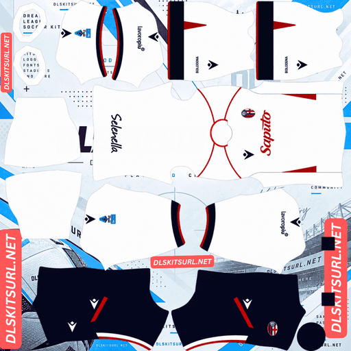
Bologna FC Away Kit
Away Kit 512×512 (2026/27)
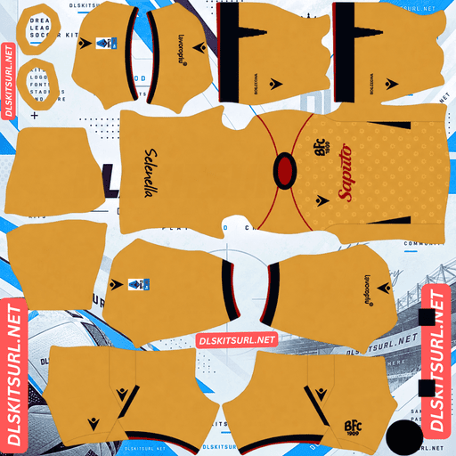
Bologna FC Third Kit
Third Kit 512×512 (2026/27)

Bologna FC GK Home Kit
GK Home Kit 512×512 (2026/27)
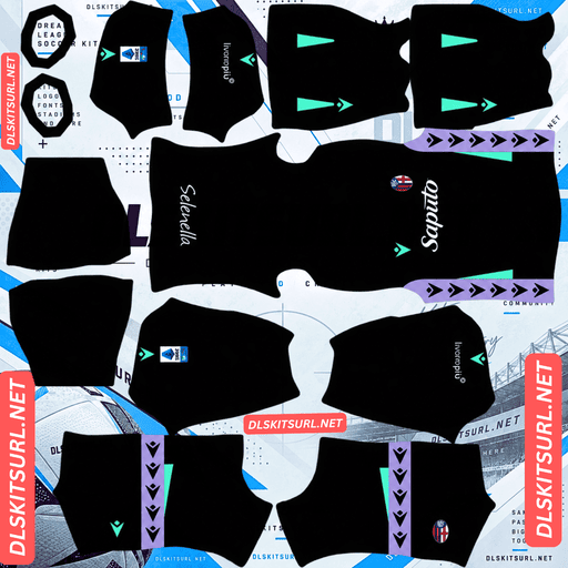
Bologna FC GK Away Kit
GK Away Kit 512×512 (2026/27)
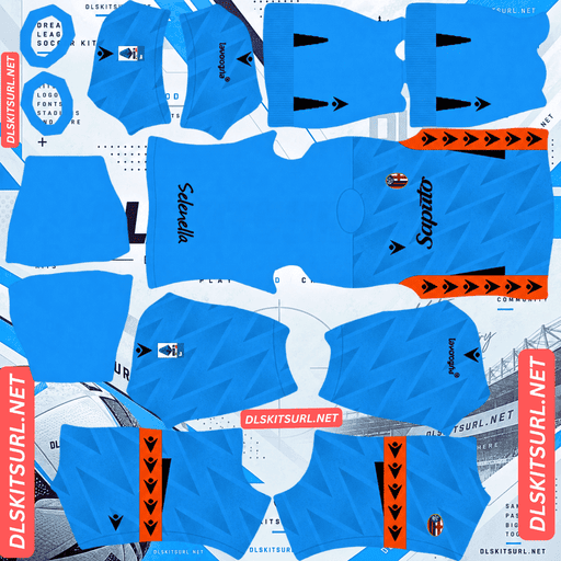
Bologna FC GK Third Kit
GK Third Kit 512×512 (2026/27)
The third kit creates a problem this site has not run into before: the game adds something the designers deliberately left out.
The third kit has no crest, and the game adds one
Released on 15 October 2026 to mark the 100th anniversary of the Renato Dall’Ara Stadium, the third is built around an elegant gold base with Bologna’s traditional rossoblù. It has a dark blue crew-neck collar, matching cuffs, blue side inserts and thin red trim, finished with gold shorts and socks.
Instead of the club crest, the chest carries a stylised retro “BFC 1909” wordmark in navy on the left, mirroring the navy Macron logo on the right.
Which inverts every badge note on this site
Almost every badge warning here is about subtraction: a crest covering a sash, the vertex of a chevron, a centenary graphic or some other important central detail.
This is the opposite.
The shirt was designed without a crest, but Dream League Soccer still draws your imported badge on the chest. The game therefore puts back the exact thing the designers removed.
What you can do
There is no way to run without a badge. The game requires one, and it goes in that position.
You have three options, and none is perfect.
Use the standard Bologna crest. The shirt then reads like a normal Bologna kit rather than the wordmark-based design. It is the simplest choice, and probably what most players will use.
Use a “BFC 1909” wordmark as your logo. If you can find or make one at 512×512, the badge will match the shirt’s own typography instead of contradicting it. This is the closest you can get to the real design.
Use a minimal or near-blank logo. This keeps the chest visually clear, but your club then has no visible crest elsewhere in the game — including the scoreboard, menus and team sheet. That is a high price to pay for getting one kit closer to the original.
The second option is the one worth the effort. It is unusual for this site to recommend a non-crest badge at all, but this shirt is an unusual case.
And the wordmark itself will be covered either way
The “BFC 1909” mark sits on the left chest, exactly where Dream League Soccer places the imported badge.
So whichever option you choose, the shirt’s own wordmark disappears.
You are replacing it, not revealing it.
But the gold base is the best thing here
Gold normally gets its metallic appearance from a gradient, and that effect cannot survive as intended in a flat 512×512 image.
How much that matters depends on how much of the shirt uses gold.
Gold as a full base becomes flat yellow-gold, but still reads correctly.
Gold in logos or a crest becomes flat as well, although it remains legible.
Gold used for thin trim or piping can effectively disappear.
Gold as a full base is therefore the one application where losing the metallic finish barely hurts. Flat yellow-gold is still a strong, obvious shirt colour.
Boca Juniors’ third and Rayo Vallecano’s third work in much the same way. Al-Nassr’s gold trim and Al-Ittihad’s gold piping are much less forgiving because there is far less colour to preserve.
And it plays extremely well
Dream League Soccer renders players small, so visibility depends heavily on how far the shirt colour sits from the grass.
A gold-yellow base sits further from pitch green than almost any colour.
The navy collar, cuffs and side inserts also provide internal contrast, stopping the shirt from becoming one uninterrupted block of yellow-gold.
This is comfortably the most readable Bologna kit.
Use navy numbers on the third.
The thin red trim will not survive
Thin trim is the narrowest application there is, and red against gold is only a moderate pairing.
Expect the red to be reduced to a line or disappear altogether.
The blue side inserts are a different matter. They are broad panels in a contrasting colour, so they should survive comfortably. They are also your most useful quality check on this shirt.
Confirm the dimensions as well. On a computer, right-click the image and open it in a new tab; your browser will report the actual size.
The home marks the stadium centenary
Released in spring 2026, the home carries Bologna’s rossoblù identity while marking the 100th anniversary of the Renato Dall’Ara Stadium. Its design draws on the Torre di Maratona, the landmark tower at the ground.
Red and blue is a moderate pairing
Bologna’s vertical stripes align in one place on the kit template, down the centre line of the body. That makes this one of the more forgiving stripe geometries.
The harder issue is contrast.
Red against blue is not maximum contrast. Both are saturated mid-to-dark colours and sit closer together in value than combinations such as red and white or blue and yellow.
With a genuine 512×512 file, the two colours separate properly. With an upscaled file, they can merge toward one dark mass.
For comparison:
Black on white, as on Angers and Juventus, gives maximum contrast.
Red on white, as on Argentinos, is also maximum.
Navy on white, as on Boca’s away, is strong.
Red on blue, as on Bologna’s home, is moderate and needs a good file.
Blue on black, as on Inter, is among the lowest-contrast combinations.
This is therefore a Bologna kit where resolution genuinely matters, unlike many other striped shirts.
Barcelona and Crystal Palace supporters face the same basic red-and-blue pairing problem.
And the tower motif needs checking
A landmark tower rendered on a shirt can survive in two very different ways.
If it is a bold graphic in a contrasting colour, it survives.
If it is worked tonally or built from fine architectural line work, it is likely to disappear.
Open the home at full size and inspect the body. If the design is clearly visible on the flat image, it has a much better chance of carrying into the game.
LAFC’s art deco survives because it is gold on black. Portland’s arches disappear because they are pale on pale.
Contrast decides it, not the subject.
Visibility
Red sits relatively close to green’s opposite, while blue separates cleanly, so the overall silhouette reads well against the pitch.
The weaker part is the internal contrast between the two club colours. At distance, the shirt can therefore read more as a dark red-blue shape than as clearly separated stripes.
Use white numbers on the home. The stripes continue across the back, so either club colour would disappear into part of the design.
The away is deliberately minimal
Released in summer 2026 and widely described as clean and understated, the away is Macron’s contribution to football’s minimalist design trend while marking 25 years of their partnership with Bologna.
Which creates the cannot-test problem
A minimal shirt has almost nothing to lose.
There is no texture, gradient or intricate pattern waiting to disappear.
That means almost any file you find will arrive looking correct — and a weak file can look just as convincing as a good one.
Judge the away by the collar, cuffs, crest and Macron branding, then confirm the dimensions. The design itself will not give you much evidence.
Monza’s home, Lecce’s stripes, Inter Miami’s black away and Huracán’s away sit in similar territory.
And minimalism concentrates the design where the game is weakest
This is worth remembering beyond Bologna.
A minimal kit puts much of its identity into trim: collars, cuffs and piping.
Those are among the smallest zones on the kit template, and they are therefore the first parts to compress.
A clean shirt can consequently arrive cleaner than intended.
Monza and Paris FC face sharper versions of the same problem, where the collar carries much of the design.
Which Bologna kit survives best?
Home — Rossoblù stripes: The design needs a genuine 512×512 file because red and blue can merge when the image has been enlarged or softened. In play, it is good.
Away — Minimal: The design reproduces almost perfectly because there is so little detail to lose. That also means the file itself is difficult to judge, so compare it carefully with the card.
Third — Gold with navy: The gold base and broad blue inserts survive well, while the thin red trim does not. In play, this is the best of the range.
How to tell if a Bologna file is current
Four checks will settle it.
Macron branding: Macron have supplied Bologna for 25 years, so this alone will not date a file.
The third should be gold: It should carry the “BFC 1909” wordmark rather than the club crest.
The home should contain the Dall’Ara centenary elements.
Compare against the cards above: Bologna’s rossoblù home can look broadly similar from one season to another.
Point two is the most reliable. A Bologna shirt with no crest on the chest is unmistakably this season’s third.
There is one important caution. An earlier leak described the third as sand and beige with a tonal pattern. The released version is gold. If a file looks noticeably paler than the card above, it may come from that early leak rather than the finished shirt.
How to use a Bologna DLS kits URL
Copy the link using the button on the card rather than from your browser’s address bar. The address bar usually gives you the page instead of the actual image.
In Dream League Soccer, open My Club, then Customise, and enter the Kit section. Do not choose Logo; that is a separate system.
Select your slot before pasting because whatever slot is currently selected is the one that gets replaced. Press and hold the field, tap Paste, then Confirm. Older builds may label that button Download.
The three outfield kits fill the three outfield slots exactly, leaving the goalkeeper slot available.
Decide on your badge before starting. The third’s crestless design makes that choice unusually important for Bologna.
The first custom kit requires a one-time gem unlock. After that, changing kits costs nothing.
Test the link first
Open the link in your browser before entering the game.
The image should fill the screen on its own, and the address should end in .png.
If you see a webpage with headers, buttons or other content surrounding the picture, you are looking at a viewer page rather than the direct image. Dream League Soccer cannot read that page as a kit file.
For the home, confirming the dimensions matters more than usual because the red and blue stripes need a genuine 512×512 file to stay properly separated.
For the away, the visual test is much less useful. A minimal shirt can look correct at almost any resolution.
Why do Bologna kit URLs stop working?
Three things commonly break kit links, and only one is obvious.
Free image hosts delete files. Unused uploads can be cleared after months or years, while the old link remains looking valid but returns nothing. Bologna sits in the middle of Serie A for coverage: there are fewer options than for the Milan and Rome clubs, but more than for Lecce or Monza. The gold third also drew unusual attention, which helps.
Hotlink protection gets switched on. This blocks requests that do not come from the host’s own site. Your browser can therefore load the image while Dream League Soccer’s request is refused. That is why a link can work when you click it but fail when you paste it into the game.
The preview and the direct file are different. Some pages display a thumbnail from their own server while giving you a URL pointing somewhere else. The page can continue rendering perfectly even after the direct file has disappeared.
Here, the shirt you see and the link you copy are the same file on the same server.
The Bologna badge
Set the crest during the same setup session, using the same menu but choosing Logo instead of Kit.
This matters more here than on almost any other club covered because the third kit was deliberately designed without a crest.
For the home and away, Bologna’s crest is a shield carrying the club’s rossoblù colours and the BFC monogram.
Dream League Soccer crops every badge into a circle. A shield naturally narrows toward its base, so use a file with clear space around the entire design rather than one trimmed tightly against the artwork.
For the third, consider a “BFC 1909” wordmark at 512×512 instead, as explained above. It matches the shirt’s own typography and is the closest the game allows you to get to the original design.
Lettering also softens at the size the game renders a badge, so a wordmark needs a genuine 512×512 source more than a conventional crest does.
Keeping your Bologna kits
Custom kits are stored on your device rather than in your account. Updating the game usually keeps them, but reinstalling the game or changing phones does not — and the badge goes with them.
If you track down a BFC 1909 wordmark logo, record that link alongside the kit links. It is the hardest part of this set to replace.
Paste all four kit links into a notes app before you start.
FAQ FOR RANK MATH
What is a Bologna DLS kits URL?
A Bologna DLS kits URL is a direct link to a 512×512 PNG Bologna shirt that you paste into Dream League Soccer’s kit screen. A working direct image link ends in .png.
Why does the third kit have no crest?
Because Macron replaced the normal club crest with a stylised retro “BFC 1909” wordmark on the left chest, mirroring the Macron logo on the right. The absence of the crest is deliberate and specific to this kit.
Can I reproduce that in DLS?
Not exactly. Dream League Soccer always draws your imported badge on the chest, so it adds a crest that the designers removed. Using a “BFC 1909” wordmark as your logo file is the closest reproduction possible.
Could I use a blank logo instead?
You can, but the cost is high. Your club then has no visible crest anywhere else in the game, including the scoreboard and menus. That is a lot to give up for one kit.
Does the gold base work in DLS?
Very well. Gold used across the whole shirt becomes flat yellow-gold, but that remains a strong and highly visible colour. It also sits further from pitch green than almost anything. The thin red trim, however, is unlikely to survive.
Why does the home kit need a good file?
Because red against blue is a moderate pairing rather than a strong one. Both are saturated mid-to-dark colours, so an upscaled or softened file can make the stripes merge toward one dark mass.
How do I check the away kit?
Check the collar, cuffs, Macron branding and dimensions. A minimal shirt has very little detail to lose, which also means it gives you very little visual evidence for judging the quality of the file.
Is the third kit gold or beige?
Gold. An early leak described a sand-and-beige version with a tonal pattern, but the released shirt is gold. If a file looks noticeably paler than the card above, it may come from that early leak rather than the finished kit.