
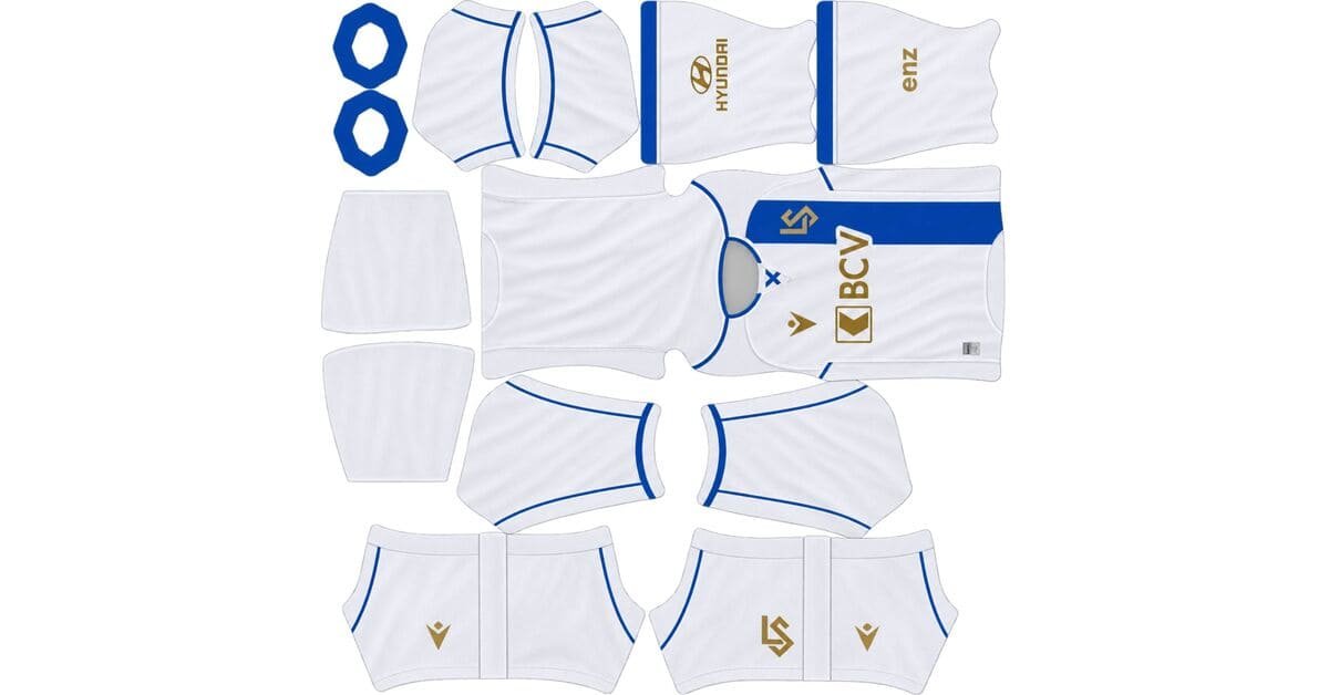
A Lausanne-Sport DLS kits URL is a direct link to a 512×512 PNG Lausanne shirt you paste into Dream League Soccer. All four slots are below, with each file loaded into the game before it was added to this page.

Lausanne Sport Logo
Official Logo 512×512 (2026/27)
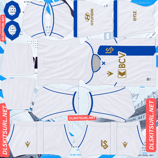
Lausanne Sport Home Kit
Home Kit 512×512 (2026/27)

Lausanne Sport Away Kit
Away Kit 512×512 (2026/27)
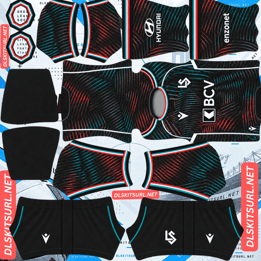
Lausanne Sport Third Kit
Third Kit 512×512 (2026/27)
The club’s 130th-anniversary range contains one of the hardest things to test in DLS: a broad hooped shirt whose colours are easy to reproduce but whose geometry becomes difficult the moment those hoops cross onto the sleeves.
Hoops across the sleeves are the hard case
Macron’s 130th-anniversary shirt, released as an extremely limited edition, uses broad alternating blue and white horizontal hoops across both the body and sleeves, finished with a crew-neck collar.
The colours are never in doubt
Blue against white is maximum contrast.
The hoops are also broad enough to sit comfortably above the resolution limit that causes thin stripes and fine patterns to disappear.
So the bands themselves are not the problem. A good file and a mediocre file can both make the colours look correct.
The real test comes from what happens when those bands have to cross the shirt construction.
Hoops are demanding geometry
A horizontal band has to maintain its height as it crosses the shirt.
There are two side seams and two sleeve junctions, while every band also has an upper and lower edge. That gives each hoop a surprisingly large number of alignment points.
Vertical stripes are much more forgiving because they largely run in one direction. A single chest band is more demanding. A full hooped shirt repeats the alignment problem over and over.
And Lausanne adds another difficulty: the hoops continue onto the sleeves.
The sleeves are where the error appears
Most hooped shirts stop the horizontal bands at the shoulder. The body carries the pattern while the sleeves remain plain or use separate trim.
Lausanne’s hoops cross the body-to-sleeve junction.
That is one of the hardest joins on the DLS template. The body and sleeve meet at an angle, the sleeve wraps around the player’s arm, and a horizontal line crossing both surfaces has to maintain its position despite that change.
So a hoop can look perfectly placed across the chest and still step upward or downward when it reaches the sleeve.
Horizontal lines make that error particularly obvious because the eye expects them to continue uninterrupted.
Check the shoulders, not the chest
This is the important test.
Import the kit and look at the player from the side.
Do the blue and white bands continue at the same height from the body onto the sleeve, or do they jump at the seam?
That is something a flat preview cannot tell you. A hooped shirt can look perfect as a laid-out PNG and still reveal an alignment problem once it is wrapped around the model.
FC Dallas, Sporting CP, Real Salt Lake and Young Boys all use banding this season, but Lausanne’s version is particularly demanding because the hoops explicitly continue onto the sleeves.
Visibility
Dream League Soccer renders players at a small scale, so the base colours matter too.
White is the brightest base available, while blue separates cleanly from the pitch.
The alternating colours also keep internal contrast running across the whole shirt. That makes the hooped anniversary shirt one of the most readable designs in the range.
Use navy or red numbers.
The hoops continue across the back, so blue and white numbers would each disappear into part of the pattern. A third colour gives the number a consistent contrast level.
The limited release matters
“Extremely limited” is more than a marketing description when you are looking for a DLS file.
A shirt produced in small numbers generates relatively little photography outside the original launch material. Lausanne is also a mid-sized Swiss club, and the Swiss Super League produces less international kit coverage than the major European leagues.
If you want this shirt, preserve the working file when you find it.
Basel’s Carnival kit, Grasshoppers’ 200-shirt limited edition, FC Zürich’s 130th-anniversary kit and Unión de Santa Fe’s special fall into the same category.
There are two anniversary shirts
This is worth knowing before searching because the names overlap.
Lausanne’s 26-27 home is itself the 130th-anniversary shirt, drawing on the design worn in the 1962 Swiss Cup final.
The broad blue-and-white hooped shirt is a separate commemorative release.
The filename will not tell you which one you have
A file called “Lausanne 130 years” could refer to either design.
Compare the actual shirt with the cards:
Broad blue-and-white hoops with a crew neck — the limited commemorative shirt.
1962-inspired design — the league home.
Luzern creates a similar problem this season with two 125th-anniversary shirts, while Servette, New Zealand and Alianza Lima have other reasons for overlapping kit names.
The 1962 revival is easy for DLS to reproduce
Designs from that era were built around flat colours and straightforward shapes.
There are no gradients, dense sublimated textures or tonal effects that need to survive downscaling.
The home should therefore reproduce cleanly.
The commemorative reference itself is another matter. If the anniversary marking sits on the chest, your imported badge can cover it. If it is on the upper back or neck, that is also where DLS renders the squad number. A hem marking becomes tiny, while an inscription inside the collar is outside the mapped surface.
So the historical design can survive while the small anniversary wording disappears.
Boca’s 06-07 revival, Schalke’s 1980s Trefoil away, Tolima’s Racing tribute and Auxerre’s double-winning homage have the same advantage: simple shapes survive, while tiny commemorative text does not.
The away is Lake Geneva blue
Released as “Les Gardiens” — The Guardians — the away honours the people who cultivate and preserve the Lavaux terraced vineyards.
Its vibrant blue base draws from the colour of Lake Geneva as seen from the hillside.
The base colour is excellent
Vibrant blue is bright, saturated and well separated from pitch green.
It is much easier to read than a navy shirt and should appear as a distinct shape when the player is viewed from a distance.
So the base colour is not the concern.
The vineyard treatment decides what survives
Terraced vineyards are naturally represented by lines following a hillside.
If the shirt turns those terraces into fine, closely spaced contour lines, the pattern has the same problem as a topographic map: too much information packed into too few pixels.
That is exactly the warning from FC Zürich’s away.
There are three possibilities:
Bold graphic terraces in a contrasting colour: likely to survive in simplified form.
Fine tonal contour lines: likely to disappear.
The vineyard used only as a design theme: nothing significant to lose.
Open the away file at full size and see how literal the vineyard treatment is.
Alavés’ Rioja Alavesa vineyard away explores similar territory, while Zürich’s topographic contours show what happens when the detail becomes too fine.
Use white or navy numbers on the away.
The third is “Lausanne après minuit”
The third completes the range with Lausanne After Midnight, playing directly on the club’s nickname, Les Seigneurs de la Nuit — the Lords of the Night.
A night theme usually means a dark base
Night-themed shirts tend to use navy, black or deep purple.
That creates an immediate visibility penalty. A dark shirt can become one large mass at match distance, leaving the accents to provide almost all of the internal separation.
Bright accents can rescue that kind of design. Tonal accents generally cannot.
Zamalek’s fluorescent detailing works. Alavés’ pastel pink works. Inter Miami’s anthracite-on-black approach struggles, as does Dortmund’s tonal treatment.
So inspect the accents rather than judging the third only by its base colour.
Night graphics can disappear twice
A city-at-night concept often uses scattered lights, small skyline details or subtle gradients.
All three are difficult at 512×512.
Scattered lights are essentially tiny dots, which are among the first details to merge during downscaling.
A gradient from one dark shade to another has very little tonal range to begin with, and the dark base makes the difference even harder to see.
Check the actual source image before assuming the night concept survives the import.
Use white numbers on the third. On a dark shirt, the number is one of the strongest bright elements you can add.
Which Lausanne kit survives best?
Home: The 1962-inspired design uses the flat colours and simple construction that 512×512 handles well. It should reproduce strongly and play well.
Away: The vibrant Lake Geneva blue gives it the best base colour for visibility. The vineyard treatment is the variable: bold graphics should survive, while fine contour work may disappear.
Third: The night theme needs to be judged by its accents. Bright details can rescue it; tonal details and tiny lights are likely to fade.
Anniversary: The broad blue-and-white hoops are extremely readable, but the sleeve alignment makes this the most important kit to inspect in-game after import.
Lausanne produce a lot of kits
This matters when searching because Lausanne have used more kit variations than the simple home/away/third labels suggest.
In 25-26, the club released a home, away, third, fourth and a separate Conference League home shirt.
For 26-27, there is a home, away, third and limited anniversary kit.
Slot labels become unreliable
When a club has five shirts in a season, “away” and “third” stop being reliable identifiers.
Different kit sites may assign the same design different slot names.
Compare the actual shirt against the cards above rather than trusting the label.
European variants create another trap
The Conference League shirt is a separate design used specifically for that competition.
That means a file labelled “Lausanne 25-26 home” could refer to the domestic home or the European version.
Basel’s makeshift Europa League kit and Union Saint-Gilloise’s separate European home and away create the same problem.
How to tell if a Lausanne file is current
Four checks make the current range easier to identify:
Macron branding — Macron has supplied Lausanne for several seasons, so the manufacturer alone does not date the file.
The home should use the 1962-inspired design and carry the 130-year anniversary theme.
The away should use the vibrant Lake Geneva blue and the Lavaux vineyard concept.
The broad blue-and-white hooped shirt is the separate limited anniversary release, not the league home.
Point four matters most. Both shirts can be described as anniversary kits, but their designs are completely different.
How to use a Lausanne-Sport DLS kits URL
Copy the link with the button on the kit card, not from your browser address bar. The browser address usually points to the page containing the image rather than the direct PNG.
In Dream League Soccer, open My Club → Customise → Kit. Do not use Logo; that is a separate system.
Select the slot before pasting. Press and hold the field, tap Paste, then choose Confirm. Older builds may call that button Download.
There are three outfield slots, while Lausanne currently has four shirts to choose from.
If you want the most readable option, the broad blue-and-white anniversary shirt is a strong choice. The night third is the one most dependent on its accent colours.
The first custom kit requires a one-time gem unlock. After that, changing kits costs nothing.
Test the link first
Open the URL in your browser before importing it.
The image should fill the screen on its own, and the address should end in .png.
If the page contains headers, buttons or other website elements around the shirt, you have a viewer page rather than a direct image.
For the hooped anniversary shirt, the browser test is not enough. Broad blue-and-white bands can look correct at almost any resolution.
Import the kit and inspect the shoulders. That is where you find out whether the hoops actually continue across the sleeve junction.
For the away and third, inspect the artwork at full size first. In both cases, the amount of detail in the source design determines how much of the concept survives.
Why do Lausanne kit URLs stop working?
Three problems account for most broken kit links.
Free image hosts delete files. Older uploads can be removed after months or years even though the URL remains published. Lausanne is a mid-sized Swiss club, and the Swiss Super League produces less international upload volume than Europe’s major leagues.
The extremely limited anniversary shirt is the highest-risk file, with Conference League variants also likely to be harder to replace.
Hotlink protection can also be enabled. A host may allow the image to load from its own website while refusing requests coming from DLS. That is why a URL can work in your browser but fail when pasted into the game.
The preview and direct file can be different. A page may show a locally hosted thumbnail while its copy button points to another file or server. The preview can remain online after the direct image has disappeared.
Here, the shirt shown on the card and the URL you copy are the same file on the same server.
The Lausanne-Sport badge
Set the crest separately through My Club → Customise → Logo.
Lausanne’s crest uses the club’s blue and white, with the city’s heraldic elements and the 1896 founding year.
DLS crops every imported badge into a circle, so leave clear space around the complete artwork instead of trimming the file tightly.
The four-digit year is the vulnerable detail. Small numerals soften quickly when the badge is rendered at DLS size.
Use a genuine 512×512 badge file, preferably one with enough surrounding space for the circular crop.
Blue against white provides excellent contrast, so the main crest should remain clear even though the small year may soften.
You may also encounter a 130th-anniversary crest version. If you use it, remember that the imported badge is global: it applies to every kit rather than only the anniversary shirt.
Houston Dynamo’s Archive Kit and Rosario Central’s retro-crest third create the same trade-off.
Keeping your Lausanne kits
Custom kits are stored on your device rather than your account.
Updating the game usually leaves them in place, but reinstalling the game or changing phones can remove the imported kits and badge.
Lausanne have enough variations to make filenames confusing: two anniversary shirts, four current designs and European variants in recent seasons.
Save all four working URLs somewhere outside the game and label them by actual design before importing.
FAQ FOR RANK MATH
What is a Lausanne-Sport DLS kits URL?
A direct link to a 512×512 PNG Lausanne shirt that you paste into Dream League Soccer’s kit screen. A working direct link ends in .png.
What should I check on the hooped anniversary kit?
Check the shoulders after importing. The broad hoops are easy to reproduce, but they cross the body-to-sleeve junction, which is the difficult join on the template. A band can sit correctly across the chest and still step when it reaches the sleeve.
Will the blue and white hoops survive?
Yes. Blue against white provides maximum contrast and the bands are broad, so resolution is not the main risk. The important issue is alignment across the sleeves.
Why are there two Lausanne anniversary shirts?
The 26-27 home is itself a 130th-anniversary design inspired by the 1962 Swiss Cup final shirt. The broad blue-and-white hooped shirt is a separate limited commemorative release.
Will the vineyard theme on the away survive?
It depends on how it is drawn. Bold graphic terracing in a contrasting colour can survive, while fine tonal contour lines behave like a topographic map and may disappear at 512×512.
Is the Lausanne après minuit third difficult to reproduce?
It can be. Dark night-themed shirts already have a visibility disadvantage, and scattered lights, fine skyline details or subtle dark gradients are all vulnerable to downscaling. Bright accents help; tonal ones do not.
What number colour should I use?
Use navy or red on the blue-and-white hooped anniversary shirt, white or navy on the vibrant blue away, and white on the dark third.
Why might the anniversary kit be hard to find?
It was released as an extremely limited edition, so there is likely to be far less photography and fewer preserved files than for a standard league shirt.