

A Newcastle Jets DLS kits URL is a direct link to a 512×512 PNG Jets shirt that you paste into Dream League Soccer. All four slots are below, with each file loaded into the game before it was added here.

Newcastle Jets Logo
Official Logo 512×512 (2026/27)
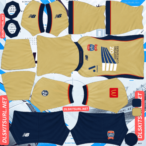
Newcastle Jets Home Kit
Home Kit 512×512 (2026/27)

Newcastle Jets Away Kit
Away Kit 512×512 (2026/27)
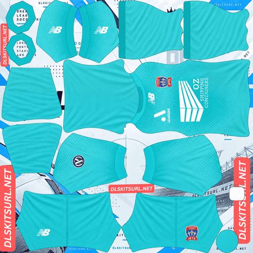
Newcastle Jets GK Home Kit
GK Home Kit 512×512 (2026/27)

Newcastle Jets Fodbold GK Away Kit
GK Away Kit 512×512 (2026/27)

Newcastle Jets GK Third kit
GK Third Kit 512×512 (2026/27)
The home kit loses its only real design feature in DLS, but that turns out to be an advantage: what remains is one of the most visible shirts in the A-League.
The wave texture is flagged three times over
Released on 2 October 2026 by New Balance, the home kit uses Newcastle’s traditional gold with an understated tonal wave texture woven into the fabric.
Each of those words is a problem
Woven means the effect comes from the arrangement of the fabric itself. A flat 512×512 PNG has no threads to reproduce, so there is nothing for the image to preserve.
Tonal is the second problem. The wave uses the same colour in a different shade, giving the image very little colour separation to work with.
Then there is understated. The design is deliberately subtle, which removes even more of the contrast that might otherwise help it survive.
Three separate problems lead to the same result.
Expect a plain gold shirt.
Viborg’s embossed tonal geometric pattern is the closest comparison this season, where both construction and contrast work against the design. Marseille’s woven chassis, Croatia’s woven away and Nacional’s jacquard map fail mainly because their texture depends on physical construction, while Bayern’s tonal pinstripes and Servette’s garnet home demonstrate the other problem: not enough contrast.
But gold is the best base colour available
DLS players are displayed relatively small, so shirt visibility depends heavily on how far the base colour separates from the pitch.
Gold and yellow are excellent here. They are bright, saturated and much easier to pick out against green than darker or similarly coloured shirts.
That makes Newcastle’s home a strange case: the entire wave texture disappears, yet the shirt itself becomes exceptionally readable.
That is a good trade. The amount of detail lost and the quality of the remaining base colour are separate issues. Brisbane Roar’s third makes the same point.
So what do you check?
There is no point judging the missing wave texture. It will not tell you whether the file is good or bad.
Instead, check the New Balance logo, crest, sponsor, collar and cuff trim. Those are the defined elements left on the shirt.
Also confirm the image dimensions. On a computer, open the image in a new tab and check the actual size reported by the browser.
Number colour
DLS takes number colours from the kit template rather than reading them from the shirt image. One swatch controls the shirt numbers and another controls the shorts.
For the gold home, navy or black is the better choice.
Avoid white. It has too little separation from gold and becomes much less useful once the players are viewed at match distance.
The ACLE kit is the rare cup variant worth finding
Newcastle released separate AFC Champions League Elite kits in July 2026, before the domestic range.
The ACLE home is predominantly gold but adds a navy panel across the upper chest and shoulders, separated by a thin red accent line. It uses a retro-inspired layout with gold shorts and socks.
Which changes the design, not just the badges
The usual rule with cup and continental variants is simple: first find out whether the actual shirt changes.
Many competition versions only add patches or alter the badge treatment. DLS replaces your crest with the badge you import, while small sleeve patches are generally too minor to matter in the game. A patches-only variant can therefore produce exactly the same result.
Newcastle’s ACLE shirt is different.
The navy shoulder panel and red accent line create a completely different layout from the plain gold league shirt.
That makes it one of the exceptions worth tracking down.
FC Thun, Basel, Adelaide United, Central Coast Mariners and Macarthur all have variants that are less useful under this test. Newcastle’s actually changes the shirt.
And it reproduces better than the league home
The navy panel follows the upper yoke, which is already a construction boundary in the kit template. That gives the colour change a natural place to fall.
Navy against gold also provides strong contrast, so the panel should remain sharply defined.
The thin red accent line is the real quality test. It is narrow, but red is genuinely different from both navy and gold, so it should survive at reduced size, even if it becomes slightly thinner than on the original shirt.
That line tells you more about the file than the missing wave texture ever could.
With a caution
A limited continental release will normally have fewer available files than a regular league kit.
If you want the ACLE version, save a working URL when you find one.
The away
Newcastle’s 26-27 away was released alongside the home and goalkeeper kits, completing the domestic rollout.
Rather than relying on a description from another page, compare the actual file with the kit card above. Then apply the normal checks:
Colour boundaries should be sharp rather than smeared.
Collar and cuff trim should have clean edges.
New Balance branding, crest and sponsor should remain crisp.
The file should be genuinely 512×512.
And watch for more weaving
If the home relies on woven tonal treatment, check whether the away uses a similar construction.
Open the image at full size. A graphic with clear colour boundaries can survive well; a texture that depends on fabric construction cannot.
Newcastle’s recent aways have been white
The 25-26 away was white with gold and red and was catalogued as a relatively plain design.
That combination works well for DLS. White provides a bright base, while gold and red create genuine colour differences rather than subtle tonal shifts.
So if the 26-27 away follows a similar approach, it should be a strong option.
Which Newcastle Jets kit survives best?
The home is gold with woven tonal waves, but the texture disappears completely. Its compensation is excellent match visibility.
The away needs to be judged from the actual card, especially for any woven or tonal treatment.
The ACLE home is the strongest design for DLS because its navy shoulder panel and red line are both defined by real colour contrast.
In other words, the league home is the best base colour, while the ACLE version gives you the most of the original design.
The 25-26 third was a gradient
The previous third is worth remembering because it was well received and behaves very differently from the 26-27 home.
Newcastle’s 25-26 third moved from navy through blue to sky blue, drawing on the coastline and marine landscape around the city.
Which is a resolution test rather than a contrast one
A gradient needs all of its intermediate shades to appear smoothly.
A genuine 512×512 file can preserve that transition. An undersized file tends to turn it into visible bands, with steps appearing where the original design should blend continuously.
That makes the gradient a useful quality test.
Heidenheim’s fading stripes, Houston’s sunset away, Elche’s black-to-green third and Venezia’s gradient away behave in the same general way.
And navy to sky blue is a wide range
The two ends of Newcastle’s gradient are far enough apart in value to remain distinct. It is therefore much less likely to disappear into itself than a subtle fade between nearby shades.
The sky-blue end also gives the shirt plenty of visibility.
It remains a perfectly usable third-slot option in DLS. The game does not care how old the design is as long as the URL works and the file is suitable.
Use white numbers on it.
New Balance are on a three-year deal
Newcastle announced a multi-year partnership with New Balance, together with Belgravia Sports Apparel.
Which dates a file within a window
A New Balance logo is a useful marker for the current Newcastle era.
Earlier kits carried other suppliers, including Viva during the late 2010s, so the manufacturer logo helps separate older files from the current range.
Use the sponsor as a second check. Emerald Horizon AG appeared on the 25-26 kits.
And New Balance is a middling case for reproduction
New Balance sit somewhere between the most construction-heavy premium designs and the more straightforward teamwear-style shirts.
The 26-27 home demonstrates the important distinction: the brand can use woven and tonal treatments, but the underlying shirt construction still relies heavily on colour and panel definition.
So the rule here is straightforward:
Expect the structure to survive. Expect the texture not to.
How to tell if a Newcastle file is current
Four checks will settle most searches:
New Balance branding — the clearest marker of the current era.
The domestic home is plain gold once its tonal wave texture is lost in DLS.
A gold shirt with a navy shoulder panel is the ACLE kit, not the league home.
Compare the file with the cards above, because Newcastle’s gold shirts can look surprisingly similar across seasons.
The third point matters most. Two gold shirts can look almost identical in a thumbnail, but the navy shoulder panel immediately identifies the continental version.
A note on the A-League season
The A-League runs across two calendar years, with the season taking place through the Australian summer. Newcastle’s current domestic range is therefore labelled 26-27 rather than simply 2026.
The club released its domestic kits in early October, after the continental range appeared in July.
That means a file labelled only “2026” can be ambiguous.
Check the design, not just the year.
How to use a Newcastle Jets DLS kits URL
Copy the link using the button on the kit card rather than copying the address from your browser. The browser address normally points to the page containing the image instead of the image file itself.
In Dream League Soccer, go to My Club → Customise → Kit. Do not use Logo; that is handled separately.
Select the slot you want to replace before pasting. Press and hold the field, choose Paste, then tap Confirm. Older versions may label that button Download.
With a home and away already installed, the third slot remains available. The ACLE home is the obvious current-season choice, while the 25-26 gradient third is another strong option.
Set the shorts and socks deliberately as well. The game treats those areas independently, so they should not be left to chance.
The first custom kit requires a one-time gem unlock. After that, changing the kit itself is free.
Test the link first
Open the URL in a browser before entering it into DLS.
A proper direct image link should show the PNG by itself, with the address ending in .png.
If you see a webpage with navigation, headers, buttons or other content surrounding the image, you have a viewer page rather than the direct file.
For Newcastle’s domestic home, visual inspection is especially misleading. The wave texture disappears anyway, so a plain gold shirt can look correct even when the source image is not the right size.
Check the dimensions and branding instead.
For the ACLE kit, use the thin red accent line as the visual test. It is narrow, defined and has enough contrast to reveal whether the file is holding detail.
Why do Newcastle kit URLs stop working?
Three common problems account for most dead kit links.
Free image hosts delete files. Older uploads can disappear after months or years, leaving a URL that looks legitimate but no longer returns the image. Newcastle are a smaller A-League club with relatively modest kit coverage, and limited releases such as the ACLE and Australia Cup shirts are particularly vulnerable.
Hotlink protection gets enabled. A host may allow the image to open in a normal browser while refusing requests coming from the game. That is why a link can work when you click it but fail after being pasted into DLS.
The preview and direct file are different. A webpage can continue displaying its own thumbnail even after the actual image URL it provides has disappeared.
For these Newcastle files, the shirt shown on the page and the copied link are the same file on the same server.
The Newcastle Jets badge
Set the badge during the same session, but choose Logo rather than Kit.
Newcastle’s crest uses the club’s gold, navy and red palette with its aviation-inspired design.
DLS crops badges into a circle, so leave clear space around the complete crest instead of using an image trimmed tightly to its artwork.
The navy and gold combination gives the badge strong contrast at the small size used beside the score.
Some fine detail will soften after the game scales it down. That is a limitation of the display size rather than necessarily a bad source file, so start with a genuine 512×512 badge rather than an enlarged image.
The badge is particularly important on the domestic home because the shirt itself becomes so simple after the wave texture disappears.
Keeping your Newcastle kits
Custom kits are stored on the device rather than attached to your account. Updating the game normally leaves them in place, but reinstalling the game or changing phones can remove the kits and badge.
Save your URLs somewhere outside the game.
Also record whether you installed the league home or the ACLE home. Both are gold, but only the continental version has the navy shoulder panel.
Save all four working links before you need them again.
FAQ FOR RANK MATH
What is a Newcastle Jets DLS kits URL?
A direct link to a 512×512 PNG Newcastle Jets shirt that you paste into the Dream League Soccer kit screen. A proper direct image URL ends in .png.
Will the wave texture on the home kit appear?
No. It is woven into the fabric, tonal rather than strongly colour-separated, and deliberately understated. A flat PNG cannot reproduce that combination, so expect the DLS shirt to look plain gold.
Is that a bad outcome?
Not necessarily. Gold is highly visible against the green pitch, so the home loses its design detail but gains excellent match visibility.
Should I look for the AFC Champions League kit?
Yes. It is one of the rare competition variants that actually changes the shirt layout. The navy upper-chest and shoulder panel gives it a clearly different appearance from the domestic home.
Why does the navy panel reproduce well?
It follows the yoke, which is already a construction boundary in the kit template, and navy against gold provides strong contrast.
What number colour should I use?
Use navy or black on the gold home. White has too little contrast.
Was the 25-26 third worth using?
Yes. Its navy-to-blue-to-sky-blue gradient has a wide enough colour range to remain visible. Check for banding, which can indicate an undersized file.
Who makes Newcastle Jets kits?
New Balance. The manufacturer logo is one of the clearest ways to separate the current Newcastle era from older kits.