
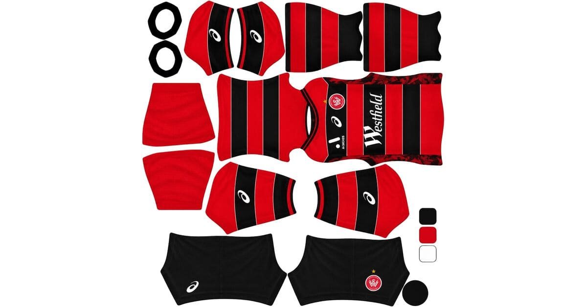
A Western Sydney Wanderers DLS kits URL is a direct link to a 512×512 PNG Wanderers shirt that you paste into Dream League Soccer. All four slots are below, with each file loaded into the game before it went on this page.

Western Sydney Wanderers Logo
Official Logo 512×512 (2026/27)
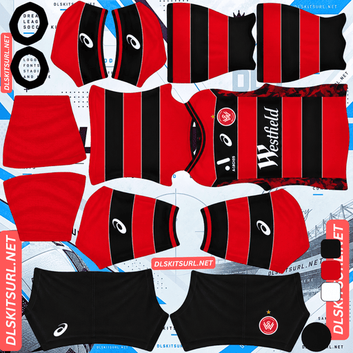
Western Sydney Wanderers Home Kit
Home Kit 512×512 (2026/27)

Western Sydney Wanderers Away Kit
Away Kit 512×512 (2026/27)
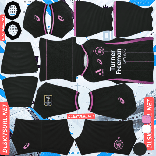
Western Sydney Wanderers Third Kit
Third Kit 512×512 (2026/27)

Western Sydney Wanderers GK Home Kit
GK Home Kit 512×512 (2026/27)
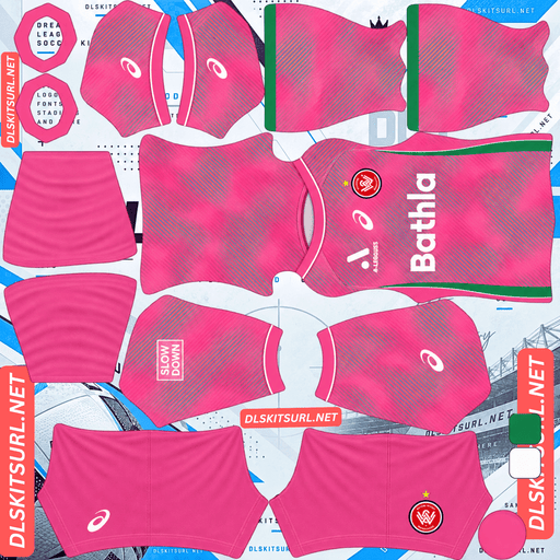
Western Sydney Wanderers GK Away Kit
GK Away Kit 512×512 (2026/27)
The home kit’s launch imagery gives away the main problem before you even import it.
Close-up launch photography is a warning sign
Released ahead of the 26-27 season as Western Sydney’s first kit by Asics, the home shirt draws on the local region, its heritage, community and landscape. The official launch imagery places noticeable emphasis on close-up views of the jersey’s construction.
Which tells you something useful
A manufacturer photographs a shirt close up when part of its appeal needs to be seen close up.
Full-length photographs are useful for colour blocking, stripes and large panels. Macro photography is where texture, weave, embossing and fine pattern usually appear.
At 512×512, the whole shirt is effectively being reduced to thumbnail scale. You are never going to approach it in the way the launch photography does.
So read the launch imagery as a signal
If the launch focuses on full-length shots and bold colour blocking, those elements are likely to reproduce.
If it keeps showing fabric close-ups and construction details, expect those details to disappear.
If the club specifically calls out a pattern, judge its contrast before you download the file.
Western Sydney’s launch materials identify “Pattern” as one of the design elements. That distinction matters: a bold regional motif in a contrasting colour can survive, while a fine or tonal pattern across the body will usually reduce to texture or disappear altogether.
AC Horsens’ “bespoke” home and Newcastle Jets’ “understated tonal wave texture” sent similar warnings this season, while Silkeborg’s “competition template” was a much more favourable description.
The simplest test is still the best one:
If you can read it clearly on a flat image, it has a chance of carrying into DLS. If you have to search for it, it probably will not.
Confirm the dimensions as well. On a computer, open the image in a new tab and check the actual size reported by the browser.
The hoops are the harder half
Western Sydney’s identity is built around red and black hoops, a look the club has carried since its foundation.
Which is the most demanding geometry here
Horizontal bands have to line up across the body, side seams and sleeves. A small vertical error is immediately visible because the eye expects a horizontal stripe to continue at exactly the same height.
And there are plenty of bands.
Import the shirt and check it from the side. Do the hoops remain at the same height wherever the body meets a sleeve panel?
FC Dallas, Sporting CP, Lausanne-Sport and Real Salt Lake all provide useful comparisons for this kind of horizontal geometry.
And red on black is only moderate contrast
Red is a saturated mid-value colour. Black is the darkest possible base.
There is a real difference between them, but it is nowhere near the separation you get from yellow on black or red on white.
That matters more on hoops than on most patterns because the entire design depends on the viewer distinguishing one broad band from the next.
FC Dallas faces the same basic colour relationship but uses thin white separators. Western Sydney does not. Here, the red meets the black directly.
But the bands are broad enough to work
This is the saving grace.
A pattern that is too fine to resolve at match distance tends to average together. That is why Macarthur’s thin white pinstripes can turn a black shirt into something that looks grey rather than visibly striped.
The Wanderers’ hoops are broad.
They have enough surface area to remain separate bands rather than merging into one dark tone. The result should therefore be a readable striped silhouette, although the moderate red-on-black contrast means the effect will be softer than it would be on a lighter base.
Number colour
DLS reads number colours from two small swatches on the kit template rather than from the shirt image. One controls shirt numbers and the other controls shorts numbers.
Use white on the home.
The hoops cross the back, so red would disappear into one stripe and black into the other. White provides the third colour needed to remain visible across both.
The third is charcoal with neon berry
The Asics third is predominantly charcoal, with striking neon berry accents and a subtle all-over tonal geometric pattern. The shorts and socks continue the charcoal base with neon berry branding.
The pattern fails on two counts
First, it is tonal: the pattern uses variations of the same colour, giving the image very little contrast to preserve.
Second, it sits on a dark base. Dark colours leave even less room for a subtle tonal pattern to separate itself.
The description itself calls the graphic subtle.
Expect a plain charcoal shirt.
Sydney FC’s Cove third, Perth Glory’s 25-26 away, Brøndby’s shadow striping and Newcastle’s wave texture demonstrate the same limitation.
But neon berry is the right kind of accent
Neon colours are extremely bright, which allows even relatively small areas to remain visible at match distance.
That matters here because the shirt, shorts and socks are otherwise charcoal. There is very little garment-level contrast to break up the dark set.
The neon is doing most of the work.
Zamalek’s fluorescent accents and Wellington’s large yellow panels show how bright colour can rescue a dark kit. Western Sydney’s neon berry does the same thing, but the accents cover less area, so the result is only adequate rather than exceptional.
Expect it to read better than an all-charcoal kit, but not like a genuinely two-tone shirt.
Use white or a neon-matching number colour on the third.
And charcoal is a slightly better base than black
Charcoal is technically a dark grey rather than pure black, so it has marginally more separation from the green pitch.
Only marginally.
It remains a dark kit, and the neon accents are what make it practical in a match.
The away
Western Sydney’s 26-27 away was released as part of the new Asics range.
Compare the actual file against the card above rather than relying on a written description elsewhere. Then check the normal structural details:
Colour boundaries should be sharp rather than smeared.
Collar and cuff trim should have clean edges.
Asics branding, crest and sponsor should remain crisp.
The image should be genuinely 512×512.
And check it against the other two
You already have a dark red-and-black home and a charcoal third.
That makes the away particularly important for variety.
If the away is light or brightly coloured, it may be the most useful shirt to put in the home slot because DLS uses that slot most often and the brighter base gives you better match visibility.
If it is dark as well, consider an older lighter Wanderers design for one of the three outfield slots.
Lyngby Boldklub and Macarthur demonstrate the same slot-redundancy problem: three technically different kits can still feel too similar once they are all dark.
Which Wanderers kit survives best?
The home keeps its broad red-and-black hoops, while the fine regional pattern is uncertain. Its moderate contrast makes the stripes readable but relatively soft.
The away should determine your final slot order, especially if it provides a lighter base.
The third loses its tonal geometric pattern but keeps the neon berry accents, making it usable without being especially strong.
The key difference is simple: the home has useful geometry, while the third has useful colour contrast.
Asics replaced Kappa
Asics became Western Sydney’s kit supplier for 26-27, making this the brand’s first A-League partnership with the club.
Which dates a file instantly
An Asics logo on a Wanderers shirt means 26-27 onward.
Kappa supplied the club from roughly 20-21 through 25-26, with Nike preceding that period.
That gives Newcastle a relatively clean supplier timeline: three distinct eras that are easy to separate by the manufacturer logo.
Central Coast Mariners and Brisbane Roar offer similar advantages, while Perth Glory, Sydney FC and Melbourne City have had suppliers that make dating individual shirts less straightforward.
And Asics is a middling case for reproduction
Asics is primarily a performance brand rather than a basic teamwear supplier.
The brand clearly uses tonal and textured treatments, as the Wanderers third demonstrates, but the underlying construction still tends to rely on straightforward colour blocking and panels.
So the expectation here is consistent:
Structure survives. Texture does not.
New Balance sits in roughly the same middle range. O’Neills, UCAN, Select, Dynasty, Konqa and Elite Eleven generally produce simpler constructions, while some Macron 26-27 designs sit at the more construction-heavy end with jacquard treatments.
How to tell if a Wanderers file is current
Four checks will settle most searches:
Asics branding, not Kappa — the clearest marker for 26-27.
The third is charcoal with neon berry accents — an easy visual identifier.
Check whether the file is the men’s, women’s or youth version, because Asics produces all three.
Compare the image against the cards above, since the red-and-black home can resemble older Wanderers kits.
The first check does most of the work.
If you see Kappa, you are looking at an older era.
A note on the A-League season
The A-League runs across two calendar years, with the Australian summer season stretching roughly from October into May. The Wanderers’ current kits are therefore labelled 26-27.
Kits are released around September, later than many European club ranges.
That makes a file labelled only “2026” potentially ambiguous.
Check the supplier logo first.
How to use a Western Sydney Wanderers DLS kits URL
Copy the direct link with the button on the kit card rather than copying the address from your browser. The browser address usually points to the page containing the image instead of the PNG itself.
In Dream League Soccer, open My Club → Customise → Kit. Do not select Logo; the badge is handled separately.
Choose the slot before pasting because the currently selected slot is the one that will be replaced.
Press and hold the field, tap Paste, then Confirm. Older versions may call the final button Download.
Three outfield kits fill the three available outfield slots, leaving the goalkeeper slot separate.
Think about the order.
With a dark home and dark third, the away may be your brightest option. If it is, it makes sense to give it the home slot for regular matches.
Set the shorts and socks deliberately too. DLS treats those areas independently, and the third’s charcoal set can otherwise leave you with very little contrast.
The first custom kit requires a one-time gem unlock. After that, changing kits costs nothing.
Test the link first
Open the URL in a browser before entering it into the game.
The image should appear by itself, and the address should end in .png.
If you see a webpage with headers, buttons or other content around the image, you have a viewer page rather than a direct image file. DLS cannot use that page as the kit source.
For the home, check the hoop edges at full size first. Then import it and inspect the alignment across the seams. Those are two different tests: the first checks the image itself, while the second checks how the shirt geometry maps onto the game model.
For the third, do not judge the file by the geometric pattern. That tonal graphic is expected to disappear. Check the neon berry accents and the crispness of the defined elements instead.
Why do Wanderers kit URLs stop working?
Three problems account for most dead kit links.
Free image hosts delete files. Unused uploads can be cleared after months or years, leaving a URL that still looks valid but returns nothing. Western Sydney is one of the better-supported A-League clubs, which helps, although Asics are new to the Wanderers and this is the first season of the partnership, so the number of available files may initially be lower.
Hotlink protection gets switched on. A host can allow the image to load normally in a browser while refusing requests from the game. That is why a URL can work when you click it but fail after you paste it into DLS.
The preview and the direct link are different files. Some pages display a thumbnail hosted locally while the copy button points somewhere else. The preview can remain visible even after the actual image URL has died.
Here, the image shown and the URL you copy are the same file on the same server.
The Western Sydney Wanderers badge
Set the crest during the same session, using Logo instead of Kit.
The Wanderers badge is a red-and-black shield built around the club’s distinctive W monogram.
That bold monogram is well suited to DLS. A single strong shape remains much easier to read at small size than a crest filled with tiny details.
The problem is the same red-on-black relationship as the shirt. It is a moderate-contrast pairing, so an undersized badge can blur the two colours together.
Use a genuine 512×512 badge file rather than enlarging a smaller source, and look for a version where white provides separation if the design permits it.
DLS also crops badges into a circle. Because the Wanderers crest narrows toward the bottom of its shield, leave clear space around the complete artwork rather than trimming the file tightly.
The result actually complements the shirt well: a red-and-black crest on a red-and-black kit continues the club identity rather than introducing an unrelated colour.
Keeping your Wanderers kits
Custom kits are stored on your device rather than in your account. Updating the game usually keeps them, but reinstalling it or changing phones can remove the kits and badge.
With older Kappa-era files still circulating, record that yours are the 26-27 Asics versions.
Save all four working links in a notes app before you need them again.
FAQ FOR RANK MATH
What is a Western Sydney Wanderers DLS kits URL?
A direct link to a 512×512 PNG Wanderers shirt that you paste into Dream League Soccer’s kit screen. A working direct link ends in .png.
Why is close-up launch photography a warning?
Because close-up photography usually highlights texture, weave, embossing or fine construction details. Those features exist at a scale you can inspect in person, but 512×512 reduces the whole shirt to a small image.
Do the red and black hoops survive?
Yes, although they will be relatively soft. Red on black provides moderate contrast, but the hoops are broad enough to remain separate bands rather than blending together.
What should I check on the home?
Check the hoop edges at full size, then inspect their alignment at the seams after importing. A band that sits a few pixels too high or low becomes obvious where the panels meet.
Will the third kit’s geometric pattern appear?
No. It is tonal, sits on a dark charcoal base and is described as subtle. Expect the shirt to become mostly plain charcoal with the neon berry accents remaining visible.
Is the third usable then?
Yes, but only adequately. The neon accents are bright enough to provide visibility, while the charcoal base remains dark.
What number colour should I use?
White on the hooped home. The hoops cross the back, so red and black would each disappear into part of the shirt.
Who makes the Wanderers’ kits?
Asics from 26-27, replacing Kappa. Nike supplied the club before the Kappa period, so the manufacturer logo is a useful way to date a file quickly.