

A Cagliari DLS kits URL is a direct link to a 512×512 PNG Cagliari shirt that you paste into Dream League Soccer. All four slots are below, and each file was loaded into the game before being added to this page.

Cagliari Calcio Logo
Official Logo 512×512 (2026/27)
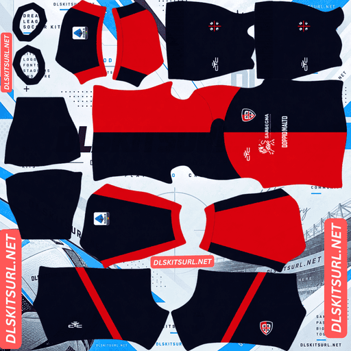
Cagliari Calcio Home Kit
Home Kit 512×512 (2026/27)

Cagliari Calcio Away Kit
Away Kit 512×512 (2026/27)

Cagliari Calcio Third Kit
Third Kit 512×512 (2026/27)

Cagliari Calcio GK Home Kit
GK Home Kit 512×512 (2026/27)

Cagliari Calcio GK Away Kit
GK Away Kit 512×512 (2026/27)

Cagliari Calcio GK Third Kit
GK Third Kit 512×512 (2026/27)
The home kit has one of the simplest shapes covered here, but it still needs a check before you import it — and the reason has nothing to do with image resolution.
The half-and-half home needs checking first
Released in early November 2026, the home keeps Cagliari’s traditional red and blue half-and-half design. It also adds a tone-on-tone geometric graphic across the fabric, along with white piping on the shoulders.
The geometry is the easiest there is
A half-and-half split runs directly down the centre of the body. That gives the design one alignment point, making it one of the most forgiving arrangements possible for a DLS template.
A vertical stripe has two edges to align, while horizontal bands create several more boundaries. Three horizontal stripes can create as many as 18 alignment points, and a diagonal split has to maintain both its position and angle across every seam.
The Cagliari split itself should therefore render correctly, particularly because red against blue provides genuine colour contrast.
But the file can be mirrored
There is one catch: the shirt is asymmetric.
Red on one side and blue on the other means the left and right sides are different. The kit template maps those sides separately, so the design works in principle, but a poorly made file can flip the two colours.
The result is particularly awkward because nothing about the finished shirt necessarily looks wrong.
Check which side is red and which is blue before importing. Once the kit is on the player model, there is no reliable way to identify a mirrored version.
This is the fifth kit covered here where left and right differ, following Vélez Sarsfield’s cuffs, Universidad de Chile’s halves, Venezia’s gradient away and Monaco’s diagonal.
Asymmetric designs are the only ones where a file can be wrong while still looking completely plausible.
And your badge sits on the boundary
Dream League Soccer places your imported crest on the chest, which is exactly where the two colours meet on a half-and-half shirt.
That means the badge straddles the divide.
A full-colour crest with a defined outline handles this much better than a version without one. The outline helps the badge remain a deliberate element sitting over the two colours instead of becoming partly lost against each half.
Cerro Porteño’s half-and-half home faces the same basic situation.
The tonal graphic will not appear
The geometric pattern is tone-on-tone, meaning it uses different shades of the same red and blue rather than a contrasting colour.
There is no meaningful colour difference for a 512×512 file to preserve, so expect both halves of the Cagliari shirt to arrive as flat red and blue.
That is a limitation of the design, not a sign that your file is poor.
Bayern’s tonal pinstripes, Barracas Central’s third, LDU Quito’s home pattern, Vélez’s navy away and New Zealand’s tonal fern all disappear for essentially the same reason.
So the white piping is your test
The white shoulder piping gives you the strongest quality check on the home.
White against both red and blue is maximum contrast, and the shoulders are already a well-defined area of the kit template.
The piping itself is narrow, so expect it to appear thinner than on the physical shirt. What matters is whether its edges remain clean and correctly positioned.
Confirm the PNG dimensions as well. On a computer, right-click the image and open it in a new tab so the browser can report the actual image size.
And both colours play well
Dream League Soccer renders players relatively small, so visibility depends heavily on how far the shirt colour sits from the pitch.
Red sits well away from green on the colour spectrum, while blue also separates cleanly without blending into the grass.
A red-and-blue half-and-half therefore has strong internal contrast across the entire silhouette.
Use white numbers. The split continues across the back, meaning red or blue numbers would disappear into one half of the shirt. White is the dependable option across both colours.
The away is American football inspired
Released on 16 May 2026, the away takes its inspiration from American football.
Which usually means bold, survivable shapes
American football design tends to rely on blocky, clearly defined elements such as shoulder yokes, broad panels, large numerals and thick striping.
Those are exactly the types of shapes that survive well at 512×512: large areas, strong boundaries and high contrast.
The away should therefore reproduce well.
With one thing to check
American football shirts can also feature a large number or other prominent marking across the chest.
That matters because Dream League Soccer places your imported badge in that same general chest position.
Open the away file at full size and check what occupies the centre of the chest. If there is a large central element there, your crest will cover part of it.
The loss is relatively minor on a shirt built around yokes and broad panels because the rest of the structure continues around the badge.
Parma, Ghana, Vélez and Inter’s baseball-inspired away face sharper versions of the same basic issue.
The third uses contrasting sleeves
The 26-27 third is grey with black, using a contrasting-sleeves construction.
Which reproduces reliably
Contrasting sleeves have an important advantage: the colour change happens at the armhole seam.
That is already a boundary built into the DLS kit template, so the design does not have to cross an arbitrary part of the shirt and maintain alignment there.
The sleeve change should therefore arrive cleanly with almost any decent file.
Austria’s black-sleeved home and Lorient’s navy-sleeved third work on the same principle.
Designs that follow the garment’s construction reproduce more reliably than graphics applied across it.
But grey and black is a weak pairing
Grey is a mid-tone neutral. It separates from pitch green adequately, but it does not have the brightness of white or the stronger colour identity of red, blue or another saturated shade.
Grey against black also provides a fairly narrow value range. Both are neutral colours, so the contrast between them is relatively muted.
At match distance, the third therefore reads as a somewhat dull silhouette, with the sleeve division providing most of its visible structure.
Use white numbers on this kit.
Which Cagliari kit survives best?
The home has the best combination of reproduction and on-pitch visibility. Its central split is almost impossible to misalign, although the tonal geometric graphic should be expected to disappear.
The away should also reproduce well because its American football-inspired construction relies on large, bold shapes. The main thing to inspect is what sits behind the imported badge on the chest.
The third has a reliable sleeve boundary, but grey and black give it the weakest visibility of the three.
In practical terms, the home has the strongest overall playability, the away has good reproduction potential, and the third is the weakest visually.
How to tell if a Cagliari file is current
Four checks should settle the current cycle.
First, look for Eye Sport branding. The supplier has been with the club for several seasons, so it cannot date a file by itself, but it should still match the current shirts.
Second, the home should be red and blue half-and-half with white shoulder piping.
Third, the third should be grey with black sleeves. The 25-26 third was completely different, using oak-leaf patterns celebrating Sardinia’s forests.
Finally, compare the file directly with the kit cards above. Cagliari’s alternate concepts change substantially from season to season, so the visual match matters.
The third is the most reliable check because the club’s traditional rossoblù home remains recognisable, while the alternate shirts change concept more dramatically.
And watch for the hem coordinates
There is another small detail worth knowing because Cagliari have used it before.
The 25-26 away carried the coordinates of the Unipol Domus stadium at the hem.
The hem is one of the least useful areas for DLS detail. It sits at the lower edge of the template, renders at a small size and can partly disappear behind the shorts.
So if a future or alternate Cagliari design contains similarly tiny hem coordinates, expect them to be absent or heavily reduced.
How to use a Cagliari DLS kits URL
Use the copy button on the kit card rather than copying the browser address. The browser address will usually lead to the webpage instead of the actual PNG.
In Dream League Soccer, go to My Club, then Customise, and open Kit. Do not choose Logo — that is a separate system for the badge.
Select your desired slot before pasting. Whatever slot is active is the one that gets replaced.
Press and hold the URL field, choose Paste, and then tap Confirm. On older builds, the button may be labelled Download.
The three outfield kits fit the game’s three outfield slots, leaving the goalkeeper slot available separately.
The 1969-70 Cagliari Serie A title remake is also worth considering as a rotation option. DLS accepts any working 512×512 URL regardless of how old the shirt design is.
The first custom kit requires a one-time gem unlock. After that, changing kits costs nothing.
Test the link first
Open every link in your browser before going into the game.
The image should load on its own, filling the browser window, and the address should end in .png.
If you instead see a webpage with headers, buttons or other elements surrounding the image, you have a viewer page rather than a direct image file. Dream League Soccer cannot use that type of URL.
For the Cagliari home, there is one check you should make before importing: verify which side is red and which side is blue.
That orientation cannot be corrected by looking at the finished player model, because a mirrored half-and-half file can still look perfectly normal.
Why do Cagliari kit URLs stop working?
Three common problems break kit links, and only one is immediately obvious.
Free image hosts delete files. Unused uploads can be cleared after months or years, while the original-looking URL remains. Cagliari sit in the lower half of Serie A for coverage, so there are generally fewer files available than for Milan or Rome’s biggest clubs. At the same time, the club’s distinctive kit programme attracts more attention than its size alone would suggest.
Hotlink protection gets switched on. This prevents requests coming from outside the host’s own website. Your browser may load the image normally, while Dream League Soccer’s request is refused. That is why a URL can work when clicked but fail when pasted into the game.
The preview and the actual link are different files. Some pages show a thumbnail stored on their own server while providing a URL that points somewhere else. The webpage can continue to display the image even after the direct file has disappeared.
Here, the shirt you see and the URL you copy are the same file on the same server.
The Cagliari badge
Set the crest during the same customisation session, but choose Logo rather than Kit.
Cagliari’s badge features the four Moors of the Sardinian flag alongside the club’s colours.
The crest matters particularly on the home because it sits directly over the red-and-blue boundary.
Use a full-colour version with a defined outline. That helps it remain visually separate from both halves rather than allowing part of the emblem to disappear into one colour.
Fine details in the Sardinian emblem will soften when Dream League Soccer renders the badge beside the score. That is a limitation of the game’s display size rather than a problem with the PNG itself.
Because DLS crops badges into a circle, use a file with clear space around the entire design rather than one trimmed tightly against the artwork.
Keeping your Cagliari kits
Custom kits are stored on your device rather than in your account.
Game updates usually keep them, but reinstalling the game or changing phones can remove the custom kits. The custom badge goes with them as well.
The home deserves one extra precaution: save the URL for the version with the correct red-and-blue orientation, because a mirrored file is difficult to identify once imported.
Paste all four URLs into a notes app before you start so you can replace the kits quickly if needed.
FAQ FOR RANK MATH
What is a Cagliari DLS kits URL?
A Cagliari DLS kits URL is a direct link to a 512×512 PNG Cagliari shirt that you paste into Dream League Soccer’s kit screen. A working direct image URL ends in .png.
What should I check on the Cagliari home kit?
Check which side is red and which side is blue before importing. The half-and-half design is asymmetric, so a mirrored file can look completely normal even though it is incorrect.
Is the half-and-half home difficult to reproduce?
No. It is one of the easiest geometries to reproduce because the split runs directly down the centre of the body, creating only a single alignment point. The important issue is the orientation of the two colours.
Will the tone-on-tone geometric graphic appear?
Probably not. A tone-on-tone pattern uses different shades of the same red or blue, so there is little contrast for a 512×512 file to preserve. Expect the two halves to arrive mainly as flat colour.
How do I check the Cagliari home file?
Use the white shoulder piping as the main quality test. White provides maximum contrast against both red and blue, while the shoulder area is already a defined part of the DLS template. Also confirm that the PNG is actually 512×512.
Does the badge cause a problem on the half-and-half shirt?
It can. The crest sits directly where the two colours meet, so use a full-colour badge with a defined outline. This helps the emblem remain readable across the boundary.
Does the Cagliari third kit reproduce well?
Yes. Its contrasting black sleeves follow the armhole seam already built into the DLS template, so the colour boundary does not need to be aligned across an arbitrary part of the shirt. Grey and black are simply weaker for match-distance visibility.
What number colour should I use on the Cagliari home?
White. The red-and-blue split continues across the back, so red or blue numbers would disappear into one half of the shirt. White gives reliable contrast across both sides.