
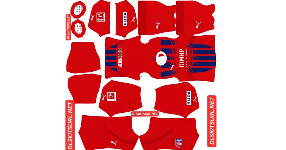
A Heidenheim DLS kits URL is a direct link to a 512×512 PNG FCH shirt that you paste into Dream League Soccer. All four slots are below, with every file loaded into the game before it was added to this page.
Fc Heidenheim Logo
Official Logo 512×512 (2026/27)

Fc Heidenheim Home Kit
Home Kit 512×512 (2026/27)

Fc Heidenheim Away Kit
Away Kit 512×512 (2026/27)
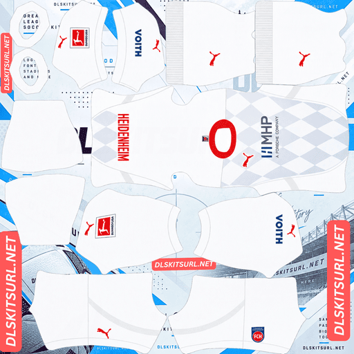
Fc Heidenheim Third Kit
Third Kit 512×512 (2026/27)
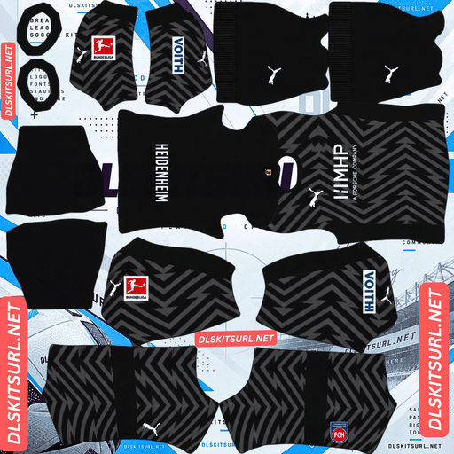
Fc Heidenheim GK Home Kit
GK Home Kit 512×512 (2026/27)

Fc Heidenheim GK Away Kit
GK Away Kit 512×512 (2026/27)
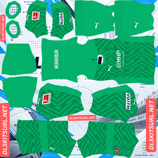
Fc Heidenheim GK Third Kit
GK Third Kit 512×512 (2026/27)
The home kit gives you something most shirts do not: a design element that visibly exposes a bad file.
The fading stripes are your resolution test
Released on 28 June 2026, the home is predominantly red, with blue gradient stripes on the front that fade towards the centre to leave room for the main sponsor.
A fade needs every intermediate value
A hard edge only needs two colours. A fade needs every step between them.
With a genuine 512×512 file, the blue stripes should dissolve smoothly toward the centre, matching the real shirt.
With an undersized file, one of two things usually happens:
The fade steps, creating visible bands where the transition should be smooth
The fade cuts off, with the stripes simply stopping instead of dissolving
Either problem is immediately noticeable. That makes this one of the rare kits where the design itself tells you something about the quality of the file.
Elche’s black-to-green third and Venezia’s gradient away work on the same principle.
And the weakest part is where contrast is lowest
This is where the failure normally begins.
Blue against red is only a moderate pairing. Both are saturated mid-tone colours, so they have less separation than combinations such as blue-on-white or red-on-white.
The fade then makes the stripe progressively weaker as it moves toward the centre.
So the end of the fade has the hardest job on the entire shirt: the lowest contrast combined with the finest gradation.
Look there first. If the tail of the fade survives cleanly, the rest of the shirt should be fine.
The clear centre is useful, as it happens
The stripes fade specifically to create room for the sponsor in the middle of the chest.
That happens to be the same area where Dream League Soccer places your imported badge.
So instead of the crest landing on top of an existing graphic, the game puts it into a space the shirt designers already left empty.
Use the standard full-colour Heidenheim crest on the home. It will look placed rather than imposed.
Juárez and Universidad de Chile are the other examples where the game’s badge position matches the club’s own layout.
Visibility
Dream League Soccer renders players at a small size, so visibility depends partly on how far the shirt colours sit from the grass.
Red sits close to green’s opposite, making it one of the strongest base colours available.
The blue stripes add internal structure, although the fade means that structure is strongest toward the sides and disappears around the centre.
Use white numbers on the home.
The third’s pinstripes survive
Released on 29 July 2026, the third has a clean white base with vertical red pinstripes down the front, red collar and sleeve-cuff trim, plus the Puma logo, MHP sponsor and club crest all rendered in red.
Red on white is the best pinstripe case there is
A pinstripe is about as thin as a stripe can get, but thickness alone does not decide whether it survives. Contrast does.
Heidenheim’s red-on-white pinstripes sit in the strongest possible category. Argentinos Juniors uses the same red-on-white combination, while Boca Juniors and Monterrey use navy on white. Sassuolo’s white on Electro Royal also survives.
By contrast, Bayern Munich’s tonal red-on-red pinstripes are lost, while Udinese’s metallic treatment disappears.
Red against white is maximum contrast, which gives the lines exactly what compression needs.
A genuine 512×512 file should keep the lines distinct. An upscaled or weak file can blur them toward pink.
Count the lines you can actually follow at full size. That is your check.
But the crest is rendered in red
The shirt uses a monochrome red version of the club crest, matching the Puma and sponsor logos.
Dream League Soccer places your imported badge over that area, giving you two sensible options.
You can use a red monochrome crest if you find one, matching the artwork on the shirt.
Or you can use the standard full-colour crest, which is easier to read at the size DLS renders it. Colour blocking generally survives small rendering better than a single-colour mark.
So the full-colour version is the safer choice for legibility, while the monochrome version is more accurate to the shirt itself.
Auxerre, Troyes, Sevilla, St. Louis and Al-Ittihad all use monochrome crests this season.
And white needs the right number colour
Dream League Soccer takes the number colour from two small swatches on the kit template, rather than from the shirt image itself. One controls the shirt numbers and the other controls the shorts.
That makes the classic light-kit mistake especially easy to make.
White numbers on a white shirt are invisible.
Use red on the third, matching the shirt’s own accent colour.
Visibility
White separates cleanly from pitch green, while the red pinstripes provide the internal detail.
The third is easy to read, although it has less visual weight than the red home.
The away is deliberately simple
Released on 3 July 2026, the away is a simple blue-and-white design.
Which means nothing to lose and nothing to judge
There is no texture, gradient or intricate pattern to test.
That means almost any file you find should arrive looking correct — but it also means a weak file can look just as convincing as a good one.
Judge the away by the collar, cuffs, crest and Puma branding, then confirm the dimensions your browser reports. On a computer, right-click the image and open it in a new tab.
Bologna’s away, Monza’s home, Lecce’s stripes and Huracán’s away sit in the same category.
And blue and white plays well
White is bright and separates cleanly, while blue has no blending risk with the grass.
Blue against white also gives maximum contrast, so whichever arrangement the shirt uses, the silhouette has plenty of structure.
Use navy or red numbers, depending on which colour dominates the upper back.
Which Heidenheim kit survives best?
The home is red with fading blue stripes. It gives you the clearest visible resolution test and is the best of the range for that reason.
The away is blue and white. It reproduces perfectly, but offers almost no way to judge whether the source file is genuinely good.
The third is white with red pinstripes. The design survives from a good 512×512 file and remains a solid option.
Two of the three therefore give you a genuine resolution check, which is unusually useful. Most clubs offer one at best.
How to tell if a Heidenheim file is current
Four checks will settle it.
- The home should be red with fading blue gradient stripes. This is the clearest 26-27 marker and should be visible immediately.
- Look for Puma branding with MHP as sponsor. Puma have supplied Heidenheim for several seasons.
- The third should be white with red pinstripes and red-rendered logos. The 25-26 third was also white with red details, but did not have the pinstriping.
- Compare the file against the cards above. Heidenheim’s red home has looked broadly similar across seasons, so the details matter more than the base colour.
Point one does the real work. The gradient fade is unmistakable.
How to use a Heidenheim DLS kits URL
Copy the link with the button on the card, not from your browser address bar. The address bar normally gives you the page rather than the direct image.
Open Dream League Soccer and go to My Club → Customise → Kit. Do not choose Logo; that is handled separately.
Select your slot before pasting because whatever is currently selected is what gets replaced. Press and hold the URL field, tap Paste, then Confirm. Older builds may label the button Download.
Three kits fill the three outfield slots exactly, leaving the goalkeeper slot.
Decide which badge you want before starting, particularly because the third’s red-only crest gives you a genuine choice between accuracy and legibility.
The first custom kit requires a one-time gem unlock. After that, changing kits costs nothing.
Test the link first
Open the URL in your browser before going into the game. The image should fill the screen by itself, and the address should end in .png.
A webpage with headers, buttons or other content around the image is a viewer page, and DLS cannot use it as the kit file.
For the home, inspect where the stripes fade out. A smooth dissolve indicates a good file. Visible banding or an abrupt stop points to a weak or undersized one.
That is the clearest single file-quality test in the entire range.
The away is the opposite. Because the design is so simple, its appearance tells you almost nothing about the quality of the source.
Why do Heidenheim kit URLs stop working?
Three things break kit links, and only one is obvious.
Free image hosts delete files. Unused uploads can be cleared after months or years, while the old link continues to look valid. Heidenheim are among the smaller German clubs by following, and a season outside the Bundesliga reduces coverage further, so there are usually fewer options than for Bayern, Dortmund or Schalke.
Hotlink protection gets switched on. This can block requests that do not come directly from the host’s own site. Your browser may load the image normally while the game is refused, which is why a link can work when clicked but fail when pasted into DLS.
The preview and the direct link can be different files. Some pages display a thumbnail from their own server while the URL they provide points somewhere else. The page can continue to render perfectly after the direct file has disappeared.
Here, the shirt shown and the link you copy are the same file on the same server.
The Heidenheim badge
Set the crest during the same session, but choose Logo instead of Kit.
There are two versions worth considering: the standard full-colour crest and the red monochrome version used on the third.
Heidenheim’s crest is circular, carrying the club’s 1846 founding year and FCH lettering in red, blue and white.
The circular shape is useful in DLS because the game crops every badge into a circle. There is no shield edge or unusual silhouette to lose, so what you paste is essentially what appears beside the score.
The weak point is the small lettering and four-digit year. Numerals tend to soften first when a badge is rendered at game size.
Use a genuine 512×512 badge file, with enough clear space around the complete design, rather than an enlarged source.
Also remember that the monochrome crest loses the colour blocking that normally helps a badge remain readable at small sizes. That is why the full-colour version is easier to read even though the red one matches the third shirt more closely.
Keeping your Heidenheim kits
Custom kits are stored on your device rather than in your account. Updating the game usually keeps them, but reinstalling or changing phones does not — and the badge goes too.
The home file is particularly worth saving if its fade remains perfectly smooth, since that is the hardest element in the range to reproduce correctly.
Paste all four working links into a notes app before you start.
FAQ FOR RANK MATH
What is a Heidenheim DLS kits URL?
A direct link to a 512×512 PNG FCH shirt that you paste into Dream League Soccer’s kit screen. A working direct link ends in .png.
How do I check a Heidenheim home kit file?
Look at the point where the blue stripes fade toward the centre. A smooth dissolve indicates a good file, while visible banding or an abrupt stop suggests the source is undersized or weak.
Why is the fade the hardest part of the home?
A hard edge only needs two colours, while a fade needs every intermediate step between them. Blue against red already has moderate rather than maximum contrast, and the tail of the fade has the least contrast of all.
Does the imported badge cover the home design?
Not really, which is unusual. The stripes fade out to create space for the sponsor in the centre of the chest, and that is also where DLS places the imported crest. The badge therefore sits inside a gap the shirt designers deliberately left open.
Do the third kit’s pinstripes survive?
Yes, when the file is a genuine 512×512. Red against white provides maximum contrast. A weak or upscaled file can blur the lines until they begin to look pink.
Which crest should I use on the third kit?
The shirt itself uses a red monochrome crest. A matching red badge is therefore the accurate choice, but the standard full-colour crest is easier to read at the small size used by DLS.
What number colour should I use?
Use white on the red home, red on the white third, and navy or red on the blue-and-white away, depending on which colour dominates the upper back. White on white is invisible, which is the classic mistake on a pale shirt.
How do I check the away kit file?
Judge the collar, cuffs, crest, Puma branding and dimensions. The design is simple enough that it has almost nothing to lose, which also means it gives you very little visual information about the quality of the source file.