
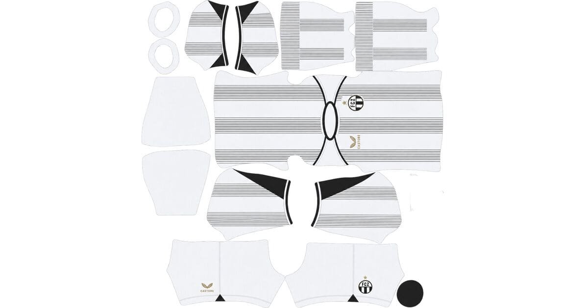
An FC Zürich DLS kits URL is a direct link to a 512×512 PNG FCZ shirt you paste into Dream League Soccer. All four slots are below, each file loaded into the game before it went on this page.

FC Zürich Logo
Official Logo 512×512 (2026/27)

FC Zürich Home Kit
Home Kit 512×512 (2026/27)

FC Zürich Away Kit
Away Kit 512×512 (2026/27)

FC Zürich GK Home Kit
GK Home Kit 512×512 (2026/27)

FC Zürich GK Away Kit
GK Away Kit 512×512 (2026/27)

FC Zürich GK Third Kit
GK Third Kit 512×512 (2026/27)
Castore gave the home fading pinstripes, which makes this one of those kits where two difficult reproduction problems overlap.
Fading pinstripes stack two hard problems
Released on 8 July 2026, the home is mainly white, with fading pinstripes that gradually build into stronger stripes. Castore finished it with a gold logo, matching the outline and star of the club crest.
A pinstripe is already close to the limit
A pinstripe is about as thin as a stripe can get. Whether it survives 512×512 depends heavily on contrast.
The pattern across the other pinstripe kits covered on this site is fairly consistent: wide colour separation survives, while narrow, tonal or metallic lines disappear.
Argentinos Juniors and Heidenheim use red on white and retain their lines. Boca Juniors does the same with navy on white. Sassuolo’s white lines on Electro Royal also have enough separation to survive.
Bayern Munich’s tonal red-on-red lines do not. Udinese’s metallic version fails for a different reason.
Even the survivors are close. A genuine 512×512 file can keep the lines distinct, while an enlarged or undersized source tends to blur them together.
A fade needs every step between the colours
A hard edge only needs two colours.
A fade needs every value between them.
That means a good file lets the stripes dissolve gradually. A weak one makes the transition look stepped, broken or simply cuts the stripe off before it reaches its intended endpoint.
Heidenheim’s fading stripes show the same behaviour this season.
Put the two problems together and failure becomes progressive
This is what makes Zürich’s home more demanding than a normal pinstripe kit.
A solid pinstripe either survives or it does not. Its width and contrast stay broadly consistent along the shirt, so the result is relatively uniform.
A fading pinstripe becomes weakest at exactly the point where it is also becoming thinnest. The line is losing contrast while simultaneously becoming harder for the 512×512 image to represent.
So the failure does not happen all at once.
It starts at the fade end and works inward.
That means the stripes can still be visible while already being wrong.
Expect them to arrive shorter than they should, stopping before the real design finishes its fade.
That is the important test here. Do not simply ask whether the stripes are visible. Ask how far through the fade they remain visible.
Count from the fade end
Open the home file at full size and follow one pinstripe from its solid end toward the point where it disappears.
The further you can follow it, the better the file.
Also confirm the actual dimensions. On a computer, open the image in a new tab or inspect its properties and make sure it is genuinely 512×512, rather than an enlarged version of a smaller source.
This is a design that effectively tests itself. Frankfurt’s barcode, Gladbach’s diamonds and Tolima’s seven stripes all give you something measurable to inspect; Zürich’s gives you a direction to follow.
White needs the right number colour
Dream League Soccer reads the number colour from two small swatches on the kit template, not from your image. One controls the shirt numbers and the other controls the shorts.
White numbers on a white shirt disappear.
It is the classic mistake on a pale kit, and the normal shirt preview will not warn you because the number colour is controlled separately.
Use blue on the home. It matches the club’s identity and gives the numbers the contrast the white base needs.
Visibility
DLS renders players small, so kit visibility depends on how far the shirt colour sits from the pitch.
White separates cleanly from green grass, with almost no blending risk, and remains one of the brightest shirt bases available.
The problem is internal contrast. A mostly white shirt with increasingly thin pinstripes can still read as one pale shape once the player is reduced to match distance.
That makes the squad number more important than usual.
The gold logo sits on the worst possible base
Castore used a gold logo on the home, matching the gold treatment around the crest and its star.
Gold on white is where gold disappears
Gold does not remain metallic in DLS. It arrives as a flat yellow-gold colour.
Whether that still reads depends almost entirely on what is underneath it.
Gold on black, as with Pasto, has enough contrast to survive. Gold on claret, as with Tolima, also remains clear. Against navy it weakens.
Against Zürich’s white, there is almost nothing to separate it from the background.
Flat yellow-gold on white becomes a pale warm colour sitting on another pale colour.
Expect the Castore logo to look faint. Do not use it as your main quality test.
Austria’s gold Art Nouveau lines on mint create the same problem, while Angers’ silver on white demonstrates the same issue with a different metallic colour.
Let the crest be your anchor
The club crest is the defined element worth checking.
It has clearer edges and stronger contrast than the gold Castore treatment, so inspect the crest alongside the pinstripe fade when judging the file.
The away carries a topographic map
The 26-27 away takes a quieter approach, incorporating a subtle topographical map of Zürich into the shirt.
This is one of the densest map types
Three different map-style kits have already appeared on this site: Lugano’s street map, Fluminense’s Laranjeiras plan and Houston’s satellite view.
All three reduce heavily at 512×512.
A topographic map is even more demanding than a street map.
Contour lines can run extremely close together, curve continuously rather than meeting at obvious junctions, and become increasingly dense where the terrain is tightly represented.
That gives the shirt an enormous amount of information to squeeze into a relatively tiny image.
At 512×512, the entire shirt is effectively being viewed at thumbnail resolution.
Expect the topographic design to disappear or reduce to a faint mottled texture.
A bold geometric pattern has a good chance of surviving because its shapes are large and defined. Street maps reduce to texture. Topographic contours can reduce to almost nothing. A satellite image goes further still, becoming mostly colour and texture rather than recognisable detail.
And subtle makes it even harder
The map is already dense.
Then it is rendered subtly.
Contrast removes whatever density leaves behind.
So expect the imported away to look much plainer than the physical shirt.
That is not necessarily a bad file. It is the combination of density and low contrast that defeats the design. No 512×512 version can preserve a graphic like this perfectly.
Judge the away by its branding
The useful checks are the Castore logo, FC Zürich crest and Nokera sponsor.
Those are defined elements rather than fine map detail.
Inspect their edges at full size and confirm the dimensions. If those elements are clean, the file is doing its job even if the topographic artwork has effectively vanished.
Which FC Zürich kit survives best?
The home is the harder file to judge because its quality depends on how far the fading pinstripes survive. A strong file should retain the stripes further into the fade, while a weaker one cuts them off early.
The away is even more visually deceptive. Its topographic map will largely disappear regardless of file quality, so judge it from the Castore branding, crest, sponsor and image dimensions rather than the map itself.
In match play, the home remains a bright white shirt but can look fairly flat once its thin detailing disappears. The away should be judged against the original kit card because the map is not a reliable in-game quality indicator.
There is a 130th anniversary kit too
FC Zürich also released a 130th anniversary shirt, marking the club’s founding in 1896.
Worth finding, with the usual caveats
The anniversary shirt is available through the club fanshop and is perfectly usable in DLS as long as you have a working 512×512 image URL.
The problem is availability.
One-off anniversary kits attract attention quickly and then become harder to find. FC Zürich also does not receive the same volume of international kit coverage as the biggest clubs.
So if you want the anniversary shirt, find and save it while it is available.
Also check where the commemorative detail sits.
If it is on the chest, your imported badge can cover it. If it is on the upper back or around the neck, the game already has squad numbers and other fixed elements occupying that area. If it sits down at the hem, it becomes too small to reproduce reliably.
All three positions are poor places for a DLS reproduction.
Basel’s Carnival kit, Grasshoppers’ limited edition and Palmeiras’ Avanti shirt fall into the same general category.
Castore replaced Nike after 22 years
FC Zürich moved to Castore, ending a Nike partnership that had lasted more than two decades.
Which gives you a very useful dating check
A Nike swoosh on an FC Zürich shirt dates the file well back.
That is particularly useful because a long supplier relationship means there are plenty of older FC Zürich files still circulating online.
If you are looking for the current 26-27 range, the manufacturer logo alone can eliminate a large number of outdated files.
Basel, Grasshoppers, Alavés, Fiorentina and Hoffenheim have also changed suppliers recently, so old manufacturer branding is worth checking whenever a club has undergone a kit-maker change.
The design philosophy changed too
FC Zürich’s 23-24 shirts were built around customised teamwear, with the away described at the time as teamwear done right.
The current range is much more bespoke.
That distinction matters in DLS.
Teamwear is generally flat colour and defined panels. Those are exactly the kinds of shapes a 512×512 image handles well.
A bespoke shirt can introduce fades, maps and metallic finishes — precisely the details that this game struggles to reproduce.
So, oddly enough, older Zürich kits can reproduce more cleanly than the current ones.
Alianza FC’s Adidas teamwear range is a useful modern example of why simple manufacturing can sometimes make a better DLS file.
How to tell if an FC Zürich file is current
Four checks should settle it.
First, look for Castore rather than Nike. Given the length of the old partnership, this is the quickest way to separate current files from older ones.
Second, check for Nokera as the sponsor.
Third, the home should be white with fading pinstripes and the gold Castore logo.
Fourth, the away should contain the Zürich topographic map. It may disappear after import, but it should still be visible in the original source image.
The manufacturer check does most of the work.
How to use an FC Zürich DLS kits URL
Copy the link using the button on the kit card, not from your browser address bar. The browser address normally leads to the page containing the image rather than the direct image file.
In Dream League Soccer, open My Club, then Customise, and choose Kit. Do not choose Logo — that is handled separately.
Select the slot before pasting because the active slot is the one that gets replaced.
Press and hold the URL field, tap Paste, then Confirm. Older versions may label the same button Download.
The home and away use two of the three outfield slots, leaving the third slot free. That makes the 130th anniversary shirt an obvious choice if you have found a good file for it.
The first custom kit requires a one-time gem unlock. After that, changing custom kits costs nothing.
Test the link first
Open the direct link in your browser before entering it into DLS.
The image should appear by itself, and the address should end in .png.
If you see a webpage with headers, buttons or other content around the shirt, you are looking at a viewer page rather than the direct image.
The home gives you the strongest visual test. Follow a pinstripe from its solid end toward the fade and see how far it remains visible.
The away is a poor visual test. The subtle topographic map can disappear even when the file is perfectly good, so inspect the branding, crest and dimensions instead.
Why do FC Zürich kit URLs stop working?
Three things break kit links, and only one is obvious.
Free image hosts delete files. Unused uploads can be cleared after months or years, leaving a link that still looks valid but returns nothing.
FC Zürich is a mid-sized Swiss club, and the Swiss Super League generates less upload volume than the major European leagues. That means there are generally fewer replacement files available than you would find for clubs such as Basel or Young Boys.
The anniversary shirt carries the highest risk because it is a one-off design rather than a regularly reproduced match kit.
Hotlink protection is another problem. A host can allow the image to load when you visit its own website while rejecting the request from Dream League Soccer. That is why a URL can work perfectly in your browser and fail when pasted into the game.
Finally, the preview and the copied link can be different files. A page may display a thumbnail from its own server while giving you a URL that points somewhere else.
Here, the shirt you see and the link you copy are the same file on the same server.
The FC Zürich badge
Set the crest during the same session, but choose Logo instead of Kit.
FC Zürich’s badge uses the club’s blue and white, with a star positioned above the crest.
Protect the star
The star is the part to watch.
Dream League Soccer crops imported badges into a circle, and stars naturally sit near the top edge of a crest — exactly where a circular crop can remove space.
Use a genuine 512×512 badge with clear space around the entire design rather than an image trimmed tightly to the artwork.
Blue against white gives the badge strong contrast, which holds up well at the small size used beside the score.
The badge matters more than usual here because both shirts lose much of their finer design work. The crest is one of the few defined elements guaranteed to remain visible.
Boca Juniors, Atlas, Palmeiras, Bahia, Tolima and Pereira supporters face the same basic issue when a star sits close to the top of a badge.
Keeping your FC Zürich kits
Custom kits are stored on your device rather than in your account.
Updating the game normally keeps them, but reinstalling the game or changing phones can remove the imported kits — and the badge goes with them.
A home file that preserves most of the pinstripe fade is worth keeping because that is the hardest part of this range to reproduce correctly.
Save all four URLs in a notes app before you start.
FAQ FOR RANK MATH
What is an FC Zürich DLS kits URL?
A direct link to a 512×512 PNG FC Zürich shirt that you paste into Dream League Soccer’s kit screen. A working direct image link ends in .png.
Why are fading pinstripes harder than normal pinstripes?
Because the stripe becomes weakest at exactly the point where it is also becoming thinnest. A solid pinstripe either survives or disappears consistently, while a fading one fails progressively from the fade end inward.
How do I check the FC Zürich home file?
Follow one pinstripe from its solid end toward where it dissolves. The further you can track the line, the better the file. Also confirm that the source is genuinely 512×512.
Will the gold Castore logo appear clearly?
Probably not. DLS turns metallic gold into flat yellow-gold, and that pale warm colour has very little contrast against Zürich’s white shirt. Judge the file using the crest, branding edges and pinstripe fade instead.
Will the topographic map on the away survive?
Not in a recognisable form. Topographic contour lines are extremely dense, and the subtle rendering removes even more contrast. Expect the map to disappear or become faint texture.
What number colour should I use on the FC Zürich home?
Blue. White numbers on the white shirt are effectively invisible, while blue gives the strongest contrast.
Who makes FC Zürich’s current kits?
Castore. The company replaced Nike after more than two decades, so a Nike swoosh is a strong indication that a file is from an older season.
Do older FC Zürich kits reproduce better?
Often, yes. The 23-24 shirts were based on customised teamwear with flatter colours and defined panels, while the current designs introduce fades, maps and metallic effects that are much harder for a 512×512 DLS image to preserve.