

A Sassuolo DLS kits URL is a direct link to a 512×512 PNG Sassuolo shirt that you paste into Dream League Soccer. All four slots are below, and each file was loaded into the game before it went on this page.

Sassuolo Logo
Official Logo 512×512 (2026/27)

Sassuolo Home Kit
Home Kit 512×512 (2026/27)
Sassuolo Away Kit
Away Kit 512×512 (2026/27)
Sassuolo Third Kit
Third Kit 512×512 (2026/27)
Sassuolo GK Home Kit
GK Away Kit 512×512 (2026/27)
Sassuolo GK Away Kit
GK Away Kit 512×512 (2026/27)
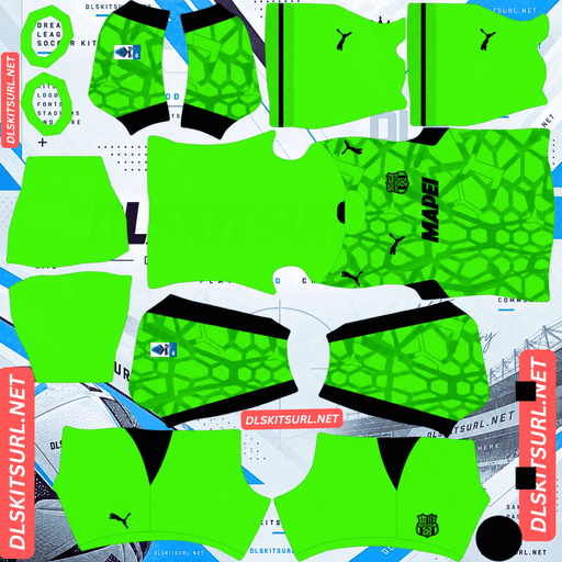
Sassuolo GK Third Kit
GK Third Kit 512×512 (2026/27)
Two of these three kits lose their pattern almost completely. The third keeps its defining detail — and it is the one you will want in regular rotation.
Black and green is the hardest pairing there is
Released on the club’s 106th anniversary, the home keeps Sassuolo’s classic identity of black and green stripes, with a pattern inspired by the smoke of bengalos.
It is the worst-case combination in this game
Dream League Soccer renders players relatively small, so visibility depends heavily on how far the shirt colours sit from the pitch.
Green is the hardest base colour to use, because it is already the colour of the grass.
Black does not provide much help. There is no bright element to lift the shirt away from the background.
The difference becomes obvious when you compare green with other colours. Green paired with yellow, as on Aldosivi and Bucaramanga, gets the best possible help because yellow carries the shirt. White, as on Cali and Banfield, breaks up the silhouette. Celeste, as on Emelec, is adequate. Black, as on Sassuolo and Kocaelispor, is the worst combination because there is no bright colour at all.
That is the key point: the amount of bright colour carried by a green kit determines how readable it becomes. Sassuolo’s home carries none.
Most clubs facing this colour problem use black and green as an alternate combination. Sassuolo use it as their home every week.
The two colours are close to each other
There is another problem on top of the pitch issue.
Black and deep green are both dark colours, so there is limited brightness difference between the stripes themselves.
That gives the design less internal contrast than a black-and-white or green-and-yellow shirt.
A genuine 512×512 file can still separate the stripes properly, but an enlarged or poorly compressed file can turn them into one dark mass.
Check the dimensions before importing. On a computer, right-click the image and open it in a new tab so your browser shows the actual image size.
The bengalo smoke will not survive
The smoke effect is soft-edged and diffuse rather than built from sharply defined shapes. In a 512×512 image, that kind of tonal variation is exactly the sort of detail that compression and scaling tend to merge.
It is also placed against a dark base, leaving very little room for subtle variation to remain visible.
So expect the imported home to look like plain black-and-green stripes.
That is not necessarily evidence of a bad file. Cagliari’s tone-on-tone graphic, Fiorentina’s tonal pattern, LDU Quito’s home pattern and New Zealand’s tonal fern all disappear for the same basic reason.
Use white numbers
Dream League Soccer takes the number colours from two small swatches on the kit template, rather than reading them from the imported PNG. One controls the shirt numbers and the other controls the shorts.
For this home, white is the clear choice.
The shirt has no bright element of its own, so the squad number is doing more visual work here than it normally would.
The away’s daffodil pattern is barely there
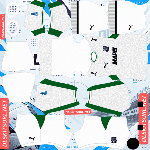
Released on 31 July 2026, the away honours the daffodil, a historic symbol of the city.
It uses a clean white base covered with an elegant “Cool Light Grey” floral pattern, with green accents around the crew-neck collar and sleeve profiles.
Light grey on white is the narrowest range possible
Grey against white provides almost no contrast.
Both colours are already light, so the difference between them is much smaller than what you would get from a normal contrasting kit.
The floral pattern makes the problem even harder. Organic shapes with fine curves have fewer strong edges to survive downscaling.
The likely result is therefore a plain white shirt.
That is not a file-quality problem. Even a perfect 512×512 PNG cannot create contrast that is not present in the original colour combination.
Angers’ silver detailing on white behaves in much the same way. A pale or metallic tone on a pale base can lose both its finish and its legibility.
The green accents become your quality test
Green against white provides genuine contrast, so the collar and sleeve profiles are much more useful when judging the file.
They are defined shapes rather than subtle tonal texture.
The problem is that both areas are small on the DLS template, so expect the green edging to become thinner than it appears on the real shirt.
If those accents look sharp and correctly positioned, the file is giving you a better sign of quality than the grey floral pattern can.
White needs the right number colour
White numbers on a white shirt disappear.
This is one of the easiest mistakes to make with a light kit because the imported shirt preview does not necessarily make the number colour problem obvious.
Use green or black numbers on the away.
It plays better than the home
The away loses more of its original design than the home does, but it has one major advantage on the pitch.
White separates cleanly from grass green.
So this is an unusual case where the kit reproduces worse but plays better. The floral pattern effectively disappears, yet the plain white shirt is much easier to follow than the dark black-and-green home.
The third keeps everything
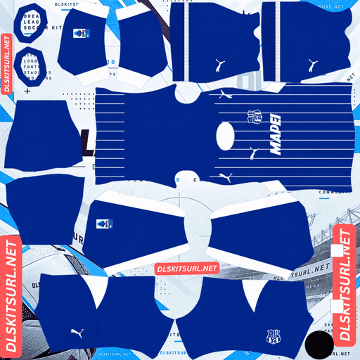
The 26-27 third uses an “Electro Royal” blue base with thin white vertical pinstripes running down the front.
The stripes draw on the striping used in the club’s emblem.
It is the one kit that works on both counts
The important difference is contrast.
Thin lines can survive at 512×512 when they are sharply separated from their background. White against a bright royal blue provides exactly that.
The same principle appears across other kits. Argentinos Juniors’ red on white pinstripes survive. Platense’s brown on white survives. LDU Quito’s light blue on navy survives. Inter Milan’s dense navy on white survives.
By contrast, tonal red-on-red stripes on Bayern Munich disappear, as do tonal Sevilla details and metallic Udinese elements.
Thinness alone does not decide whether a pattern survives. Contrast matters just as much, and Sassuolo’s third has plenty of it.
It is still a resolution test
The pinstripes survive, but they do so on a relatively narrow margin.
A genuine 512×512 file should keep the individual lines distinct. An upscaled file can blur them together until the shirt starts looking like a pale blue wash.
Open the third at full size and follow the pinstripes across the shirt. If the individual lines are difficult to distinguish before importing, they are unlikely to improve inside DLS.
This is the strongest file-quality test in the entire Sassuolo range.
Electro Royal is a strong base
The bright royal blue also solves the visibility problem.
It separates cleanly from pitch green and reads as a distinct shirt rather than another dark shape on the field.
It is a much stronger playing colour than navy and dramatically easier to see than the home combination of black and green.
Use white numbers on the third.
Which Sassuolo kit survives best?
The home keeps its black-and-green identity, but the bengalo smoke pattern is expected to disappear. The stripes themselves need a genuinely 512×512 file because black and deep green can merge when the image has been enlarged or poorly compressed. It is also the hardest shirt in the range to follow during a match.
The away loses its light-grey daffodil pattern almost entirely because grey on white has too little contrast. Its green collar and sleeve accents remain useful file-quality checks, while the white base makes it much easier to see than the home.
The third is the clear winner. Its Electro Royal blue base separates from the pitch and its white pinstripes have enough contrast to survive at genuine 512×512 resolution. It is the only Sassuolo kit here that performs well both as an imported design and as an on-pitch shirt.
How to tell if a Sassuolo file is current
Four checks will usually settle it.
First, look for Puma branding with Mapei as sponsor. Puma have supplied Sassuolo for years, so this confirms the club and manufacturer but does not date the file by itself.
Second, the home should show the bengalo smoke-inspired pattern. You can see it in the original design even though that soft detail is unlikely to survive the DLS import.
Third, the away should be white with the grey floral daffodil pattern and green accents.
Fourth, the third should be Electro Royal blue with white pinstripes. The 25-26 third was yellow, green and black, so it is visually very different from the current design.
The fourth check is the most useful. Sassuolo’s black-and-green home is a constant, while the third kit changes colour family from season to season.
How to use a Sassuolo DLS kits URL
Copy the link using the button on the kit card rather than copying the browser address bar. The address bar often gives you the webpage containing the image instead of the direct PNG.
In Dream League Soccer, open My Club, then Customise, and enter the Kit section. Do not choose Logo, because badges are handled separately.
Select the kit slot before pasting. Whatever slot is active is the one that gets replaced.
Press and hold the URL field, tap Paste, then select Confirm. Older versions of the game may label the same action Download.
The three Sassuolo outfield kits fit neatly into the game’s three outfield slots, with the goalkeeper occupying the separate goalkeeper slot.
Think about the order before importing them. The game uses the home kit most often, and Sassuolo’s black-and-green home is the hardest shirt in this range to follow at match distance.
The first custom kit requires a one-time gem unlock. After that, changing kits does not cost additional gems.
Test the link first
Open the URL in your browser before putting it into the game.
A working direct image should fill the screen by itself, and the address should end in .png.
If you see a webpage with headers, buttons or other surrounding content, you are looking at a viewer page rather than the actual image file. DLS cannot use that type of URL.
The away is a poor visual test because the light-grey daffodil pattern on white is barely visible even in a perfect file. Instead, check the green accents and confirm the image dimensions.
The third is much more useful. The pinstripes are the test. Open the file at full size and make sure the individual white lines remain distinct.
Why do Sassuolo kit URLs stop working?
There are three common reasons a direct kit URL can eventually fail.
Free image hosts delete files
Free image hosts sometimes remove uploads after long periods of inactivity. The old URL can still look valid while the file behind it has already been deleted.
Sassuolo sit in the lower half of Serie A for overall coverage, so you may find fewer alternative files than you would for the major Milan and Rome clubs. Their distinctive kit programme still attracts more attention than their size might suggest, however.
Hotlink protection gets switched on
Some hosts allow an image to load on their own website but later prevent external services from requesting the same file directly.
That creates the familiar situation where the image opens normally when you click the link but fails when you paste it into DLS.
The preview and the direct file are different
Some pages display a thumbnail hosted on their own server while the URL they provide points somewhere else.
The webpage can therefore continue showing the shirt even after the direct image has disappeared.
For the links used here, the shirt you see and the URL you copy refer to the same PNG on the same server.
The Sassuolo badge
Set the crest in the same session, but choose Logo instead of Kit.
Sassuolo’s crest carries the club’s black-and-green striping inside a shield, making it visually connected to the same colours used by the home and the pinstripe inspiration of the third.
Dream League Soccer crops imported badges into a circular area. Because a shield narrows toward its base, a file cropped too tightly around the artwork can lose part of the design.
Use a badge with clear space around the complete shield rather than one trimmed tightly to the artwork.
Black and green are a relatively quiet pairing at small size, so the badge has less natural contrast than a crest built around white or another bright colour.
For that reason, use a genuine 512×512 badge file rather than an enlarged image.
The badge is especially important on the home because once the smoke effect disappears, it becomes one of the few sharply defined elements left on the shirt.
Keeping your Sassuolo kits
Custom kits are stored on your device rather than in your account.
A normal game update will usually leave them in place, but reinstalling the game or changing phones can remove them, and the imported badge goes with them.
The third is the file worth keeping track of most carefully because it is the only kit in this range where a good-quality PNG makes a major visual difference.
Before importing, paste all three outfield URLs and the goalkeeper link into a notes app, along with the badge version you used.
FAQ FOR RANK MATH
What is a Sassuolo DLS kits URL?
It is a direct link to a 512×512 PNG Sassuolo shirt that you paste into Dream League Soccer’s kit screen. A working direct image URL normally ends in .png.
Why is the Sassuolo home kit hard to follow?
Because black and green is one of the worst colour combinations for visibility in DLS. Green blends into the pitch, while black provides no bright colour to lift the shirt away from the background.
Will the bengalo smoke pattern appear?
Probably not. The smoke is soft, diffuse detail rather than sharply defined artwork, and it sits against a dark base. At 512×512, expect the imported shirt to read mainly as black-and-green stripes.
Will the daffodil pattern on the away appear?
The light-grey floral pattern is unlikely to remain visible. Light grey on white has very little contrast, so even a perfect 512×512 file cannot make the pattern much more prominent. The green collar and sleeve accents are the more useful details to check.
Which Sassuolo kit works best in DLS?
The third kit. Its Electro Royal blue base separates well from pitch green, while the white pinstripes provide enough contrast to survive at genuine 512×512 resolution.
Should I put the third in my home slot?
It is worth considering. Sassuolo’s home is the hardest shirt in this range to follow during a match, while the Electro Royal third is both more visible and more demanding of a good file.
What number colour should I use?
Use white on the home and third, while green or black works on the white away. The home benefits especially from white numbers because it has no bright colour of its own.
How do I spot an outdated Sassuolo third-kit file?
Check the colour first. The 25-26 third was yellow, green and black, while the current third is Electro Royal blue with white pinstripes. That makes colour one of the quickest ways to reject an older file.