
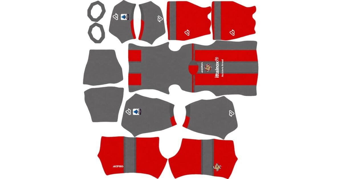
A Cremonese DLS kits URL is a direct link to a 512×512 PNG Cremonese shirt that you paste into Dream League Soccer. All four slots are below, and each file was loaded into the game before it was added to this page.
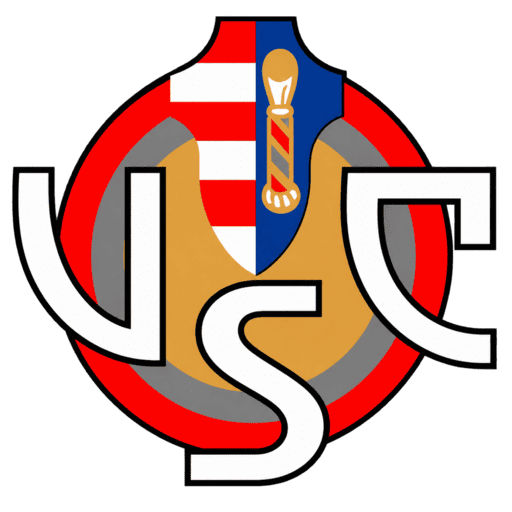
Us Cremonese Logo
Official Logo 512×512 (2026/27)
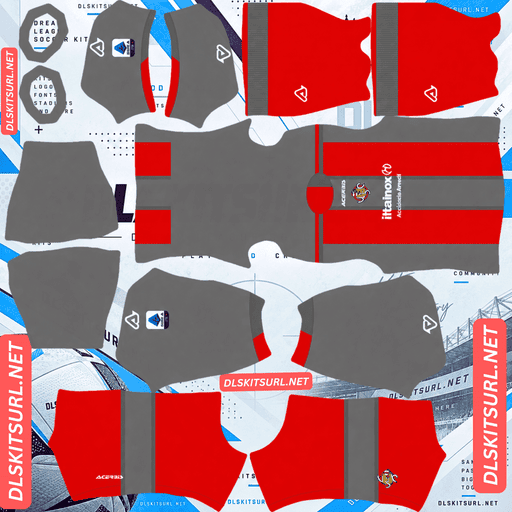
Us Cremonese Home Kit
Home Kit 512×512 (2026/27)
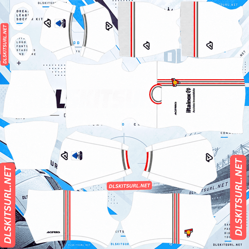
Us Cremonese Away Kit
Away Kit 512×512 (2026/27)
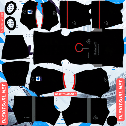
Us Cremonese Third Kit
Third Kit 512×512 (2026/27)
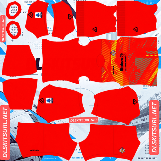
Us Cremonese GK Home Kit
GK Home Kit 512×512 (2026/27)
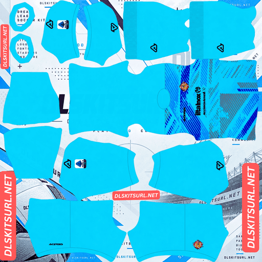
Us Cremonese GK Away Kit
GK Away Kit 512×512 (2026/27)
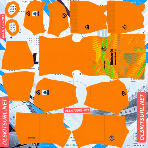
Us Cremonese GK Third Kit
GK Third Kit 512×512 (2026/27)
The away uses a colour combination that has disappeared on other kits covered here. This time it works, and the reason comes down to how much space those colours occupy.
Grey on white survives when the areas are large
Released on 7 August 2026, the away has a predominantly white base with light grey sleeves and side panels, bright red accents around the collar and cuffs, geometric line details across the front and lower sections, and a large fold-over V-neck collar.
The pairing normally fails
Grey against white is one of the weakest colour differences you can ask a 512×512 image to preserve. Both colours are light, so there is only a small tonal gap between them.
We have already seen that disappear on Sassuolo’s away, where a light grey daffodil pattern on white effectively vanished, and on Angers’ away, where metallic silver flattened toward grey and disappeared into the white.
But Young Boys’ away survived because its grey-and-white bands occupied much larger areas.
Scale is what changes the result
Survival depends on contrast and scale together.
A strong contrast can survive as a tiny line. A weak contrast needs much more space.
Cremonese’s grey is not being used as a fine pattern. The sleeves and side panels are large blocks, so the difference has enough area to remain visible.
That is why the same basic grey-on-white pairing can fail as a small graphic but survive as a major shirt panel.
The sleeve change follows the template
There is another reason the away works well.
The grey sleeve begins around the armhole, which is already a natural panel boundary in the DLS kit template. The colour change therefore follows an existing seam rather than asking the file to create a new one.
The side panels are different. They run down the flanks and have to line up across the front and back sections.
Check those after importing.
Look from the side and make sure the grey panel does not step or shift where the front meets the back.
Austria, Lorient, Cagliari, Alavés, Basel, Young Boys and Grasshoppers all use contrasting sleeve construction this season, although the exact panel arrangements differ.
The red accents should be easy
The red details have much stronger contrast against both white and light grey.
That means the collar, cuffs and geometric red elements should remain visible even when they are relatively narrow.
They are also the best file-quality test on the away. High-contrast thin lines reveal compression damage much faster than a large grey panel does.
Open the image at full size and inspect their edges. Crisp means a strong file; soft or broken edges mean the file is weak.
Lugano’s black piping on white, Pachuca’s white lines on navy, Sporting’s black trim on gold and Palmeiras’ central stripes all provide the same kind of test.
The lower graphics are less reliable
Some of the geometric detailing sits close to the bottom of the shirt.
The hem is one of the smallest-rendering areas of the kit template, and the shorts can cover part of it once the shirt is placed on the player.
So do not judge the entire file by the lowest lines.
Expect some lower geometric detail to become weaker or disappear. The higher sections are the better test.
White needs the right number colour
Dream League Soccer gets number colours from two separate swatches on the kit template, not from the shirt image. One controls the shirt numbers and another controls the shorts.
That means white numbers on a white shirt are effectively invisible.
Use red for the away numbers.
It matches the shirt’s own accent colour and gives strong contrast against both the white body and the grey panels.
The away is easy to see
White separates very clearly from the green pitch, so there is little risk of the base colour blending into the background.
The grey panels are close enough in tone to keep the shirt looking pale overall, while the red details give the design most of its stronger definition.
The away is the most readable kit in the Cremonese range.
The home is grigiorosso
Released on 31 July 2026, the home uses Cremonese’s traditional grey and red combination and is paired with black shorts featuring red details.
Grey and red is a moderate pairing
Red is a saturated mid-value colour. Grey is a neutral mid-value colour.
There is a genuine difference between the two, but it is much weaker than red against white or black against white.
That makes the home more dependent on the quality of the source image.
A genuine 512×512 file keeps the grey and red separated more effectively. An enlarged or poorly compressed image can push both colours toward a muddier middle tone.
So on this shirt, confirming the actual dimensions matters.
On a computer, right-click the image and open it in a new tab so your browser can show the real file dimensions rather than a resized preview.
The shorts are separate
Dream League Soccer maps the shirt, shorts and socks as separate areas on the kit template.
The black shorts and their red detailing therefore need to be judged independently from the shirt.
A file can reproduce the grey-and-red shirt well while still having weak or poorly defined shorts artwork.
Check both areas after import.
Visibility
Red provides useful separation from pitch green, while grey is a quieter mid-tone.
Together, the colours create a medium-weight silhouette rather than an especially bright one.
The home is perfectly usable, but it is less immediately readable than the predominantly white away.
Use white numbers on the home.
White provides the cleanest contrast against both the grey and red sections.
The third
Cremonese released their 26-27 third in September 2026, also produced by Acerbis.
For this one, compare the image directly against the kit card rather than relying on a written description.
The basic checks remain the same:
Colour boundaries should be sharp rather than smeared.
Collar and cuff trim should have clean edges.
The Acerbis branding, crest and sponsor should remain crisp.
The file should actually be 512×512.
The 25-26 third was black, red and silver, so a file with that combination is from the previous season.
Also remember that silver does not retain its real metallic appearance in a flat PNG. Metallic effects rely on gradients and reflected light, so an older silver-heavy Cremonese shirt will normally arrive looking more like ordinary grey.
Which Cremonese kit survives best?
The home reproduces well when the source is a genuine 512×512 file, but the moderate contrast between grey and red makes quality more important than usual.
The away is the strongest overall. Its large grey panels survive despite the weak grey-on-white colour range, while the red accents provide excellent file-quality checks.
The third should be identified against the current card because older Cremonese designs can look similar, particularly when silver or black is involved.
Cremonese make a lot of special kits
Cremonese produce more one-off shirts than you might expect from the club’s size.
Recent examples include repeated Christmas kits, a 120th anniversary shirt in 2023, and a “110 Years in Grigiorosso” anniversary kit in 24-25.
All of these are perfectly usable in DLS if you find a working 512×512 direct image URL. The game does not care whether the shirt is from the current season or several years old.
The problem is availability.
Special shirts tend to receive a burst of attention when released and then become much harder to find later. Cremonese are also a smaller club, so there are naturally fewer files circulating.
If you find a good one, save the link.
Basel’s Carnival kit, Grasshoppers’ limited edition, Palmeiras’ Avanti shirt and Alianza Lima’s Morada fall into the same category.
How to tell if a Cremonese file is current
Four checks will usually settle it.
First, check the Acerbis branding. Acerbis have supplied Cremonese for many years, so the manufacturer alone cannot identify the season.
Second, check the away. The current shirt should have a white body with light grey sleeves and side panels, plus red accents.
Third, check the home combination. The current home is paired with black shorts carrying red details.
Fourth, eliminate the old third. A black, red and silver design belongs to 25-26 rather than the current collection.
The grey-panel away is the most reliable identifier because that construction is specific to this season.
How to use a Cremonese DLS kits URL
Copy the direct link using the button on the kit card, not from the browser address bar. The address bar often gives you the webpage containing the image rather than the image file itself.
In Dream League Soccer, go to My Club → Customise → Kit. Do not choose Logo; the badge has its own separate import screen.
Select your slot before pasting because whatever slot is active is the one that gets replaced. Press and hold the URL field, choose Paste, then tap Confirm. Older builds may call that button Download.
The home, away and third use the three normal outfield slots, leaving the goalkeeper slot separate.
That also gives you room to rotate in an older special shirt. A Christmas kit or anniversary shirt can replace one of the normal outfield designs whenever you want.
Set the shorts and socks deliberately as well. Cremonese’s shirt, shorts and socks are mapped independently, so importing the shirt does not automatically reproduce the complete outfit.
The first custom kit requires a one-time gem unlock. After that, changing kits costs nothing.
Test the link first
Open the URL in your browser before importing it.
The image should appear by itself, and the address should end in .png.
If you see a webpage with headers, buttons or other content surrounding the picture, it is a viewer page rather than a direct image URL, and DLS cannot use it.
For the home, checking the actual dimensions is particularly important because grey and red rely on a reasonable amount of image detail to stay separated.
For the away, use the red accents as the quality test and then inspect the side panels in-game.
Why do Cremonese kit URLs stop working?
Three common problems can kill a kit URL.
Free image hosts can delete files. Some remove unused uploads after months or years. The URL can remain unchanged even though the image behind it has disappeared.
Cremonese also have much less worldwide kit coverage than Italy’s biggest clubs, and Acerbis releases do not receive the same international attention as Nike, Adidas or Puma ranges.
That makes Christmas and anniversary shirts particularly risky because replacement files can be scarce.
Hotlink protection is another problem. A host can allow the image to load in your browser while blocking requests from an external application. The result is a URL that appears to work normally but fails when pasted into DLS.
The preview and the direct file can also be different. A website may keep displaying its own thumbnail while the actual image URL it gives you has expired or moved.
For the files listed here, the shirt shown and the URL you copy are the same file on the same server.
The Cremonese badge
Import the crest through the same general menu, but select Logo rather than Kit.
Cremonese’s badge uses the club’s grey and red colours and includes the violin associated with Cremona, the city famous for its historic violin makers and the Stradivari tradition.
The violin is a relatively fine shape for DLS. Its neck, strings and smaller details can soften when the badge is displayed at the small size used beside the score.
The overall silhouette is much more likely to survive than those tiny internal details.
Use a genuine 512×512 badge file rather than enlarging a smaller image, and leave some clear space around the artwork.
Dream League Soccer crops every imported badge into a circle, so a file trimmed tightly around the crest can lose its outer edges.
Keeping your Cremonese kits
Custom kits are stored on your device rather than in your account.
A normal game update will usually leave them intact, but reinstalling DLS or changing phones can remove the imported kits and badge.
That matters even more with Cremonese because older and special-edition files are harder to replace than those of Serie A’s biggest clubs.
Before importing everything, paste the URLs you want to keep into a notes app. That gives you a backup if you ever need to rebuild the kit collection.
FAQ FOR RANK MATH
What is a Cremonese DLS kits URL?
A Cremonese DLS kits URL is a direct link to a 512×512 PNG Cremonese shirt that you paste into Dream League Soccer’s kit screen. A working direct image URL normally ends in .png.
Do the grey sleeves and panels on the Cremonese away survive?
Yes. Grey against white is a weak colour difference when used as fine detail, but Cremonese use the grey over large sleeve and side-panel areas. The extra scale gives the difference enough room to remain visible.
How can I check the quality of the away file?
Look closely at the red accents. Thin, high-contrast elements reveal compression damage quickly. Crisp red edges indicate a strong file, while soft or broken edges suggest a weaker source.
What should I check after importing the away?
Check the grey side panels from the front, side and back. The grey sleeve follows an existing armhole seam, but the side panels need to line up across the front and rear sections.
Why is the Cremonese home more dependent on file quality?
Grey and red have only moderate contrast because both sit around the middle of the brightness range. A genuine 512×512 image keeps them more distinct, while an enlarged or poorly compressed file can make them blend toward a muddy mid-tone.
What number colour should I use?
Use white on the home and red on the away. White numbers disappear against the away’s white base, while red provides strong contrast on both the white and grey sections.
Will the geometric lines near the bottom of the away survive?
Some may not. The lower edge of the kit template renders smaller, and the shorts can cover part of that area. Judge the file mainly by the clearer geometric details higher on the shirt.
Who makes Cremonese’s kits?
Acerbis. The Italian brand has supplied the club for many years, so seeing the Acerbis logo alone is not enough to identify the 26-27 season.