

An Auckland FC DLS kits URL is a direct link to a 512×512 PNG Auckland shirt you paste into Dream League Soccer. All four slots are below, with each file loaded into the game before it was placed on this page.
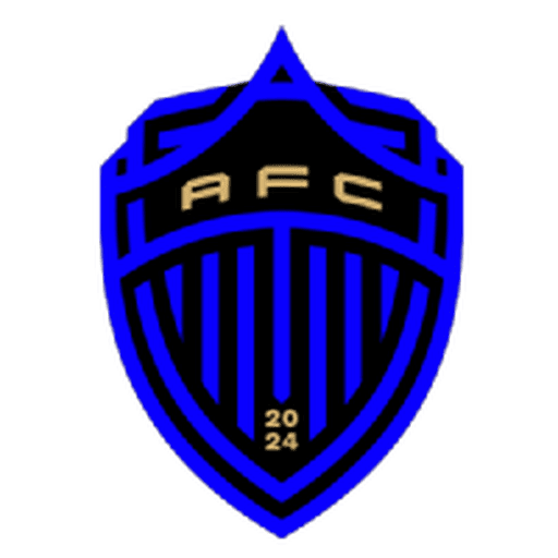
Auckland FC Logo
Official Logo 512×512 (2026/27)
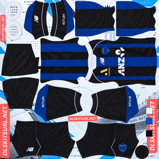
Auckland FC Home Kit
Home Kit 512×512 (2026/27)
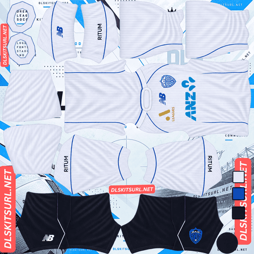
Auckland FC Away Kit
Away Kit 512×512 (2026/27)
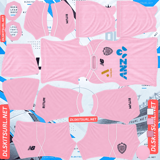
Auckland FC GK Home Kit
GK Home Kit 512×512 (2026/27)
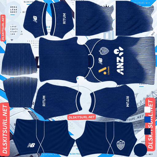
Auckland FC GK Away Kit
GK Away Kit 512×512 (2026/27)
The away kit uses a technique DLS handles particularly badly, so it is worth understanding what the design is trying to do before judging the file.
The mountains are made of spacing, not ink
Released by New Balance, Auckland’s away is inspired by the misty Waitākere Ranges. It is predominantly white, with blue seam piping and royal blue accents. Across the front, vertical lines of tiny blue raindrops gradually become denser toward the hem, creating the appearance of misty mountain peaks.
Which is a halftone, used to make a picture
The mountains are not actually drawn as solid shapes.
They appear because the raindrops become dense enough in certain areas to read as a continuous form, while remaining separated elsewhere.
In other words, the picture exists in the spacing between the dots as much as in the dots themselves.
That is what makes this design difficult for a 512×512 DLS file.
And compression destroys spacing first
A tiny dot is one of the smallest repeating elements a shirt design can use, and 512×512 is already close to thumbnail resolution when the whole shirt is represented in one image.
The raindrops therefore begin to merge.
The problem is that they do not merge only where the original designer intended. They start merging across the shirt.
That is the opposite of what the graphic needs.
The original design relies on controlled density in one region and separation in another. Once the distinction disappears, the result becomes a general blue haze rather than a mountain silhouette.
So this design does not simply become weaker.
It effectively inverts.
The merging effect that was supposed to reveal the mountains happens everywhere, which removes the mountains themselves.
Elche’s halftone third and Monza’s dotted wave pattern use dots decoratively, so their details can collapse into texture while the overall idea remains. Auckland is different because the dots are being used to represent an actual image.
And the mountains sit at the hem
There is a second problem.
The raindrops become densest toward the hem, which is already one of the smaller areas of the kit template once the shirt is mapped onto the player.
Then the shorts cover part of that lower section.
So even a file capable of holding the gradient would lose some of the mountain shape when the full kit is assembled.
That is a position problem independent of the halftone problem.
Al-Ittihad’s hem-level tiger claw, Puebla’s hem piping and Cagliari’s hem coordinates run into the same general limitation: detail positioned too close to the bottom edge has less room to remain visible.
But the piping survives
The blue piping along the seams is narrow, but it has something the mountain graphic does not: strong contrast.
Royal blue against white gives the piping a wide colour separation, so the narrow lines can survive even though the raindrops cannot.
That makes the piping your best quality check on this shirt.
If the piping is blurred or broken, the file itself needs attention.
If the piping is crisp but the mountains are missing, that does not automatically mean the file is bad. The mountain effect is simply operating beyond what this resolution can preserve.
Also confirm the dimensions. On a computer, open the image in a new tab and check the browser’s reported size. A large-looking preview is not proof that the actual file is 512×512.
And you keep a readable kit
The base colour is much easier for DLS to handle.
White is the brightest practical shirt colour and has no blending problem with the green pitch.
So the graphic may disappear while the shirt remains highly readable: you lose the concept but keep a clean white kit with blue piping.
Houston’s away and Hoffenheim’s lilac third produce a similar result, where the difficult visual concept can disappear without making the underlying shirt unusable.
Use navy or black numbers on the away.
White numbers on white are invisible, which is the common mistake on pale kits. The kit preview does not necessarily reveal it because number colours come from separate in-game swatches.
The home is black and blue, which is the harder pairing
Auckland’s 26-27 home uses a black and blue colour scheme and was launched ahead of the club’s pre-season fixture against Tottenham.
Which is the lowest-contrast combination this site covers
Black and blue are already close in value, so there is little natural separation between the two.
The strongest pairings are yellow on black and white on black. Red on black remains usable. Blue on black sits at the lowest-contrast end of the combinations covered here, alongside examples such as Inter and Minnesota.
The exact shade of blue matters enormously.
A bright or electric blue can lift itself away from black.
A navy or dark royal blue can simply disappear into it.
So check the blue before anything else
Open the home at full size.
If the blue looks bright and clearly separated from the black, the design has enough contrast to carry into DLS.
If the blue looks like a dark tone placed over another dark tone, expect the shirt to become predominantly black.
Fine blue elements are even more vulnerable. Pinstripes, piping and narrow lines have two problems working against them: low contrast and narrow width.
Midtjylland’s red pinstripes on black provide a borderline example. Blue on black is an even harder test.
Visibility
An almost entirely black kit becomes one dark shape at match distance.
Blue accents can help only if they are bright enough to break that shape apart. If they remain too close to the black base, they do very little.
That makes the home the harder Auckland kit to follow.
For DLS, the white away is the better choice for the home slot, since that is the slot you will use most often.
Use white numbers on the home.
Zamalek’s fluorescent away and Alavés’s pastel pink show how a bright accent can rescue a dark kit. Inter Miami’s anthracite stripes and Dortmund’s tonal lightning show the opposite: details that remain too close to the base colour do not provide enough separation.
Two fits, one file
Auckland sell the home in two cuts: Replica and Elite, under the idea of “one kit, two fits.”
That distinction is about the garment, not the artwork.
DLS takes one flat image, so the physical cut is irrelevant.
Do not assume an Elite file is higher quality. The fit tells you nothing about the resolution or source dimensions.
The away is replica-only, which removes that complication entirely.
Which Auckland kit survives best?
The home depends heavily on the shade and brightness of its blue. If the blue is too dark, much of the design becomes a black mass.
The away loses its raindrop-to-mountain effect, but the white base and blue piping survive well.
For actual DLS use, the white away is the strongest of the current range.
That is worth acting on: put the white away in your home slot if you want the most readable rotation.
St. Gallen, Viborg and Midtjylland create similar opportunities where a lighter kit can make more sense in the most-used slot than the official home.
The goalkeeper kit inverts the graphic
The goalkeeper version changes the visual balance.
New Balance applied the misty mountain graphic in white over a dark navy base for the away goalkeeper shirt.
Which is a better version for this game
White on dark navy provides much stronger contrast than blue on white.
That does not magically save the halftone. The dots can still merge and the mountain gradient can still flatten.
But any surviving part of the graphic will be easier to see.
DLS accepts any working 512×512 kit URL regardless of what the garment was originally designed for, so the goalkeeper shirt can be used as a legitimate third-slot option if you want the mountain concept in its strongest colour arrangement.
There is one practical problem: goalkeeper shirts are photographed and uploaded much less often than standard outfield kits, so expect very few files.
Auckland’s 25-26 goalkeeper home was pink and white hoops, which is another useful option to know about. Pink sits well away from pitch green and makes it one of the club’s most readable designs.
How to tell if an Auckland file is current
Four checks will settle it:
New Balance branding — New Balance have supplied Auckland since the club’s founding, so the logo alone will not date the file.
The away’s raindrop-to-mountain graphic — this is visible in the original source design even though the detail will not survive the DLS import.
The 25-26 home was black with electric blue pinstripes, which separates it from the current design.
Compare against the cards above rather than relying on a filename.
Auckland are a new club, founded in 2024, so there is not a long kit history to confuse.
That also has a downside: there are fewer historical files available overall.
A note on the A-League season
The A-League runs across two calendar years, with the Australian and New Zealand summer season generally running from October through May.
That is why Auckland’s current range is labelled 26-27.
Kits are also released later than many European club kits, commonly around August and September. Auckland have launched kits at New Zealand Fashion Week in previous seasons, which is useful context when searching by date.
A file labelled simply “2026” is therefore not enough to identify the exact range.
Check the design.
How to use an Auckland FC DLS kits URL
Copy the link using the button on the kit card, not from the browser address bar. The address bar usually gives you the page displaying the image rather than the direct PNG.
Open Dream League Soccer and go to My Club → Customise → Kit. Do not choose Logo; the badge has its own import system.
Select the slot before pasting because the selected slot is the one that gets replaced. Press and hold the field, tap Paste, then Confirm. Older builds may call the button Download.
With the home and away occupying two slots, the third slot remains available for another design.
The goalkeeper shirts are the most interesting alternatives, particularly the pink-and-white 25-26 goalkeeper shirt or the dark goalkeeper version carrying the mountain graphic.
Think about the order of the slots rather than simply following the official kit list. The white away is much easier to follow than the black home.
The first custom kit requires a one-time gem unlock. After that, changing kits costs nothing.
Test the link first
Open the URL in your browser before going into DLS.
The image should appear by itself, and the address should end in .png.
If you see a webpage with headers, buttons or other content surrounding the image, you have a viewer page rather than the direct file.
On the away, do not judge the file by the mountains. They are not expected to survive from a normal 512×512 texture.
Instead, check the blue seam piping.
On the home, look at the blue against the black. If it reads as a bright, distinct colour, the design has something to work with. If it is already difficult to separate from the black at full size, expect the imported shirt to look mostly black.
Why do Auckland kit URLs stop working?
Three problems account for most broken kit links.
Free image hosts delete files. Old uploads can be cleared after months or years while the saved URL continues to exist. Auckland are a new club in a modestly covered league, although New Balance and the club’s strong launch profile help generate attention.
Goalkeeper shirts and restricted or members-only releases are the highest-risk files. The 26-27 home was initially sold through an exclusive member link before wider release.
Hotlink protection can be switched on. The browser may load the image because it is making a normal request to the host, while DLS is refused because its request does not come from the host’s own website. That is why a link can work when opened manually but fail when pasted into the game.
The preview and direct file can be different. Some pages display a thumbnail from their own server while the copied URL points somewhere else. The preview can remain visible after the actual image file has disappeared.
Here, the shirt shown and the link copied refer to the same file on the same server.
The Auckland FC badge
Set the crest in the same session through My Club → Customise → Logo rather than Kit.
Auckland’s badge uses the club’s black-and-blue identity with a stylised design reflecting the city.
DLS crops every badge into a circle, so leave clear space around the complete artwork rather than using a file trimmed tightly to its edges.
Black and blue provide very little natural contrast, making an undersized badge especially vulnerable to becoming a dark blur.
Use a genuine 512×512 badge file rather than enlarging a smaller source.
If you can find a version where white separates the black and blue areas, that is preferable. White performs the same job on the badge that it does on the away shirt: it introduces the contrast the darker pairing lacks.
The badge is particularly important on the home because a black-and-blue shirt can leave very few sharply defined elements once the finer details are reduced.
Keeping your Auckland kits
Custom kits are stored on your device rather than in your account.
A normal game update may leave them in place, but reinstalling the game or changing phones can remove the saved kits and badge.
Make a note of which slot you put the white away in, because the most useful arrangement is not necessarily the official one.
Save all four URLs in a notes app before you begin.
FAQ FOR RANK MATH
What is an Auckland FC DLS kits URL?
A direct link to a 512×512 PNG Auckland shirt that you paste into Dream League Soccer’s kit screen. A working direct file ends in .png.
Will the mountains on the away kit appear?
Not reliably. The mountains are formed by raindrops becoming denser in one area and remaining separated in another. At 512×512, those dots begin merging across the shirt, removing the spacing difference the design depends on.
So does the design simply fade?
No. The problem is more fundamental. The merging effect that was supposed to reveal the mountains can happen across the entire shirt, leaving an even blue haze instead of a mountain silhouette.
How do I check whether the away file is good?
Use the blue piping along the seams. Royal blue against white has strong contrast, so the piping should remain crisp even though the halftone mountain graphic is expected to collapse.
Why is the home kit harder?
Black and blue is a very low-contrast pairing. A bright or electric blue can separate from black, while a dark blue can disappear into it. Fine blue pinstripes and piping are especially vulnerable.
Do Replica and Elite mean different DLS files?
No. They describe different garment cuts, not different artwork. DLS uses one flat image, so the physical fit does not affect the kit texture or its resolution.
Which Auckland kit should I use as my home?
The white away is the strongest choice for visibility. The black-and-blue home can become one dark shape at match distance, while the white base gives you much clearer separation from the pitch.
What number colour should I use?
Use navy or black on the white away, and white on the black home.