
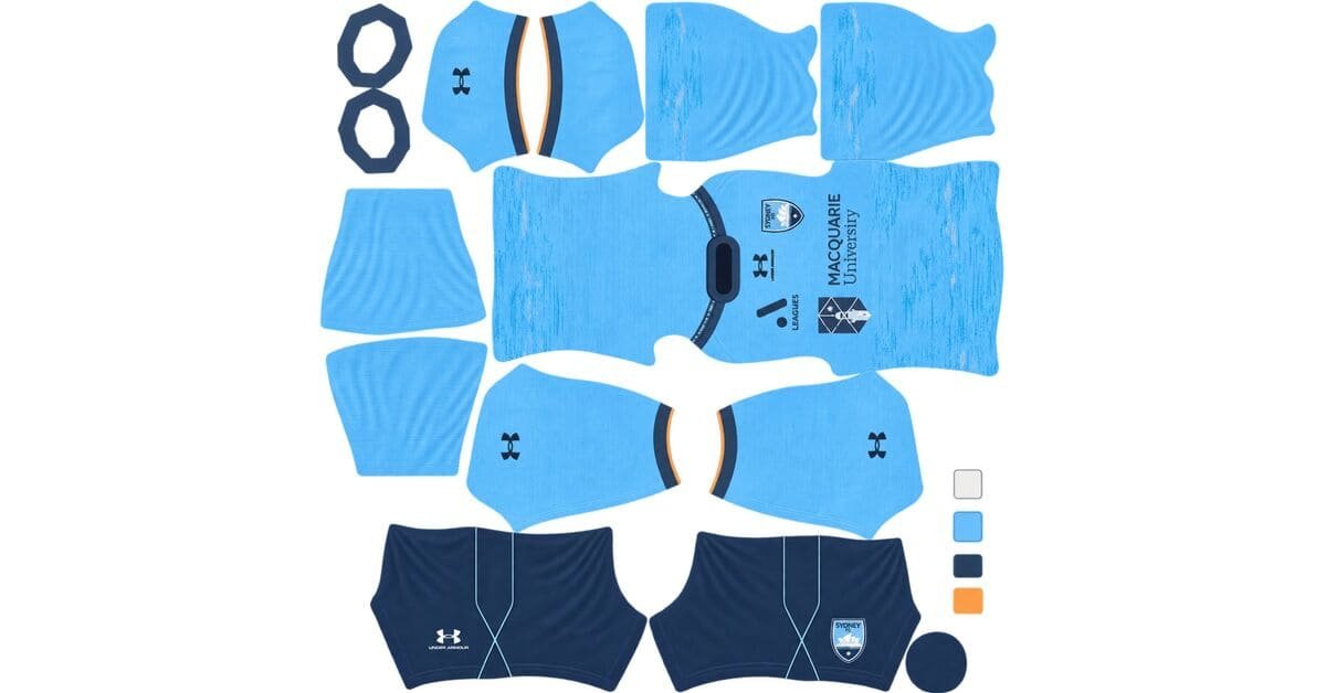
A Sydney FC DLS kits URL is a direct link to a 512×512 PNG Sky Blues shirt you paste into Dream League Soccer. All four slots are below, with each file loaded into the game before it went on this page.
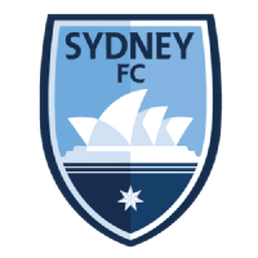
Sydney FC Logo
Official Logo 512×512 (2026/27)
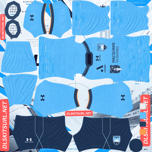
Sydney FC Home Kit
Home Kit 512×512 (2026/27)

Sydney FC Away Kit
Away Kit 512×512 (2026/27)
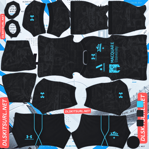
Sydney FC Third Kit
Third Kit 512×512 (2026/27)

Sydney FC GK Home Kit
GK Home Kit 512×512 (2026/27)
Sydney have made landmarks part of their kit language, so there is one question worth asking before judging almost any of them: is the landmark built from bold shapes, or from fine linework?
With a landmark kit, ask whether the building is mass or linework
Released on 29 September 2026 by Under Armour, Sydney’s away is a 90s-inspired tribute to the Harbour Bridge. It also rated better with supporters than the home.
The test that decides it
An architectural reference reproduces or vanishes depending on what the building actually is.
Mass survives. Arches, towers, shells, silhouettes and blocks are bold shapes that still read at thumbnail size.
Linework does not. Steel trusses, glazing bars, railings and lattices are fine repeating lines spread across a shirt. At 512×512, those details start turning into texture.
The Harbour Bridge arch is therefore a good subject. It is one large curve and remains recognisable. The steel latticework inside it is the difficult part.
The same rule applies elsewhere. Opera House shells and city skylines are strong because they are built from large shapes. Adelaide United’s Palm House is harder because its character comes from fine ironwork.
And the Harbour Bridge is the good case
The bridge’s icon is its arch — one great curve with nothing particularly fine about it.
If Under Armour drew that arch, it should survive cleanly. If the shirt relies instead on the steel latticework, expect that detail to reduce heavily.
Open the away at full size and see which version you have. If the structure is clear on the flat image, it has a good chance of carrying into the game.
Portland’s art deco arches and Bologna’s Torre di Maratona are useful comparisons: both rely on larger architectural shapes that hold together at this resolution.
The 90s reference helps too
Designs from that era were generally built around flat colour and strong shapes rather than the sublimated textures and tonal treatments that cause trouble in a flat PNG.
So a 90s-inspired kit starts with a structural advantage, regardless of the exact graphic.
Boca’s 06-07 revival, Schalke’s 1980s Trefoil away, Cerro Porteño’s 1990s remake and Tolima’s Racing tribute all benefit from the same basic principle.
What to check
Compare the file against the card above and run the usual structural checks:
Any boundary between two colours should be sharp rather than smeared.
Collar and cuff trim should have clean edges.
Under Armour branding, the crest and sponsor should remain crisp.
Confirm the dimensions. On a computer, open the image in a new tab and check the actual image size reported by the browser.
The third is dedicated to The Cove, and none of it survives
Released after the home and away, the third uses a sleek black base covered in a bespoke tonal graphic across the front and sleeves, dedicated to The Cove, Sydney’s active supporter group. Black shorts and socks complete the strip.
Which fails twice before you start
The first problem is tone. The graphic uses the same colour in a different shade, so there is no strong colour boundary for a 512×512 image to preserve.
The second is the black base. Black gives tonal graphics very little room to work with. As the shade gets darker, the available range above and below it becomes smaller.
Expect a plain black shirt.
That is a contrast problem, not evidence of a bad file. No 512×512 version can manufacture contrast that is not present in the original design.
And “bespoke” is the warning word
Manufacturers can use premium techniques on bespoke shirts: sublimated textures, tonal weaves, embossed relief and other surface effects.
A flat PNG cannot reproduce the physical part of that construction. It can only carry colour and shape.
So when a launch description calls a kit bespoke, expect its defining surface treatment to be the first thing lost. AC Horsens’ home this season carries the same warning; Silkeborg’s use of a competition template points in the opposite direction.
So a tribute kit arrives carrying no tribute
The graphic is the dedication. Once it disappears, the shirt is simply black.
An all-black strip is also one of the weakest choices for match visibility. Black shirt, black shorts and black socks create one dark mass at playing distance, with very little separation between the individual pieces.
Use white numbers if you choose it. On this strip, the number is one of the few bright elements you can introduce.
Zamalek’s fluorescent away and Alavés’ pastel pink show how a dark kit can be rescued by a bright contrast element. Sydney’s third does not have that advantage.
Sky blue is doing the real work
Sydney’s identity is built around sky blue, supported by navy and white.
Which is a genuinely good base
Dream League Soccer renders players small, so shirt visibility depends heavily on how far the base colour sits from the pitch.
Sky blue is bright and saturated, giving it useful separation from green grass. It reads as a distinct shirt rather than a dark shape.
It is also a markedly better base than navy.
Yellow sits at the top of the visibility scale used here, with orange also excellent. White is very good, while Sydney’s sky blue is comfortably good. Navy is merely adequate, and black is poor.
There is also a useful internal contrast between sky blue and navy. One is light and the other dark, so navy detailing has enough value difference to remain visible.
Whatever landmark appears on the home, the base colour is already working in your favour.
Number colour
Dream League Soccer takes number colours from two small swatches on the kit template rather than reading them from the shirt image. One controls shirt numbers and the other controls shorts numbers.
Use navy or white on the sky blue home and white on the black third.
The home
Released on 10 September 2026 alongside the goalkeeper kits, Sydney’s home is described as a contemporary celebration of the city, its landscape and the club’s heritage.
Compare the file against the card above rather than relying on a written description elsewhere. Then apply the same structural checks used for the away.
And apply the landmark test again
If the home carries a cityscape or skyline, that is a silhouette: bold mass that should survive.
If it instead depends on fine architectural detail or a tonal landscape texture, expect the smaller details to reduce or disappear.
Sydney have stayed in this territory before. Their 25-26 home used the city skyline, while the away referenced ocean pools.
The club therefore has a recurring visual language. The important part for DLS is identifying which part of that language the PNG actually contains.
Which Sydney FC kit survives best?
The home has the strongest base because sky blue plays well against the pitch, although its landmark graphic still needs the mass-versus-linework test.
The away benefits from the 90s-inspired construction, and the Harbour Bridge arch should reproduce well if that bold curve is the main graphic.
The third is the weakest. Once its tonal Cove graphic disappears, it becomes an all-black kit with black shorts and socks.
Worth acting on: the third is effectively plain black in DLS, so the back catalogue deserves a look before giving it one of the three outfield slots.
The back catalogue is unusually strong
Sydney produce more special kits than many A-League clubs, which gives you several alternatives when a current design does not translate well.
Recent options include:
A 24-25 third inspired by the Sydney Opera House
A 24-25 Unity Kit, the club’s first, celebrating diversity and inclusivity
A 25-26 away in sky blue and grey pinstripes
A 19-20 third with anthracite shorts and socks
All are usable in DLS if you have a working 512×512 URL. The game does not require the shirt to belong to the current season.
The Opera House one is the pick
The Opera House is defined by its large shells — broad curved masses with clear edges against the sky.
That is almost the ideal landmark construction for a 512×512 image.
It is the clearest example of Sydney’s landmark approach working in your favour, and it makes more sense as a third-slot choice than the current tonal black shirt.
And the 25-26 away is a pinstripe caution
Sky blue and grey are a relatively narrow pairing. Grey is neutral, and against a mid-light blue the difference in value can be modest.
At pinstripe width, that puts the design close to the losing end of the contrast scale.
Expect the stripes to be faint or absent.
Midtjylland demonstrated the pinstripe contrast problem clearly this week; Sydney’s sky-blue-on-grey version sits toward the weaker end of the same scale.
How to tell if a Sydney file is current
Four checks narrow it down:
Under Armour branding — Under Armour took over from Puma in 19-20, so the supplier alone cannot date a recent file.
Check the sponsor, which provides a tighter dating clue.
The away should carry the Harbour Bridge reference and its 90s-inspired character.
A black shirt with a tonal graphic is the 26-27 third, rather than an older design.
Point three is the strongest current-season marker.
A note on the A-League season
The A-League runs across two calendar years, with its Australian summer season extending from October into May, so Sydney’s current kits are labelled 26-27.
Kits are generally released around September, later than many European clubs. Sydney also staggered this range: the home appeared in September, the away later that month and the third several weeks afterward.
That means a file labelled simply “2026” could refer to more than one kit cycle.
Check the design, not just the year in the filename.
How to use a Sydney FC DLS kits URL
Copy the link with the button on the kit card, not from the browser address bar. The address bar often gives you the webpage rather than the image itself.
In Dream League Soccer, go to My Club → Customise → Kit. Logo is a separate system.
Select the slot before pasting because the selected slot is the one that gets replaced. Press and hold the field, tap Paste, then Confirm. Older builds may call that button Download.
Three outfield kits fill three outfield slots. That makes the slot decision important here: the Opera House alternative is a more useful third than the current black tonal kit.
Set shorts and socks deliberately as well, since the game treats them independently.
The first custom kit requires a one-time gem unlock. After that, kit changes are free.
Test the link first
Open the URL in your browser before importing it. The image should appear by itself, and the address should end in .png.
A webpage with headers, buttons or other elements around the image is a viewer page, not the direct file DLS needs.
For the away, establish whether the graphic actually gives you the bold arch or the fine latticework before judging it. A truss that arrives as texture is a limitation of the design at this resolution, not necessarily a bad source file.
The third is different. Its tonal graphic is unlikely to provide a useful visual quality test because the contrast is already too low. A better file cannot create a tonal difference that the original does not have.
Why do Sydney kit URLs stop working?
Three problems account for most dead kit links.
Free image hosts delete files. Older uploads can disappear after months or years while the original page remains accessible. Sydney are one of the better-supported A-League clubs, so current files are easier to find, but older special kits such as the Unity Kit and earlier thirds carry more risk.
Hotlink protection can be switched on. The host may allow the image to load on its own website while refusing requests coming from the game. That is why a URL can work in your browser but fail after you paste it into DLS.
The preview and the direct file can be different. A page may display a thumbnail from one location while the copy button points somewhere else. The preview can continue working after the actual direct file has disappeared.
For the cards on this page, the shirt shown and the copied URL are the same file on the same server.
The Sydney FC badge
Set the crest during the same session by opening Logo instead of Kit.
Sydney’s crest uses a sky blue shield with the club name and a stylised central design.
DLS crops imported badges into a circle. Because a shield narrows toward the bottom, a file trimmed tightly around the artwork can lose part of its shape during that crop.
Use a genuine 512×512 badge with clear space around the design.
Navy against sky blue provides useful value contrast, so the main crest should remain readable. The small lettering is more vulnerable and will soften first.
The badge matters particularly on the third. Once the tonal graphic disappears, the crest becomes one of the few sharply defined elements left on the black shirt.
Keeping your Sydney kits
Custom kits are stored on the device rather than in your account. Reinstalling the game or changing phones can therefore remove the kits, along with the badge.
Save the four URLs somewhere outside the game. It is also worth noting which third you selected, since the current black tonal design and the 24-25 Opera House alternative serve very different purposes in DLS.
FAQ FOR RANK MATH
What is a Sydney FC DLS kits URL?
A direct link to a 512×512 PNG Sky Blues shirt that you paste into Dream League Soccer’s kit screen. A working direct file normally ends in .png.
Will the Harbour Bridge show up on the away kit?
It depends on which part of the bridge the graphic emphasises. The arch is a single bold curve and should survive well. The steel latticework is fine repeating linework and can reduce to texture at 512×512.
Does the landmark test work on other Sydney kits?
Yes. Ask whether the landmark is represented by mass or linework. Opera House shells and city skylines are large shapes and tend to survive, while fine ironwork and trusses are much harder to preserve.
Will the Cove graphic on the third appear?
Expect very little of it to remain. It is a tonal graphic on a black base, giving the image extremely little contrast to work with.
What will the third look like in DLS?
Effectively a plain black shirt with black shorts and socks. That also makes it one of the weakest Sydney options for match visibility.
What is a better third-slot option?
The 24-25 Opera House-inspired third is the strongest alternative because its large curved shells are much better suited to 512×512 reproduction.
What number colour should I use?
Navy or white on the sky blue home, and white on the black third.
Is sky blue good for Dream League Soccer?
Yes. It is bright and saturated enough to separate well from the green pitch and is a better visibility base than navy.
Why might the 25-26 away pinstripes barely appear?
Sky blue and grey provide relatively narrow contrast, and thin pinstripes have very little room to survive when the value difference is already small. Expect them to become faint or disappear at match distance.