
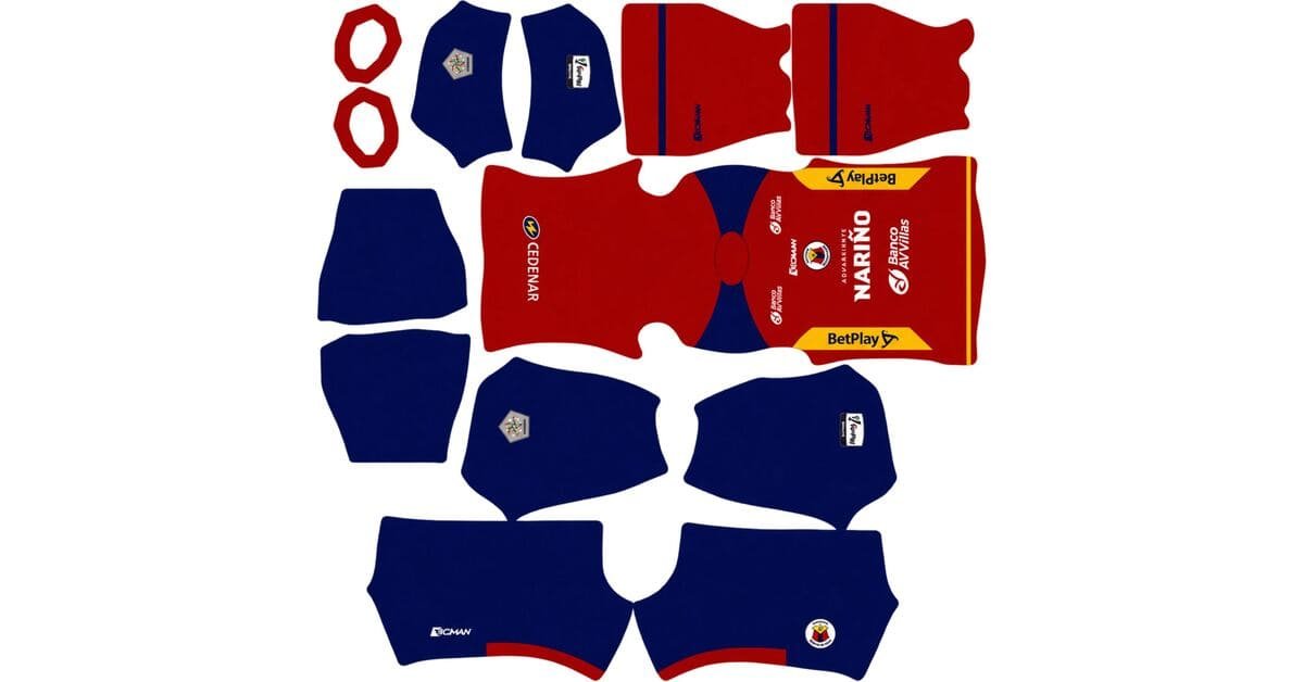
A Deportivo Pasto DLS kits URL is a direct link to a 512×512 PNG Pasto shirt that you paste into Dream League Soccer. All four slots are below, each file loaded into the game before it went on this page.
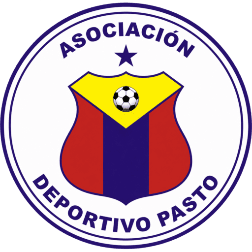
Deportivo Pasto Logo
Official Logo 512×512 (2026/27)
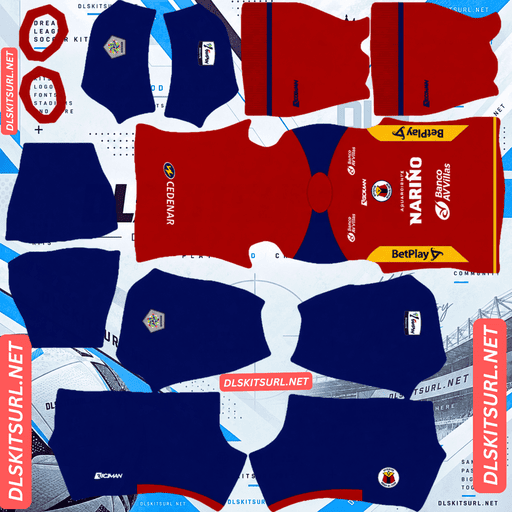
Deportivo Pasto Home Kit
Home Kit 512×512 (2026/27)

Deportivo Pasto Away Kit
Away Kit 512×512 (2026/27)

Deportivo Pasto Third Kit
Third Kit 512×512 (2026/27)
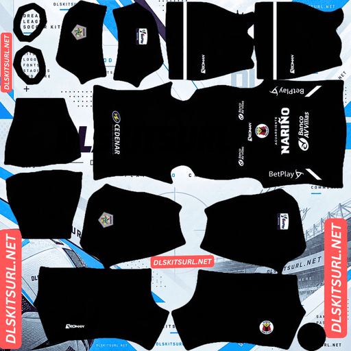
Deportivo Pasto GK Home Kit
GK Home Kit 512×512 (2026/27)

Deportivo Pasto GK Away Kit
GK Away Kit 512×512 (2026/27)

Deportivo Pasto GK Third Kit
GK Third Kit 512×512 (2026/27)
The anniversary third has gold detailing, which usually loses its shine and can disappear altogether. Pasto’s version has something working in its favour: the black background gives the flattened gold enough contrast to remain visible.
Gold on black is the one combination that saves the trim
Released on 7 February 2026 under the concept “El orgullo sigue intacto”, the third marks twenty years since Pasto’s championship, won against Deportivo Cali. It has a black base with gold detailing, is made by Boman, and carries Aguardiente Nariño as sponsor.
Gold always loses its metallic finish
Gold looks metallic because of the way light moves across it. A bright highlight, a mid-tone and a darker shadow create the impression of a reflective surface.
A flat 512×512 image cannot reproduce that effect. The gradient and surface quality are reduced to a much simpler colour, so the gold arrives as flat yellow-gold.
That happens regardless of the kit or the quality of the source file. The metallic finish is what disappears.
The remaining colour still needs a background
Losing the shine does not automatically mean losing the gold detail.
Once the metallic effect is flattened, what remains is a yellow-gold colour. Whether you can still see it depends on the colour underneath.
Black gives that colour the strongest possible contrast.
On a dark base, the gold remains clearly visible even when its metallic finish has gone. Against navy or burgundy, the difference is less convincing. Against mint or cream, the flattened gold can become difficult to distinguish.
This is the contrast-and-scale rule applied to metallic details: narrow elements are not necessarily lost if the colour contrast is strong enough.
Pasto’s gold trim should survive as yellow-gold against black. It will be thinner than on the physical shirt and will not have the original shine, but the design remains recognisable.
Austria’s gold Art Nouveau lines on mint show the opposite result. Once the metallic effect disappears, there is very little contrast left to carry the detail.
The gold edges are your quality test
Narrow details with strong contrast are useful for spotting compression damage.
Look closely at the gold edges at full size. They should be continuous and clearly separated from the black. Soft, broken or uneven edges suggest a weak source file.
Check the dimensions as well. On a computer, right-click the image and open it in a new tab; your browser will report the actual size.
Black and gold is reasonably readable in a match
A black shirt normally appears as one dark shape at match distance. Pasto’s gold gives it something brighter to break up that silhouette.
The more gold the design carries, the easier it is to distinguish from the pitch and surrounding players.
That is why this is a better black kit for visibility than most. Zamalek’s fluorescent away and Alavés’ pastel pink use the same principle: a dark kit becomes easier to follow when its brighter details have enough contrast.
Use white or gold numbers on the third. Both stand out against the black base.
Anniversary shirts are harder to replace
There is one practical point worth remembering.
This is a one-off anniversary design, not a regular league shirt. Expect fewer files to be available, and fewer uploads to remain online over time.
If you want this version, save the working link while you have it.
Basel’s Carnival kit, Grasshoppers’ limited edition and Palmeiras’ Avanti shirt fall into the same category.
The away uses contrasting sleeves
Released on 16 January 2026, the away is built around a blue base with red and yellow details and a contrasting-sleeve construction.
Contrasting sleeves are reliable in DLS
The reason is simple: the colour change follows the armhole seam.
That seam already exists in the DLS kit template, so the sleeve and body are mapped separately. The boundary falls where the game expects it to be.
There is no stripe crossing the seam, no diagonal to align and no extra boundary for the image to get wrong.
The sleeve change should reproduce cleanly from almost any decent file.
Austria, Lorient, Cagliari, Alavés, Basel, Young Boys, Grasshoppers and Cremonese all use contrasting sleeves this season. Designs that follow the construction of the garment tend to reproduce more reliably than graphics laid across it.
The colours help with visibility
Blue separates clearly from pitch green, while red and yellow both provide strong contrast wherever they appear.
That makes the away a fairly readable kit. The contrasting sleeves also give the player’s silhouette a clear shape.
Use white or yellow numbers, depending on which colour occupies most of the upper back.
What to check
Compare the file against the card above, paying attention to where the red and yellow meet the blue.
Both colours have a clear contrast against blue, so those boundaries should remain distinct.
A smeared edge is a sign of a weak file. The sleeve construction itself is forgiving; the colour boundaries are the more useful places to inspect.
The home is the club’s tricolour
Also released in January 2026, the home uses Pasto’s traditional red, yellow and blue. These are the colours of Nariño and the source of the club’s Fuerza Tricolor nickname.
The arrangement is relatively plain, but all three colours have something going for them in DLS.
All three colours work on the pitch
Yellow is one of the easiest colours to distinguish from pitch green. Red also separates strongly, while blue remains clear of the grass.
That gives Pasto an advantage over several other tricolour clubs.
Fluminense’s green and Bahia’s dark blue can be harder to track against the pitch. Pasto avoids much of that problem because all three of its main colours remain visually distinct.
A plain design is not much of a file test
There is no intricate texture, complicated gradient or dense pattern to preserve.
That makes the shirt straightforward to reproduce, but it also means a weak file can look almost as convincing as a good one.
Judge the image by its defined details instead: the collar, cuffs, crest, Boman branding and sponsor. Confirm the dimensions rather than relying on the overall appearance.
Bologna’s away, Monza’s home, Lecce’s stripes and Heidenheim’s away have a similar advantage: simple designs that offer relatively little visual information to test.
Check where the three colours meet
Although the home is uncomplicated, the colour boundaries are not all equally strong.
Red against yellow: strong contrast, although a weak file can blur the boundary toward orange.
Blue against yellow: very strong contrast, so the separation should remain clear.
Blue against red: the weakest pairing, since both are relatively dark and saturated.
Inspect the blue-red boundary first. It is the part most likely to merge if the source has been enlarged or compressed.
Fluminense’s green and maroon and Bahia’s blue and red face the same problem. Both rely on white elements to keep their darker colours separated.
Number colour
Use white or black on the home.
With red, yellow and blue already covering the shirt, none of the club colours is a dependable number choice across the whole back. A neutral colour is the safer option.
Which Pasto kit survives best?
The home is the strongest for colour visibility, with red, yellow and blue all separating well from the pitch. Its plain design also makes reproduction straightforward.
The away has the most reliable construction detail. The contrasting sleeves follow the existing armhole seam, so they should remain cleanly separated.
The third is the most interesting file to check. Its gold loses the metallic finish but remains visible against black, making the anniversary design more successful in DLS than gold detailing usually is.
Expect fewer files than usual
This matters when searching for Deportivo Pasto kits.
Pasto are supplied by Boman, a Colombian manufacturer with little international presence.
That creates two practical problems.
First, there is less coverage. Kit sites follow Nike, Adidas and Puma releases closely, while domestic brands receive far less attention. There are consequently fewer images available to work from.
Second, the supplier does not help much with dating older files. With a global manufacturer, a change of brand can narrow an image down to a particular season. Boman does not offer that same clue here.
Compare files against the cards above rather than trusting their filenames, and save working links when you find them. Replacing a Pasto file is harder than replacing one for a widely covered European club.
Deportivo Pereira, Atlas, Santos Laguna and Cremonese face similar problems with their domestic suppliers.
How to tell if a Pasto file is current
Four details will help identify the 2026 range:
Aguardiente Nariño appears as the sponsor.
The third is black with gold detailing, marking the anniversary.
The away has a blue base with contrasting sleeves.
Compare the home against the cards above, since Pasto’s tricolour design can look similar across different seasons.
The black-and-gold third is the strongest identifier. It is specific to the 2026 anniversary and much easier to distinguish from the club’s regular designs.
How to use a Deportivo Pasto DLS kits URL
Copy the link using the button on the kit card, not your browser address bar. The address bar will often give you the webpage instead of the actual image.
Open Dream League Soccer and go to My Club, then Customise. Choose Kit, not Logo, because the badge is managed separately.
Select the slot you want to replace before pasting. Press and hold the URL field, tap Paste, then choose Confirm. Older versions may show Download instead.
The three outfield kits fill the three available outfield slots, leaving the goalkeeper slot free.
The first custom kit requires a one-time gem unlock. After that, changing kits is free.
Test the link first
Open the URL in your browser before importing it.
The image should fill the screen on its own, and the address should end in .png.
If you see a webpage with headers, buttons or other controls around the image, it is a viewer page rather than the direct file DLS needs.
For the third, inspect the gold edges. Narrow details with strong contrast reveal compression damage quickly, and they are the best quality check in this range.
The home is less useful as a visual test. Its plain design can look convincing at several different resolutions, so confirm the dimensions and pay particular attention to any blue-red boundary.
Why do Pasto kit URLs stop working?
Three common problems account for most broken links.
Free image hosts delete files. Unused uploads can be removed after months or years, even though the old URL remains in an article.
Pasto is a mid-sized Colombian club using a domestic supplier, which means fewer files are available than for Millonarios, Nacional or América de Cali. The anniversary third is the hardest design to replace, since it is a one-off release rather than a regular league shirt.
Hotlink protection is another cause. Some hosts allow an image to open in your browser but reject requests coming from outside their own website. Dream League Soccer then fails to load a URL that appeared to work when you tested it.
The preview and the copied link can also point to different files. A page might display a thumbnail hosted on its own server while the copy button leads to an external image. The preview can remain visible even after that external file has disappeared.
Here, the shirt shown on the card and the URL you copy are the same file on the same server.
The Deportivo Pasto badge
Set the crest in the same customisation session, but choose Logo instead of Kit.
Pasto’s badge uses the club’s red, yellow and blue, along with the volcano that gives Los Volcánicos their name.
A volcano silhouette is a useful shape for DLS. It has a recognisable outline rather than relying entirely on fine detail, so the main figure should remain visible at the small size used beside the score.
The challenge is fitting three colours into a small badge. Use a genuine 512×512 file rather than an enlarged image, since red and blue are the first colours likely to merge when the artwork becomes soft.
DLS crops every badge into a circle, so leave clear space around the complete design rather than using an image trimmed tightly to the artwork.
Also check for a championship star if it appears on your chosen version. Stars usually sit near the top of a crest, exactly where the circular crop is most likely to cut into them.
Keeping your Pasto kits
Custom kits are stored on your device, not in your account.
A normal game update usually leaves them in place, but reinstalling the game or changing phones can remove the kits and badge.
That is particularly important with Pasto because replacement files are harder to find. Save all four links in a notes app before importing them, so you have a copy if the game loses your customisation.
FAQ FOR RANK MATH
What is a Deportivo Pasto DLS kits URL?
A direct link to a 512×512 PNG Pasto shirt that you paste into Dream League Soccer’s kit screen. A working direct link ends in .png.
Does the gold detailing on Pasto’s third kit survive?
Yes, as a colour. The metallic shine disappears in a flat image, but the remaining yellow-gold contrasts strongly against the black base.
Why does gold usually disappear in DLS?
Gold depends on highlights, shadows and gradients to look metallic. Once those effects flatten, the remaining colour can blend into pale or mid-tone backgrounds. Black provides enough contrast to keep it visible.
What is the third kit celebrating?
It marks twenty years since Pasto’s championship against Deportivo Cali. It was released under the concept “El orgullo sigue intacto”.
Why does the away kit reproduce reliably?
Its contrasting sleeve colours follow the armhole seam, which the DLS template already maps separately. The boundary therefore falls where the game expects it, without requiring extra alignment.
What should I check on the home kit?
Inspect any boundary where blue meets red. They are the closest colour pairing on the shirt, so that is where a weak file is most likely to blur the design.
What number colours should I use?
Use white or black on the tricolour home, white or yellow on the blue away, and white or gold on the black third.
Why are there fewer Pasto kit files online?
Pasto use Boman, a domestic Colombian manufacturer with much less international coverage than Nike, Adidas or Puma. Fewer sites track its releases, so fewer images circulate.