
A Deportivo Pereira DLS kits URL is a direct link to a 512×512 PNG Matecaña shirt that you paste into Dream League Soccer. All four slots are below, each file loaded into the game before it went on this page.

Deportivo Pereira Logo
Official Logo 512×512 (2026/27)

Deportivo Pereira Home Kit
Home Kit 512×512 (2026/27)

Deportivo Pereira Away Kit
Away Kit 512×512 (2026/27)
Deportivo Pereira Third Kit
Third Kit 512×512 (2026/27)

Deportivo Pereira GK Home Kit
GK Home Kit 512×512 (2026/27)
Deportivo Pereira GK Away Kit
GK Away Kit 512×512 (2026/27)
Pereira’s away uses one of the best colours for this game, while the home relies on stripes thin enough that the source file actually matters.
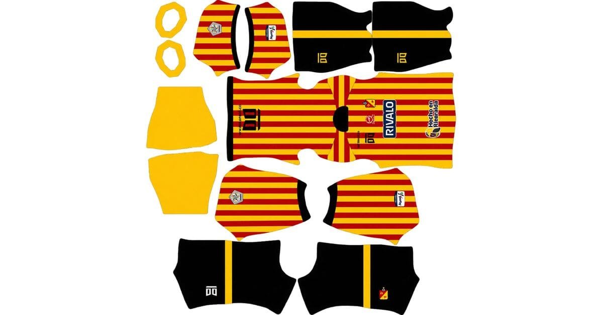
The home’s stripes are thin, but the colours carry them
Launched in January 2026, the home keeps Pereira’s traditional red and yellow stripes, although the stripes are particularly thin this season. It comes with black shorts and black socks, is made by Oto, and carries Rivalo Apuestas as sponsor.
Thin does not automatically mean lost
A narrow stripe is not necessarily a bad fit for a 512×512 image.
Contrast and scale have to be considered together. A design with strong colour separation can survive at a smaller size, while a low-contrast design needs much more area before it becomes readable.
Pereira has the better combination here.
Red against yellow has a wide colour range. Yellow is one of the brightest colours available, while red is a much darker saturated tone, so there is a genuine difference between the two.
That means the stripes hold their separation. They may look thinner than they do on the physical shirt, but they remain identifiable.
They are still close to the threshold
The important distinction is that these stripes survive rather than survive comfortably.
With a genuine 512×512 file, you should be able to follow the individual red and yellow lines. With an enlarged or poorly processed file, the edges start to blur and the two colours can merge toward orange.
That orange cast is your warning sign.
Open the image at full size, count the stripes you can clearly follow and look closely at the areas where red meets yellow.
Confirm the dimensions as well. On a computer, right-click the image and open it in a new tab; the browser will show the actual size.
Vertical stripes are forgiving geometry
There is one thing Pereira does not have to worry about: complicated alignment.
Vertical stripes align in a single direction down the kit template. They do not have to cross a horizontal seam or form a diagonal junction.
So there is no major geometry problem here. Resolution is the issue.
Visibility
Dream League Soccer renders players at match distance, so a kit that looks bright on a desktop can still disappear if its colours sit too close to the pitch.
Pereira’s home has the opposite problem.
Yellow sits well away from pitch green, while red also has strong separation from the grass.
Both colours remain easy to distinguish, making this one of the more readable striped shirts covered here.
For the numbers, use black or navy. The stripes continue across the back, so red or yellow numbers would disappear whenever they land on the matching colour. Black also ties the number colour into the shorts and socks.
The black shorts work in your favour
Dream League Soccer maps the shirt, shorts and socks as three separate areas.
That makes Pereira’s combination straightforward: the striped shirt stays on the shirt, while the plain black shorts and socks occupy their own mapped sections.
There is no seam where the colours need to line up.
Set all three areas deliberately after importing, because it is easy to paste the shirt and leave the other two on whatever colours were already selected.
Bahia and Young Boys use the same basic multi-garment approach.
The lilac away is the best colour in the game
Pereira’s second kit takes a much simpler route, using lilac across both the shirt and shorts.
It is unusually well suited to DLS
Purple and lilac sit a long way from pitch green. The colour is bright, saturated and visually separated from the background players run across.
The matching lilac shirt and shorts also keep the entire upper body and legs in one strong block rather than breaking the silhouette into several darker sections.
This is the most readable Pereira kit by a clear margin.
If you regularly lose your own players in crowded matches, this is the one worth putting in the home slot.
Fiorentina, Hoffenheim’s third, Austin FC, Orlando City, Dortmund, Marseille and Alianza Lima’s Morada benefit from the same general colour advantage.
A single colour also reproduces cleanly
There is very little for a flat image to lose when the design is mostly one colour.
No texture needs to survive. There is no complex gradient to flatten and no tonal pattern that can disappear.
The lilac should arrive looking like lilac.
That also means the shirt itself is not a very demanding quality test. A poor file can look convincing simply because there is so little design information to reproduce.
Instead, inspect the crest, Oto branding, sponsor and dimensions.
Number colour
Use white or black for the away numbers.
Both have clear contrast against lilac. Avoid colours close to purple, since they can sink into the shirt rather than standing apart from it.
The third pairs the worst colours with a bright rescue
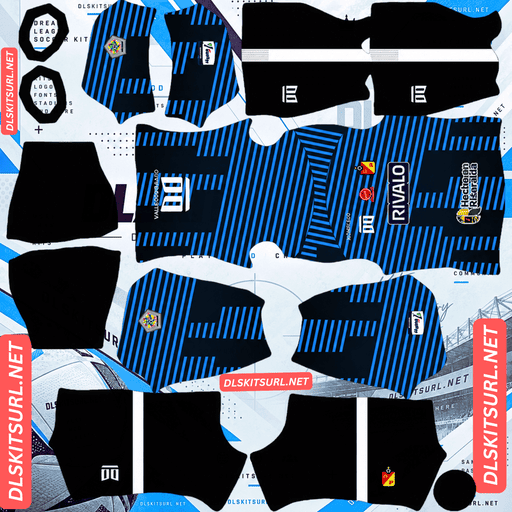
Pereira’s third introduces blue and black, with pink also forming part of the design.
Blue on black is extremely difficult
Blue and black are both dark, saturated colours.
That gives them very little internal value separation, making blue on black one of the weakest common football colour pairings for a 512×512 file.
Inter Milan’s home is the familiar example. The blue stripes are present, but whether they remain obvious depends heavily on how cleanly the source image handles the contrast.
So if Pereira’s third uses blue-on-black patterning, expect some of that structure to reduce.
Pink changes the equation
Pink against black is completely different.
Pink is bright and saturated while black is the darkest possible base, so there is genuine contrast between the two.
Wherever the pink appears, it should survive much more convincingly than the blue.
That is the same basic mechanism behind Zamalek’s fluorescent accents on black and Alavés’ pastel pink elements.
Check the pink sections at full size. They are the strongest visual test on this shirt and the part providing much of its structure.
Visibility
At match distance, blue and black can collapse into one dark shape.
The pink is therefore doing most of the work.
The more clearly the pink survives, the easier the third is to follow. If the design contains only small pink details, the overall shirt will remain relatively dark.
Use white numbers to add another bright element to the back.
Which Pereira kit survives best?
The away is the clear winner because its lilac colour reproduces almost effortlessly and gives the player excellent visibility.
The home is also strong, provided the source is a genuine 512×512 file. Its thin stripes are close to the resolution threshold, but the red/yellow contrast gives them enough separation to survive.
The third is the weakest. Blue-on-black loses definition, while the pink accents survive and provide the necessary contrast.
Expect fewer files than usual
This is worth knowing before searching for Pereira kits.
Pereira are supplied by Oto, a Colombian manufacturer without the international footprint of Nike, Adidas or Puma.
That affects the number of files you will find in circulation.
Large global brands receive coverage from kit sites almost immediately, while domestic suppliers generate far fewer uploads. Pereira therefore has fewer sources to work from than clubs such as Millonarios, Nacional or América de Cali.
There is another problem: Oto has been a constant supplier, so the brand itself does not help much with dating an image.
With a global supplier, a logo change can narrow a file down to a particular season. Here, you need to identify the design itself.
Compare the image against the cards above rather than trusting the filename, and save working links when you find them.
Atlas, Santos Laguna and Cremonese face milder versions of the same issue with their domestic suppliers.
How to tell if a Pereira file is current
Four checks make the current range easy to identify.
The home has thin red and yellow stripes, with black shorts and black socks.
The away is lilac, including the shorts.
The third uses blue and black with pink.
Rivalo Apuestas appears as the sponsor.
The lilac away is the strongest identifier.
It is unusual enough that it should immediately separate the 2026 range from previous Pereira kits.
How to use a Deportivo Pereira DLS kits URL
Copy the link from the button on the kit card rather than from your browser address bar. The browser address often points to the page containing the image instead of the image file itself.
In Dream League Soccer, open My Club, then Customise, and select Kit. Do not choose Logo; the badge is handled separately.
Select the slot before pasting because the selected slot is the one that gets replaced. Press and hold the URL field, tap Paste, then Confirm. Older versions may label the final button Download.
The three outfield kits occupy the three available outfield slots, leaving the goalkeeper slot separate.
One useful option is to put the lilac away in your home slot. That kit is much easier to track during a match than the darker third.
The first custom kit requires a one-time gem unlock. After that, changing custom kits costs nothing.
Test the link first
Open the URL in your browser before importing it.
The image should appear by itself, and the address should end in .png.
If the image sits inside a page with headers, buttons or other website controls, you are looking at a viewer page rather than the direct file DLS needs.
For the home, look for the orange cast where red and yellow meet. That is a useful sign that the stripes are beginning to merge because the source is too small or has been enlarged.
For the away, the visual design itself is not much of a quality test. A largely single-colour shirt can look correct even when the file is weak.
Check the dimensions and inspect the crest, Oto branding and sponsor instead.
Why do Pereira kit URLs stop working?
Three problems account for most dead links.
Free image hosts delete files. Unused uploads can be cleared after months or years, leaving an old URL that no longer returns the image.
Pereira has another disadvantage here: it is a mid-sized Colombian club using a domestic supplier. Expect noticeably fewer available files than you would for Millonarios, Nacional or América de Cali.
That makes a good working source worth keeping.
Hotlink protection is the second problem. A host can allow an image to open normally in your browser while rejecting the request made by Dream League Soccer. The result is a URL that looks perfectly healthy when clicked but fails inside the game.
The preview and the direct link can also point to different files. A webpage may display a locally hosted thumbnail while its copy button leads to an external image. The preview can remain visible after the actual file disappears.
Here, the image shown on the card and the copied URL are the same file on the same server.
The Deportivo Pereira badge
Set the crest during the same customisation session, but choose Logo instead of Kit.
Pereira’s badge uses the club’s red and yellow and includes a star marking their league title.
The star is the detail that needs the most care.
DLS crops every badge into a circle, and stars positioned near the top of a crest are close to the area where a tight crop can cut into the artwork.
Use a file with clear space around the entire badge rather than one trimmed tightly to the design.
A genuine 512×512 source is also preferable to an enlarged file. Small details such as a star can become soft or blob-like when an undersized image is scaled up.
The red/yellow combination itself has excellent contrast and remains easy to distinguish at the small size used beside the score.
Boca Juniors, Atlas, Palmeiras, Bahia and Peñarol supporters face similar issues when a star sits close to the edge of the badge.
Keeping your Pereira kits
Custom kits are stored on the device rather than in your account.
A normal game update will generally leave them alone, but reinstalling the game or moving to another phone can remove the kits and badge.
Pereira makes this worth taking seriously because the files are genuinely harder to replace.
Save all four URLs somewhere outside the game. A simple notes app is enough, and it is better to record the kit links before you start importing them rather than trying to recover everything after a reinstall.
FAQ FOR RANK MATH
What is a Deportivo Pereira DLS kits URL?
A direct link to a 512×512 PNG Matecaña shirt that you paste into Dream League Soccer’s kit screen. A working direct link normally ends in .png.
Do the thin Pereira home stripes survive?
Yes, provided the source is a genuine 512×512 file. The stripes are narrow, but red against yellow provides enough contrast to keep them separated. An enlarged or weak file can make them blur toward orange.
How can I tell if the home file is too weak?
Open it at full size and look where red meets yellow. If the colours begin producing an orange cast, the stripe edges are merging. Also confirm that the image is actually 512×512.
Is the lilac away good for DLS?
It is the best kit in the range. Lilac sits far from pitch green, and using the same colour for the shirt and shorts creates one highly visible player silhouette.
Should I use the lilac away as my home kit?
It is worth considering. The home slot is used most often, and the lilac kit is considerably easier to follow than the darker third.
Why is the third harder to reproduce?
Blue and black have very little internal contrast, so blue-on-black patterning can lose definition at 512×512. The pink sections have much stronger contrast and should survive better.
What number colours should I use?
Black or navy on the red/yellow home, white or black on the lilac away, and white on the third. The home needs a separate dark colour because red and yellow already occupy the back.
Why are Pereira kit files harder to find?
The club uses Oto, a domestic Colombian manufacturer with much less international kit coverage than Nike, Adidas or Puma. That means fewer images are available and the supplier logo does not help much when dating older files.
Which Pereira kit is easiest to identify as the 2026 version?
The lilac away. It is unusual enough to be the quickest visual marker, while the home should have thin red/yellow stripes and the third should combine blue, black and pink.