
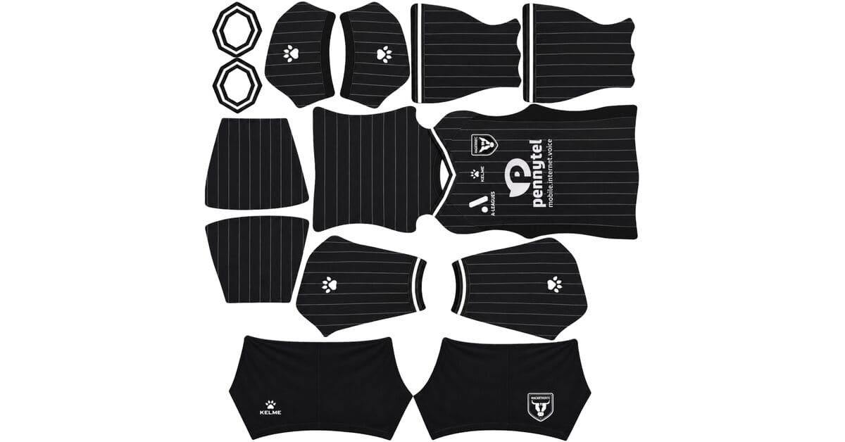
A Macarthur FC DLS kits URL is a direct link to a 512×512 PNG Bulls shirt that you paste into Dream League Soccer. All four slots are below, with each file loaded into the game before it went on this page.
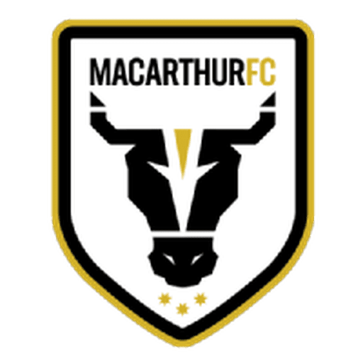
Macarthur FC Logo
Official Logo 512×512 (2026/27)

Macarthur FC Home Kit
Home Kit 512×512 (2026/27)

Macarthur FC Away Kit
Away Kit 512×512 (2026/27)
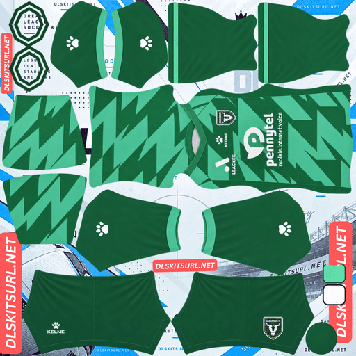
Macarthur FC GK Home Kit
GK Home Kit 512×512 (2026/27)

Macarthur FC GK Away Kit
GK Away Kit 512×512 (2026/27)
The home kit’s pinstripes reproduce about as well as a pinstripe can. The catch is that they still do not look the way you might expect once the players are viewed at match distance.
The best-case pinstripe, and what it still cannot do
Kelme’s 26-27 Macarthur home is predominantly black, covered by crisp, thin vertical white pinstripes, with two-tone striping around the V-neck collar and sleeve cuffs.
White on black is the top of the contrast scale
The pinstripe rule on this site now covers fifteen clubs, and it has stayed remarkably consistent: large colour differences survive; narrow or tonal differences do not.
White against black gives you the maximum possible value difference. There is nowhere further to go.
That puts Macarthur in the best possible position for a thin stripe. Boca Juniors’ navy-on-white away and AGF Aarhus’ navy-on-white home also survive because their stripes have maximum contrast. Midtjylland’s red-on-black home sits closer to the borderline, while the 25-26 third’s off-white-on-cream striping effectively disappears.
So if a pinstripe is going to reproduce, this is the kind that should.
The lines are still thin, though. A genuine 512×512 file matters because the pattern is already working near the limit of what the image can preserve.
Count them to check your file
Open the home image at full size.
If you can separate individual lines, the file is doing its job. If they have merged into a grey wash, suspect an undersized image.
That makes the Macarthur home a useful quality check. You have maximum contrast combined with minimum stripe width, so even a small loss of resolution becomes obvious.
Confirm the dimensions as well. On a computer, open the image in a new tab and check the actual image size reported by your browser.
But at match distance they tint rather than break up
This is the important distinction.
Dream League Soccer shows players relatively small on the pitch. When a pattern becomes too fine to resolve at that size, the lines do not simply vanish. They get averaged together.
Fine white lines over black therefore average toward grey.
At match distance, the Macarthur shirt can read more like a dark grey shirt than a black shirt with individually visible white stripes.
That is not necessarily a bad file. It is a limitation of the pattern at the scale the game displays it.
Which is different from a rescued black kit
Several black kits covered on this site have solved visibility in a different way. They use bright accents that occupy enough area to remain visible as shapes.
Wellington Phoenix uses large yellow and white panels that break up the silhouette. Zamalek uses fluorescent blocks. Alavés has sizeable pastel pink areas. Those accents remain identifiable from distance.
Macarthur’s white is spread across narrow lines instead. Rather than creating separate shapes, it tints the shirt.
Inter Miami’s anthracite striping has the opposite problem: the contrast is so low that the pattern contributes almost nothing.
The Macarthur home is therefore somewhere in the middle for match visibility. The grey effect separates from pitch green better than a completely black shirt, but it is not the same thing as a clearly readable striped pattern.
Number colour
Dream League Soccer takes number colours from two small swatches on the kit template rather than reading them from the PNG. One controls the shirt numbers and the other controls the shorts.
For the home, white or yellow both work. White gives maximum contrast against the black base, although it sits against an overall shirt that may already read as grey. Yellow can provide a little more separation when the pinstripes are dense.
And the collar striping will thin
The two-tone treatment on the V-neck collar and sleeve cuffs occupies some of the smallest areas of the template.
At 512×512, expect the two colours to become less distinct. In-game, the trim may effectively reduce to a single narrow line rather than retaining the full two-tone effect.
Monza’s collar-led home, Paris FC’s three-colour wave collar and Denmark’s flag-coloured V-neck show the same limitation: small multi-colour trim is much harder to preserve than a large panel.
Ochre is your dating check
Macarthur dropped its ochre detailing for 25-26 and moved to a black-and-white-only look.
Which separates the eras at a glance
Ochre on a Macarthur shirt means 24-25 or earlier.
Black and white only means 25-26 onward.
That is more useful for recent dating than the manufacturer. Kelme have supplied Macarthur since 22-23, so the Kelme logo does little to separate the last few seasons.
Use the sponsor as a second reference point when you have one.
The same principle appears elsewhere. Necaxa’s older black striping, for example, can be easier to date through a colour or design the club abandoned than through a supplier that stayed in place.
Both current kits rated poorly
This matters because it affects what you are likely to find online.
Macarthur’s 26-27 home and away sit at the bottom of the A-League supporter rankings supplied for this season.
Which thins the files
A shirt that supporters do not like is less likely to attract people making 512×512 versions of it.
Macarthur are also among the smaller A-League clubs, while the league itself receives relatively modest coverage from kit sites. Put those together and the result is predictable: fewer files and fewer alternatives.
Brisbane Roar’s away and third, Luzern’s gold third, Vaduz’s teal third and Perth Glory’s home have faced similar availability problems this season. Macarthur’s current pair is simply one of the more severe examples.
If you find a working file, save it.
The away
Macarthur’s 26-27 away was released alongside the home and is also made by Kelme.
Rather than trusting a filename, compare the actual image with the card above and run the usual checks:
Colour boundaries should be sharp rather than smeared.
Collar and cuff trim should have clean edges.
Kelme branding, crest and sponsor should remain crisp.
The image should actually be 512×512.
And check it against the home
Macarthur’s recent away shirts have included black-based designs, which creates a practical DLS problem.
If the home and away are both predominantly black, two of your three outfield slots can end up looking almost identical during a match.
Put both source images beside each other and reduce them to thumbnail size. If they still look like the same shirt, replace one with something from the back catalogue.
Lyngby Boldklub demonstrates the same issue this season, with a navy third that sits too close visually to its blue home.
Which Macarthur kit survives best?
The home is the better technical test because its white-on-black pinstripes have maximum contrast, but that does not make it the best-looking kit during a match. The stripes survive in the source image yet become more of a grey tint at player size.
The away needs to be judged against the actual file and, more importantly, against the home. If the two are too similar at thumbnail size, one of them is not doing enough for your three outfield slots.
The pink charity kit is the one to find
There is another Macarthur shirt worth prioritising if you are building a stronger set.
The club’s 25-26 special was pink with black detailing, with Sony Foundation Australia as the sponsor.
Which gets everything right
Pink sits a long way from pitch green. It is bright, saturated and visually separate from the playing surface, making it one of the easier base colours for the game to display clearly.
Black against pink also gives strong contrast, so the detailing has a much better chance of remaining visible.
For a club whose two current shirts are dark, that makes the pink special an ideal third-slot option.
Alianza Lima’s Morada, Sport Recife’s Pink October shirt, Silkeborg’s 25-26 third, Adelaide United’s 25-26 away and Inter Miami’s home benefit from the same basic principle: a strong pink base is difficult for the pitch to swallow.
But charity kits are the hardest to find
The problem is availability.
A one-off shirt worn for a limited occasion, produced for a smaller club in a modestly covered league, naturally attracts fewer kit makers.
If you find a working Macarthur charity-kit URL, save it immediately.
The club also had charity kits in 23-24 and 24-25, so those seasons are worth searching for under the same terms.
Macarthur run a lot of extra kits
There is another reason Macarthur filenames can be misleading.
For 26-27, the club has an Australia Cup home and away in addition to its league pair. In 25-26, there was an AFC Champions League Two home as well as another Australia Cup shirt. Earlier seasons also contain charity and special versions.
Which makes filenames unreliable
A file labelled “Macarthur home” might be the regular league shirt, an Australia Cup version or a continental variant.
The design itself is a better identifier. Compare the image with the cards before deciding which season or competition it belongs to.
And check what actually differs before hunting
Cup and continental versions often change only the competition patches or badge treatment.
That distinction matters less in DLS. Your imported crest replaces the shirt’s crest, while sleeve patches are generally too small to contribute much at game scale.
So a cup version that only changes patches can produce essentially the same result after import.
A version with a different colour arrangement or layout is worth finding. A version whose only difference is a competition badge usually is not.
FC Thun, Basel, Adelaide United and Central Coast Mariners create the same problem when their archives contain multiple competition variants.
How to tell if a Macarthur file is current
Four checks are enough to narrow it down:
No ochre: black and white only points to 25-26 onward.
Kelme branding: useful for confirming the manufacturer, but not enough to date a recent file because Kelme have supplied the club since 22-23.
Home design: black base, thin white vertical pinstripes and two-tone collar detailing.
Competition: confirm whether the image is the regular league kit, Australia Cup version or AFC variant.
The first check is the quickest. It needs no reference image.
A note on the A-League season
The A-League runs across two calendar years, with the Australian summer season stretching roughly from October into May.
That is why these are 26-27 kits rather than simply 2026 kits.
Macarthur tends to debut its home later than many European clubs, around late October, so a file labelled only “2026” is not enough to establish which season it belongs to.
Check the design, not the filename.
How to use a Macarthur FC DLS kits URL
Copy the direct image URL using the button on the kit card rather than copying your browser’s address bar. The browser address often points to the page containing the image instead of the image itself.
In Dream League Soccer, go to My Club → Customise → Kit. Do not open Logo; the badge is handled separately.
Select the slot before pasting. Press and hold the URL field, choose Paste, then tap Confirm. Older versions may label that button Download.
With the home and away occupying two slots, the third is available for the pink charity shirt. Given how dark the current pair is, that is the most useful way to diversify the squad.
Set the shorts and socks deliberately as well. DLS treats them separately from the shirt, so a contrasting lower half can add definition that the fine pinstripes cannot provide.
The first custom kit requires a one-time gem unlock. After that, changing custom kits is free.
Test the link first
Open the URL in your browser before putting it into the game.
The image should appear by itself, without a surrounding webpage, and the address should end in .png.
If you see headers, buttons or a gallery around the shirt, you are looking at a viewer page rather than a direct image file.
For Macarthur’s home, the pinstripes give you an unusually useful test. At full size, individual lines should remain distinguishable. If they have already merged into a grey mass, the file is probably too small.
Just remember that a clean 512×512 source will still produce some grey averaging in an actual match. That is the pattern reaching the game’s display limit, not necessarily a problem with the URL.
Why do Macarthur kit URLs stop working?
Three problems account for most dead kit links.
Free image hosts can delete files. Old uploads disappear while the article or card remains online. Macarthur already has fewer replacement files available because it is a smaller A-League club, and the charity and cup versions are even more limited.
Hotlink protection can block DLS. A host may allow the image to open in a browser while rejecting a direct request from the game. That creates the frustrating situation where the URL appears to work for you but fails when pasted into DLS.
The preview and direct file can be different. A page may display a locally hosted thumbnail while the copied URL points somewhere else. The preview continues working even after the actual image link has disappeared.
For these Macarthur cards, the displayed shirt and copied link are the same file on the same server.
The Macarthur FC badge
Set the crest during the same session by returning to My Club → Customise, then choosing Logo instead of Kit.
Macarthur’s badge uses the club’s black-and-white identity and the bull that gives the Bulls their name.
That is a good shape for DLS. The bull’s head is bold and angular, so the main silhouette remains recognisable even when the badge is rendered small.
Black against white also gives the badge maximum contrast.
Remember that DLS crops badges into a circle. Use a file with some clear space around the artwork instead of one trimmed tightly to the horns. A tight source can lose the outer edges during the circular crop.
The badge is particularly useful on this home because the fine pinstripes become less distinct at match distance. A clean crest remains one of the strongest defined elements on the shirt.
Keeping your Macarthur kits
Custom kits are stored on the device rather than attached to your account. Reinstalling the game or moving to a new phone can remove the saved kits and badge.
Macarthur URLs are not among the easiest files to replace, so save the working links somewhere outside the game.
Keep all four URLs together, and note which one is the league home, league away, cup variant or charity shirt. That small bit of organisation saves a lot of searching later.
FAQ FOR RANK MATH
What is a Macarthur FC DLS kits URL?
A direct link to a 512×512 PNG Bulls shirt that you paste into Dream League Soccer’s kit screen. A working direct image link normally ends in .png.
Do the Macarthur home kit’s pinstripes survive?
Yes. White on black provides maximum value contrast, so this is about as favourable as a pinstripe can get. Because the lines are thin, a genuine 512×512 file is still important.
Does the home look fully striped during a match?
Not necessarily. At player size, the fine white lines are difficult for the game to resolve individually and can average into a dark grey appearance. That is a display limitation rather than automatically a bad file.
Why does a black kit with large bright panels work better?
Large accents remain visible as shapes and break up the shirt’s silhouette. Macarthur’s thin stripes spread the white across many narrow lines, so they tint the shirt rather than creating large readable sections.
How do I date a Macarthur kit file?
Look for ochre. Macarthur dropped its ochre detailing for 25-26, so an ochre shirt points to 24-25 or earlier. Black-and-white-only designs are from 25-26 onward.
What number colour should I use?
White or yellow are the strongest choices for the home. White gives maximum contrast against black, while yellow can provide more separation when the dense stripes make the shirt read grey.
Which Macarthur kit is best for DLS?
The 25-26 pink charity shirt is worth hunting down. Its pink base separates strongly from the pitch, while the black detailing provides clear contrast.
Why are Macarthur kit files difficult to find?
Macarthur is a smaller A-League club with relatively limited kit-site coverage, and the supplied 26-27 home and away ranked at the bottom of the supporter ratings. One-off charity and competition shirts are even less likely to have multiple 512×512 versions.