
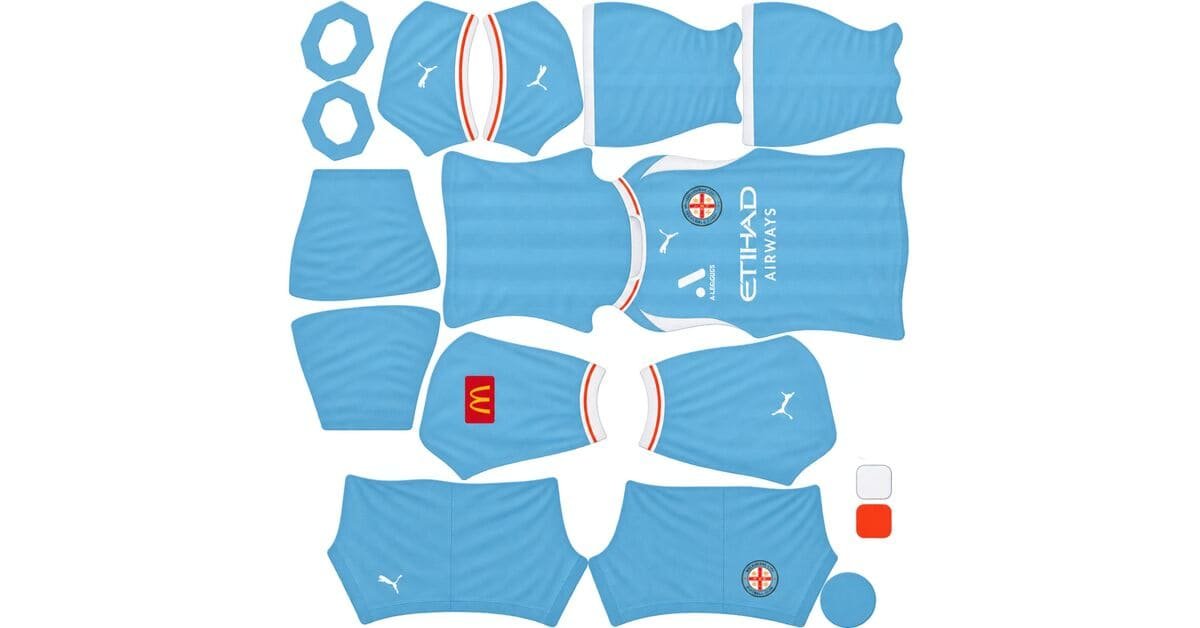
A Melbourne City DLS kits URL is a direct link to a 512×512 PNG City shirt you paste into Dream League Soccer. All four slots are below, with each file loaded into the game before it went on this page.
Melbourne City FC Logo
Official Logo 512×512 (2026/27)
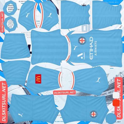
Melbourne City Home Kit
Home Kit 512×512 (2026/27)

Melbourne City Away Kit
Away Kit 512×512 (2026/27)

Melbourne City Third Kit
Third Kit 512×512 (2026/27)
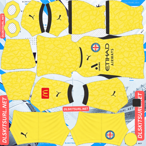
Melbourne City GK Home Kit
GK Home Kit 512×512 (2026/27)
Puma describe these kits as fully sublimated, but that is not automatically a warning. In this case, it is actually the kind of construction a flat PNG handles well.
Sublimation is printing, and printing is what this game wants
Melbourne City’s recent Puma kits have been fully sublimated, with the club crest applied separately.
Which is not the same as a woven or embossed design
The distinction matters.
Sublimation is a printing process. The design is dyed into the fabric as flat colour. There is no raised surface, depth effect or thread structure for the image to reproduce.
A jacquard weave, 3D knit or embossed finish is different. Those effects come from how the material itself is constructed, and a flat image cannot recreate that physical structure.
The useful dividing line is simple:
Sublimation: printed flat colour — reproduces well.
Jacquard weave: woven threads — does not reproduce.
3D knit: physical relief — does not reproduce.
Embossing: raised and recessed areas — does not reproduce.
Applied panels: separate fabric pieces — can reproduce because their shapes and colours can be represented in the image.
So a fully sublimated shirt is, in effect, already being described in the language the PNG understands.
Whatever is printed on it can arrive in the file.
Which refines the launch-copy warning
“Bespoke” has been a useful warning word on this site because it often points toward premium construction techniques. AC Horsens’ home this season is a good example.
“Sublimated” belongs on the other side of that line.
The process itself is not the problem. What was sublimated is what matters.
A bold sublimated graphic in contrasting colours can survive almost completely. A subtle tonal graphic can disappear, but that is because the contrast is weak, not because the shirt was sublimated.
Judge the content, not the method.
And the crest being applied separately matters not at all
The game’s imported badge is drawn over the chest area anyway.
Whether Melbourne City’s original crest was printed, embroidered or attached as a separate patch therefore makes no difference to the DLS version. Your own imported badge replaces what was there.
But Melbourne City keep printing subtle things
This is where City become more difficult.
Recent kits have repeatedly used graphics described as subtle or fading:
25-26 home: City blue with red trim and a subtle stripe graphic.
23-24 home: a fading graphic across the front.
22-23 home: sky blue with a diagonal zig-zag pattern that fades in and out.
Which is the one case where sublimation does not help
A fade needs all the intermediate values between its starting and ending points.
A genuine 512×512 image can preserve that transition smoothly. An undersized file may turn the same fade into visible steps or cause sections of it to disappear altogether.
There is another problem: a subtle graphic is usually tonal by definition.
It may be the same colour in a slightly different shade, giving the eye very little contrast to work with. Compression has much less information to preserve than it would with a bold red panel against white, for example.
So City’s signature visual device is exactly the sort of thing that sublimation cannot rescue.
Open the home at full size. If the graphic is clearly visible as colour variation, it has something to reproduce. If it only appears to suggest depth or texture, that part will not survive as a physical effect.
Heidenheim’s fading stripes, FC Zürich’s fading pinstripes, Elche’s black-to-green third and Venezia’s gradient away face the same basic limitation.
The fade itself is your quality gauge
Look closely at the point where the graphic dissolves.
A smooth transition suggests a good file. Visible banding suggests a weak or undersized one.
That makes the fade more useful than simply checking whether the shirt looks broadly correct.
Confirm the dimensions too. On a computer, open the image in a new tab and check the actual size reported by the browser.
And City blue is a good base
Dream League Soccer shows players relatively small, so the base colour still matters even when a graphic disappears.
Sky blue is bright and saturated and sits well away from pitch green.
It therefore remains a clean, readable shirt even if the subtle pattern does not survive the game’s display scale.
It is a much easier base to read than navy and is among the stronger colours for pitch visibility.
Use navy or white numbers on the home.
The third goes back to Melbourne Heart
Melbourne City’s 26-27 third pays tribute to the club’s origins as Melbourne Heart, the identity it used before the 2014 rebrand.
Which reproduces well
Melbourne Heart played in red and white, giving the shirt a naturally strong contrast base.
Red against white provides a very large value difference, and a design drawing on that early-2010s identity predates the subtle gradients and tonal graphics that make City’s modern shirts harder to reproduce.
Flat colour and defined shapes are exactly what a 512×512 file likes.
Expect the third to arrive looking much closer to its source design and to be one of the more readable options in the collection.
If the back is split between red and white, choose the number colour carefully. Navy or black can disappear into the darker sections, while white can disappear wherever it crosses white fabric. Match the swatch to the actual back design rather than assuming one colour works everywhere.
But the Heart crest will not appear
If the shirt itself carries the Melbourne Heart badge, your imported crest covers it.
More importantly, the badge is global.
Setting the Heart crest for this third also puts that crest onto your home and away. That would create a strange combination when those shirts are supposed to represent the current Melbourne City identity.
With only one kit benefiting from the historical badge, the current City crest is the more practical choice.
Houston Dynamo’s Archive Kit, Rosario Central’s retro-crest third, Odense’s original-logo third, Nacional’s period crests and Brisbane Roar’s 2005 logo create the same dilemma.
And it is an unusual kind of heritage kit
Most retro shirts revive an earlier version of the same club identity.
This one goes further back to an identity that Melbourne City deliberately replaced.
Melbourne Heart became Melbourne City following the ownership and rebranding process, and the club moved from its red-and-white identity into the sky-blue City branding.
That makes the third especially useful in DLS.
It is visually different from the blue home and therefore gives the third slot a genuinely different look.
The away
Melbourne City’s 26-27 away was released alongside the home and third.
Compare the actual file against the card above rather than relying on a description elsewhere, then run the standard checks:
Colour boundaries should be sharp rather than smeared.
Collar and cuff trim should have clean edges.
Puma branding, crest and sponsor should remain crisp.
The image should actually be 512×512.
With one caution from last season
City’s 25-26 away was black and silver.
Silver is a difficult material effect for a flat PNG because genuine metallic appearance depends on how light moves across the surface. The image can reproduce the colour, but not the physical metallic response.
The result is usually grey rather than silver.
Grey against black also provides only a limited value difference, so the detailing can become faint.
If the 26-27 away uses metallic-looking elements, expect the same limitation. Udinese’s metallic pinstripes, Angers’ silver-on-white treatment and Al-Ittihad’s gold piping face related problems.
Which Melbourne City kit survives best?
The home has a strong base colour, but its subtle graphic is the part most likely to weaken. The sky blue remains readable even when the pattern does not.
The away needs to be judged from the actual card, with particular attention to metallic-looking areas and small trim.
The Melbourne Heart third is the strongest technical option because its identity is built around the kind of flat, high-contrast colour blocks that survive well at 512×512.
For DLS purposes, the third is also the most useful visually because it breaks up the otherwise blue-heavy collection.
City Football Group means Puma, and that is stable
Melbourne City are owned by City Football Group, which signed a group-wide Puma deal in 2019.
Which means the logo dates nothing
The Puma cat appears across City’s kits throughout the current supplier period.
That makes the manufacturer a poor recent dating tool.
Instead, date the file from its design. The Melbourne Heart third is the clearest 26-27 marker, while the 25-26 black-and-silver away belongs to the previous season.
Sion, Thun, Odense, Nordsjælland, Perth Glory and Sydney FC have similar problems where a stable manufacturer does little to narrow down the season.
Central Coast Mariners and Brisbane Roar are the opposite: supplier changes make their recent files much easier to date.
And group ownership shows in the designs
Melbourne City have occasionally shared templates with other City Football Group clubs and with Puma’s wider catalogue.
The 20-21 away, for example, used the same design as Iceland’s 2020 away shirt.
That can actually help when identifying or reconstructing a kit. A shared template means the underlying shirt shape is already established, while template designs tend to rely on flat colours and defined panels.
Those are exactly the features that reproduce well in DLS.
Silkeborg’s Adidas Tiro 26 template and Alianza FC’s teamwear kits follow the same general principle.
How to tell if a Melbourne City file is current
Four checks narrow it down quickly:
The third should reference Melbourne Heart. This is the clearest 26-27 marker.
Puma branding is not enough. It has remained constant since 2019.
A black-and-silver away belongs to 25-26, not the current set.
Compare the design against the cards above, especially the home graphic, because City’s blue shirts can look broadly similar from season to season.
The first check does most of the work.
A note on the A-League season
The A-League runs across two calendar years, with the Australian summer season extending from October into May.
That is why City’s current collection is labelled 26-27 rather than simply 2026.
The club typically launches its new collection around late September or early October.
So a file labelled only “2026” is not enough to establish its season.
Check the design, not the year.
How to use a Melbourne City DLS kits URL
Copy the direct link using the button on the kit card rather than copying your browser’s address bar. The browser address often leads to the page containing the image instead of the image file itself.
In Dream League Soccer, go to My Club → Customise → Kit. Do not choose Logo; the badge is handled separately.
Select the slot before pasting because the selected slot is the one that gets replaced. Press and hold the URL field, tap Paste, then Confirm. Older builds may call that button Download.
The home, away and third fill the three outfield slots, leaving the goalkeeper slot separate.
Set the shorts and socks deliberately as well. DLS treats those parts independently from the shirt, so a contrasting lower half can change how clearly the whole kit reads.
Decide on the badge before finalising the collection too. The Melbourne Heart third creates a choice between using the current City crest everywhere or sacrificing that consistency for the historical badge.
The first custom kit requires a one-time gem unlock. After that, changing kits is free.
Test the link first
Open the URL in your browser before taking it into the game.
The image should appear by itself, without headers, buttons or a gallery around it, and the address should end in .png.
A viewer page is not a direct image file and cannot be pasted into DLS as a kit URL.
For City’s home, inspect the point where the graphic fades.
A smooth dissolve is a good sign. Visible banding is not.
Then confirm that the image is actually 512×512. A file can look fine in a browser preview while still being too small for the detail you are trying to preserve.
Why do Melbourne City kit URLs stop working?
Three problems account for most dead kit links.
Free image hosts delete old uploads. Files can disappear after months or years while the article or card containing the link remains online.
Melbourne City should have better file availability than some smaller A-League clubs because of City Football Group’s international profile and Puma’s wider visibility, but older specials and unusual variants can still be difficult to replace.
Hotlink protection can block DLS. A host may allow the image to open normally in a browser while refusing a direct request from the game. That is why a URL can appear healthy when clicked but fail when pasted into DLS.
The preview and direct file can be different. A page may display a locally hosted thumbnail while the copied URL points to another location. The preview can remain visible after the actual file disappears.
Here, the shirt displayed and the URL copied from the card are the same file on the same server.
The Melbourne City badge
Set the crest in the same session by returning to My Club → Customise and choosing Logo instead of Kit.
There are two identities worth knowing here: the current Melbourne City crest and the historical Melbourne Heart badge used for the 26-27 third.
City’s current crest is circular and uses the club’s sky-blue identity with the Melbourne skyline and heraldic elements.
The circular shape is helpful in DLS.
The game crops badges into a circle, so a naturally round crest loses less of its artwork at the edges than a badge with wide horizontal elements or sharp corners.
Use a genuine 512×512 badge file rather than enlarging a small source. Fine skyline details are among the first elements to soften when the badge is rendered small.
Keeping your Melbourne City kits
Custom kits are stored on the device rather than attached to your account. Updating the game normally leaves them in place, but reinstalling the game or moving to another phone can remove the kits and badge.
Keep the URLs somewhere outside DLS.
It is also worth noting which crest you used. The Melbourne Heart third makes the badge decision more noticeable than usual, because a historical crest will appear across the entire collection rather than on that one shirt only.
FAQ FOR RANK MATH
What is a Melbourne City DLS kits URL?
A direct link to a 512×512 PNG City shirt that you paste into Dream League Soccer’s kit screen. A working direct image link ends in .png.
Is a fully sublimated kit good for DLS?
Yes. Sublimation is a flat printing process, so the design is already represented as colour in the fabric. It is different from jacquard, 3D knit or embossed construction, which relies on physical texture or relief.
Why can Melbourne City’s subtle graphics still disappear?
Because the problem is contrast, not sublimation. Fading and tonal graphics contain less visual separation, so they are much easier to lose at 512×512 and at match distance.
How do I check the City home file?
Look at where the graphic fades. A smooth transition is a good sign; obvious banding or abrupt steps suggest an undersized or weak file. Confirm that the source is genuinely 512×512 as well.
What is special about the 26-27 third?
It pays tribute to Melbourne Heart, the club’s red-and-white identity before the 2014 rebrand to Melbourne City. Its flat, high-contrast design should reproduce more cleanly than City’s subtle blue graphics.
Will the Melbourne Heart crest appear automatically?
No. The imported DLS badge covers the shirt’s original crest. If you choose the Heart badge, it applies globally to your kits rather than only to the third.
How do I date a Melbourne City kit?
The Melbourne Heart tribute is the clearest 26-27 marker. Puma does not help much because the supplier has remained stable since 2019, while the black-and-silver away belongs to 25-26.
What number colour should I use?
Use navy or white on the sky-blue home, then check the actual back design before choosing a colour for the Heart-inspired third. A number colour that crosses both red and white can disappear on one of the two sections.